11 Galley Kitchen Design Tips That'll Help You Make The Most Of Your Space
We may receive a commission on purchases made from links.
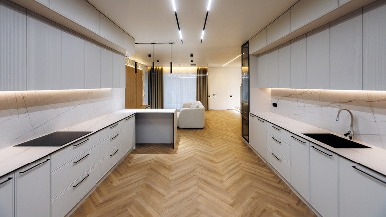
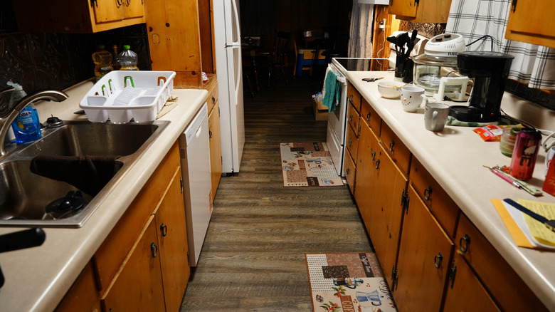
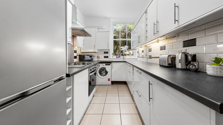
Galley kitchens are compact, linear, and efficient. It's a space-saving layout that's been used on ships, in cramped apartments, and on restaurant prep lines for over a century. A traditional galley kitchen is usually just a corridor between two walls with appliances and cabinets on either side, but the design is incredibly functional for workflow when prepping and cooking food. The problem with installing a galley kitchen at home is that most people try to apply the same broad design style they'd use for a sprawling open-plan kitchen. But galley kitchen design needs an entirely different approach.
Luckily, there are so many inspiring galley kitchen ideas to make the most of this unique format. In exclusive interviews, House Digest spoke with four designers — Kerrie Kelly, CEO and Creative Director of Kerrie Kelly Studio; Brittany Rediger, founder and Principal Designer at Rediger Design; and Laura Roberts and Nana Oldach, founders of the Los Angeles-based design firm Hearts at Home – who understand the galley kitchen intimately. We wanted to find out what separates a stylish yet functional galley kitchen from one that simply looks like a corridor with a stove and refrigerator shoved in. These experts talked us through making a galley kitchen feel light and spacious, how to combat claustrophobia and the tunnel effect, and how to make the most of this understated setup.
Choose the right spacing between galley kitchen countertops
With galley kitchens, the width of the aisle between the counters controls everything else. It determines how deep your cabinetry can be, how comfortably two people can move through the space at one time, and whether you can actually open the oven without pinning yourself against the opposite counter. Laura Roberts and Nana Oldach tell House Digest that getting the numbers right is the foundation that the whole kitchen design rests on: "Aim for an aisle width of 42 to 48 inches between opposing counters. Closer to 42 inches works for single-cook kitchens, while 48 inches is ideal for two people cooking at once."
This is a practical design issue rather than a purely aesthetic preference. Industry planning guidelines establish 42 inches as the bare minimum for single-cook work aisles, and 48 inches is the absolute minimum for kitchens used by more than one cook. This is measured between the faces of your countertops, cabinets, and appliances, not wall to wall. You need to take this aisle width into account when thinking about cabinets and appliances, as deep cabinets or appliances with wide-swinging doors can easily eat up space and bring the available width under 42 (or 48) inches.
Of course, Roberts and Oldach also note that you can run into the opposite problem: A galley that's too wide wastes floor space that could go to counter depth or storage. It then starts to feel less like an efficient kitchen and more like a hallway that someone just added a few counters to.
You can create a smart working triangle, even in a galley kitchen

The linear nature of a galley kitchen doesn't automatically mean you have to give up on workflow efficiency. Laura Roberts and Nana Oldach are clear that careful placement of the three primary work zones can more than compensate for size constraints. The pair note that, "Even though galley kitchens are linear, you can still optimize flow by spacing the sink, cooktop, and refrigerator strategically." They recommend that you "avoid placing all three in a straight line with no landing space. Ideally, position one element across the aisle to reduce congestion and improve movement."
The classic kitchen work triangle, which connects the sink, refrigerator, and cooktop to minimize unnecessary movement during meal prep, is well-suited to a galley format. Even in a tight footprint, you can get a nice cross-aisle triangle by placing the sink on the opposite wall from the cooktop and refrigerator. What you're trying to do is avoid a kitchen where these three elements are placed in a straight line together, as this can result in you having to pace up and down the line every time you move ingredients from one zone to another. Straight line layouts look fine on a floor plan, but for practical everyday use, its inefficient and not terribly user-friendly.
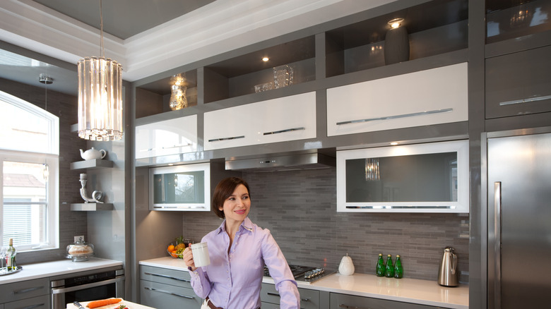
Maximize vertical storage with cabinetry to the ceiling
Because the floor area in a galley kitchen is finite, the layout can't be easily added to or rearranged. This means storage solutions need to be particularly smart. Laura Roberts and Nana Oldach recommend thinking vertically and committing to this fully. "Use tall upper cabinets for less frequently used items and incorporate tall pantry pull-outs or appliance garages where possible," the pair recommends. "This keeps counters clear and makes the kitchen feel more expansive".
Running cabinets all the way to the ceiling eliminates the gap above standard-height upper cabinets, which mostly collects dust and serves as an informal shelf for items no one knows what to do with. When you replace this gap with more cabinetry, the upper zone can easily become overflow storage or a space to stash important appliances that you don't use very often. This is super helpful in a kitchen where you don't have any spare floor space, and countertops may be narrower, so you've also got less counter storage. Reducing countertop clutter can also help make a long, narrow kitchen feel more open.
Prioritize continuous counter space to support efficient prep and movement
One of the most common design planning mistakes in a galley kitchen is fragmenting the kitchen counter surfaces with appliances and fixtures that interrupt what should be a clean prep zone. Laura Roberts and Nana Oldach are specific about what to protect: "Aim for at least one uninterrupted work zone, 3 to 4 feet long, ideally located between the sink and the cooktop [...] In smaller galley kitchens, maintaining long unbroken countertop runs is essential for maximizing both function and flow."
In most homes, the countertop between the sink and the stove is the most used part of the kitchen. This tends to be the place where you prep ingredients, where you place pots you're planning to use or are already finished with, where ingredients wait for their turn on the stove, and often where you plate up, too. If you break up this section with a built-in coffee station or a collection of random appliances, you go from a perfectly functional prep space to a frustrating series of obstacles that make meal prep inefficient and annoying.
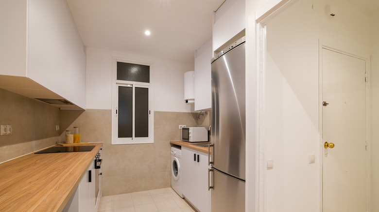
Group tall appliances and features on one side
One of the unique challenges of a galley kitchen is the risk of making both walls feel equally dense and cluttered, which amplifies the already existing tunnel effect rather than counteracting it. Laura Roberts and Nana Oldach recommend using a deliberately asymmetric approach: "Group tall elements like the fridge, ovens, and pantry on one wall and keep the opposite side lighter [...] This improves visual openness and enhances circulation, making the space feel less confined."
Placing the refrigerator, oven, and tall pantry cabinetry on one wall keeps the other side of the room lighter, less oppressive, and more breathable. The difference in grouping the same appliances in the same size kitchen on one wall versus both walls is astonishing. If you're already dealing with some of the common problems and mistakes that affect galley kitchen layouts, regrouping the tall elements on one wall is one of the simplest layout corrections you can make.
Plan landing spaces around appliances
Every single appliance in your kitchen requires counter space next to it, even if your kitchen is small. Brittany Rediger tells House Digest that this is one of the most consistently neglected realities of galley kitchen design. Rediger says, "I cannot stress this enough. Appliances need breathing room [...] Every zone should have 15 to 24 inches of clear counter on either side, not as a suggestion but as a requirement. That's where the hot pots and pans land. That's where you're grating cheese while something simmers."
Industry guidelines also set out minimum landing areas for every appliance, but in a galley kitchen, these zones are often the first things that get sacrificed if space feels a bit tight. The downside of this is that you could be compromising on safety. If you've got a cooktop with no counter space beside it, you've basically got a burn hazard waiting to happen. It's also not terribly practical. A refrigerator with no landing area means that every item you take out has to travel the length of the kitchen before it can be set down. In a compact galley set-up, this can be a significant pain point. Rediger stresses that these clearances are functional requirements, not luxuries, and that you shouldn't automatically sacrifice them if square footage is challenging. As she says, "Lose those buffers, and you've basically turned your kitchen into a game of Tetris every time you cook."
Create moments of visual pause
Another expert trick to make a small kitchen feel bigger is to create a natural pause. If you find yourself standing at the end of a galley kitchen and looking down a corridor of tall, closed-in cabinetry on both sides, you'll really get a feel of the tunnel effect. It can make a kitchen that's already small feel claustrophobic, overwhelming, and unwelcoming. Speaking with House Digest, Kerrie Kelly suggests a solution: "In a galley kitchen, everything is in close proximity, so incorporating a visual exhale, such as a slab backsplash, a softly veined surface, or even a section of open wall, prevents the space from feeling overly compressed. This helps the kitchen feel more expansive without changing the footprint."
A large-format slab backsplash, for example, with minimal veining, will give the eye somewhere to rest without adding too much visual noise. An open shelving section on the wall breaks the monotony of closed cabinetry but doesn't give up meaningful storage. You can even use a framed piece of art or a mirror on an open wall section to get the same effect at a lower cost. You're trying to break the visual rhythm at least once by giving the eyes somewhere to pause, so the kitchen doesn't feel like a cluttered, oppressive corridor.
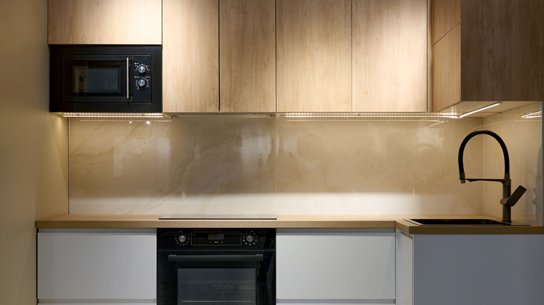
Integrate appliances seamlessly
When you're looking straight down the corridor of a galley kitchen, the visual weight of the appliances can be jarring, particularly if they are bright white in a neutral or dark kitchen or vice versa. In such cases, appliances can dominate the space, while the rest of the kitchen loses its visual impact. Kerrie Kelly's approach is to treat appliances as part of the cabinetry rather than as separate objects that interrupt it. "Rather than allowing appliances to interrupt the rhythm of the space, consider panel-ready options or aligning finishes so they read as part of the cabinetry," she advises. "This creates a more cohesive, tailored look and allows the eye to move fluidly through the kitchen."
Panel-ready appliances are those that accept custom cabinet fronts, so the doors match the surrounding cabinetry. Do remember that these aren't cheap, and they will require coordination with your cabinetry supplier. However, in a galley kitchen where visual continuity does a huge amount of the design work, it could be worth the investment. A budget version is simply choosing appliances with a finish and proportions that match the overall kitchen. You may also, at the lowest end of the budget, get a similar look by using kitchen-safe self-adhesive contact paper, like this dark wood grain waterproof contact paper from Decotalk Store, to cover the appliance fronts and make them look as though they are integrated.
Soften edges and transitions
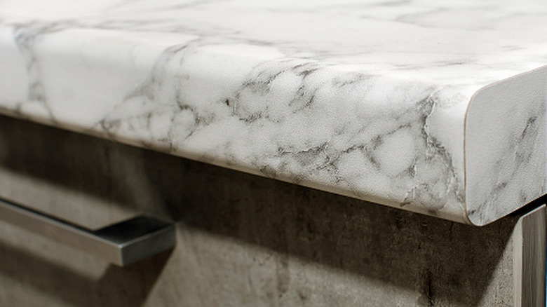
The nature of a galley kitchen means that it has a certain inflexibility that other layouts don't suffer from. This lack of flexibility means that everything is parallel and perpendicular. Kerrie Kelly's recommendation to counter this involves softening details. She explains, "Galley kitchens can feel linear and rigid, so introducing softened edges through curved hardware, eased countertop profiles, or subtle radius corners helps create a more comfortable, human-centered experience as you move through the space."
An eased or bullnose countertop edge, for example, rather than a sharper, squared-off edge, makes working at a narrow galley counter noticeably more comfortable. If you're standing close to surfaces on both sides and you've got a sharp knife-edge counter profile, you'll likely bump your hips and your forearms on it over and over again. This seems like a small thing, but in your home kitchen, this can become a considerable annoyance. Using radius corners on cabinet doors or hardware with a gently curving profile further softens the normally hard edges of a galley kitchen. These changes make the kitchen look more inviting and feel more comfortable to work in.
Prioritize material continuity
Lots of material transitions in a galley kitchen can make the design feel choppy and confusing. It can also have a strange visual effect, which makes the kitchen seem shorter than it actually is. If planned carefully, this can be useful where you're trying to combat the tunnel effect in a long, narrow kitchen, but in general, you probably want to avoid mixing too many clashing materials. Kerrie Kelly recommends "using the same or complementary materials across both sides of the galley to create a sense of cohesion and calm."
Now that doesn't mean you have to create a monotonous or monotone kitchen. You can still use different materials, but they should be chosen deliberately and well thought out. The overall palette should stay fairly limited to make sure that both walls look like they belong to the same room. For example, a kitchen where one side has brightly painted cabinetry, bold backsplash tile, and butcher block countertops, and the other side has wood front cabinets and quartz countertops, is confusing and jarring to look at. You can still mix countertop materials for visual contrast in a galley kitchen — you just need to make sure that the materials you choose are complementary, so the transition looks natural rather than random.
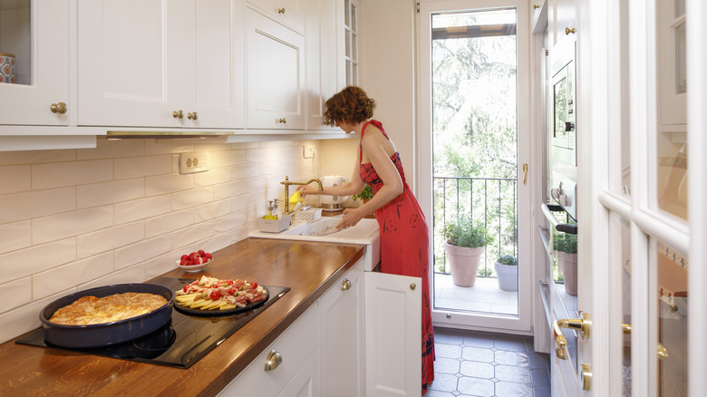
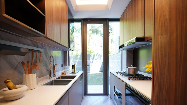
Design for the view beyond
Because of the potential tunnel effect in a galley kitchen, the eye tends to be drawn to the end wall. Yet it's one of the most underused design spaces in the kitchen. Kerrie Kelly says, "One of the most overlooked strategies is considering what the eye lands on at the end of the galley. Whether it's a window, a piece of art, or a beautifully detailed wall, giving the kitchen a focal point draws you through the space and enhances the overall experience."
If you already have a window at the end of your galley or you are doing a big renovation and can add one, this is an immediate plus. The natural light helps brighten and illuminate the space, and the window creates the illusion of a larger, longer space. And it makes a galley feel less claustrophobic. If adding a window isn't possible, then choosing a nice piece of art that also draws the eye or creates the feeling of extra space or depth can have a similar effect. You can also turn the end of a galley kitchen into storage with a built-in shelving unit displaying a few attractive objects. At the most basic level, you're trying to avoid a flat, featureless wall that just stops the eye dead and makes the kitchen feel like it's been truncated or that it just runs out of room.