Not Material, Not Height: The Fence Feature That Can Decrease Home Value
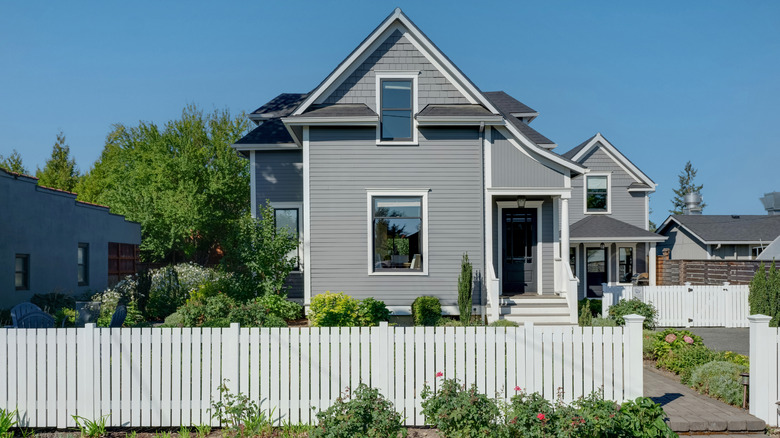
Adding a fence to your home can certainly boost property values. After all, they look nice, keep kids and animals contained, and add a sense of security. However, if you're looking to entice potential home buyers, you can't just throw up any fence. Things like height and material can play a role, but one of the biggest reasons you may find people put off by your fence is the color.
When choosing a fence color, you may think that something bright is the best option. After all, it will catch the eye and attract attention. Unfortunately, if you're looking to sell your house, you may want to avoid something quite so strong. Otherwise, you risk turning off some potential buyers. Bold colors, or ones that match their surroundings a little too well, can actually turn off potential buyers.
Having the wrong materials and heights can make a difference. Some fences, like chain-link, can look tacky. And too short a fence may not add the privacy or protection for pets that potential buyers may want. However, a color that feels garish or catches the eye in the wrong way can have an immediate impact on buyer perception. The reason certain colors put off potential buyers and decrease home value is because of how people perceive them. Some are too bold and flashy, while others are too plain and flat. It's hard to find a color that works for your fence.
The colors you may want to avoid when painting your fence
Though you may be a fan of bright, bold colors, you may want to avoid using them on your fence if you're trying to appeal to the widest range of buyers. Bold shades of red, pink, orange, and purple can easily feel overwhelming and clash with the rest of your landscape. Additionally, you want to consider the meaning of the color related to fences and property. For example, you may want to think twice before painting your fence purple, as purple paint is sometimes used as a no-trespassing marker in certain states.
The same goes for using multiple colors. Having a rainbow mural could be fun, but too many colors along your fence can be off-putting and may not fit in with the rest of your yard and home. Certain shades of gray and brown can make a fence appear weathered or neglected. Greens are nice, but the wrong shade can end up blending in with your garden a little too well and feel overwhelming.
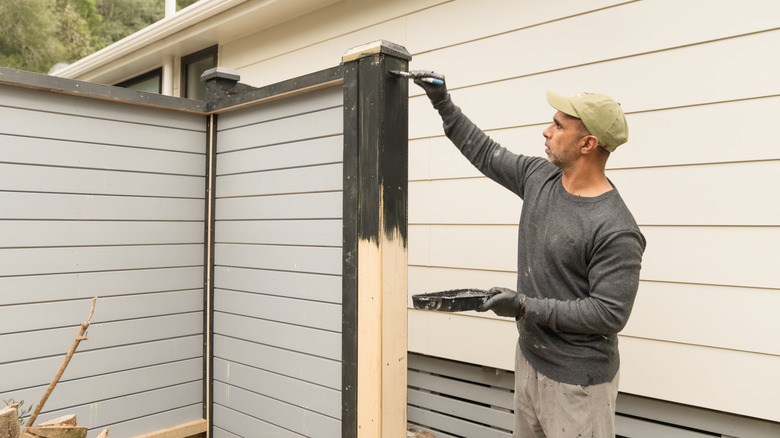
Of course, if you really love these colors, and you aren't planning on selling any time soon, there's no harm in painting your fence whatever color you want. However, no matter what, you may want to consider avoiding really light colors, including plain white. While they can look nice and catch the eye, they don't stay clean. With darker and more neutral colors, a bit of dirt or dust might not be noticed.
Better color choices to paint your fence and increase value
After going through that list, you may feel like every fence color comes with a downside. Thankfully, there are some great colors you can still choose from. And, sometimes, just changing up the base tone under a color can make a world of difference. For example, though bright pinks, oranges, and reds are often considered risky choices, using muted versions with cool gray undertones can make them feel less overwhelming.
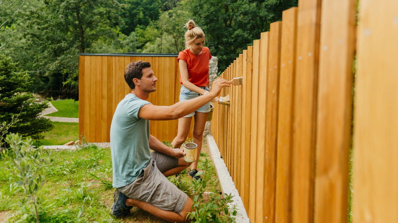
Other great options are neutrals and earth tones, like some shades of brown, beige, and terracotta. Wood stains are a safe bet because they tend to look natural and timeless. Darker blues that don't blend in with the sky are another choice. You can also pick greens that complement your garden without disappearing into it, which can add depth and help a small yard feel more expansive.
Try to pick something that matches your home and exterior decorations as well. You don't have to paint your fence the same color as your house, but having something that works well together is always a good idea. You can also consider adding a more fun choice by customizing your backyard fence to give it a natural and rustic look, but like with the grays and browns, you need to be careful to find the balance between charmingly vintage and worn down.