The Unexpected Countertop Design You Should Consider For Your Small Kitchen
In a world of sprawling, Pinterest-inspired kitchens, small kitchens tend to feel a little disappointing — but that's only to the homedesigner with little imagination. Sure, it's easy to create a showstopping design if you have enough room for an 8-seat island and miles of countertops, but small kitchens can be just as impactful. You just need to be intentional so you can simultaneously wow the eyes while maximizing most of your space. Because of this, there are a lot of tips online on which design elements to avoid since they can make the room feel smaller than it already is. The only issue with those said tips is that they often lack nuance — you can pretty much incorporate any design or trend into a small kitchen, as long as you balance it. Take, for example, dark countertops.
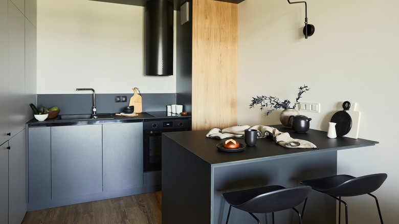
You likely heard that dark kitchen countertops in a tiny space are a hard no, since the dark hue can make the space feel smaller. But according to Kerrie Kelly, CEO & Creative Director of Kerrie Kelly Studio, they "can absolutely work in a small kitchen, but they need to be used thoughtfully." She exclusively tells House Digest: "The question isn't whether a countertop is dark or light — it's whether the overall palette creates balance. In some cases, a rich charcoal, deep graphite, or moody stone can add sophistication and visual depth that actually makes a small kitchen feel more intentional and expansive." However, the trick is to ensure you don't pair it with other equally dark elements, creating a small cave out of your small kitchen. Below, our expert shares tips on how to avoid doing just that.
Why dark countertops work in a small kitchen
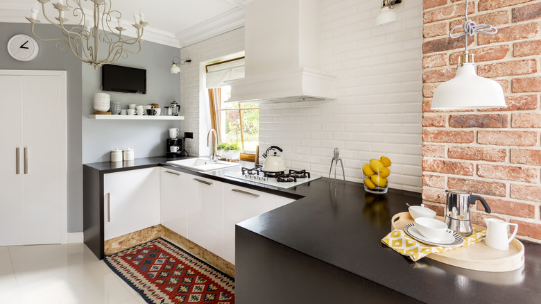
When working with a small space, most people tend to layer as many bright whites as possible to make it feel bigger and less cramped. But Kerrie Kelly exclusively tells House Digest that the road to good design doesn't rely solely on how big its square footage is. "My biggest advice is to focus less on making the kitchen feel larger and more on making it feel cohesive. A well-designed small kitchen often feels more luxurious than a poorly planned large one." Because of this, dark countertops can be perfectly acceptable. "Dark surfaces tend to ground a space. When paired with lighter cabinetry, reflective finishes, layered lighting, and thoughtful material selections, they can create contrast and dimension that helps a small kitchen feel curated rather than cramped," she notes. Lighter cabinetry doesn't always equal white or cream-colored doors, either. For example, Martha Stewart's Bedford kitchen uses light, butter yellow cabinets with black countertops. And since biophilic design is all the rage right now, you can lean into the natural-wood-cabinet-revival and pair your black countertops with a light wood, such as white oak.
The issue is that most homeowners tend to choose their dark countertops without considering the other design elements in the kitchen. "Where homeowners run into trouble is when dark countertops are combined with dark cabinetry, limited natural light, and minimal contrast. The result can feel visually heavy. The countertop should be considered as one piece of a larger composition rather than an isolated design decision," she explains. So if you like a black soapstone or a moody marble, make sure you plan around that color selection. Here's how.
How to make dark countertops work in a small kitchen
In order to create contrast and make the dark countertops appear visually lighter, you need to surround them with lighter colors. But choosing those shades can be trickier than it seems. To help narrow down the selection, Kerrie Kelly gravitates toward three categories. She exclusively tells House Digest that she likes "soft warm whites and creamy neutrals that reflect light and create a sense of openness," paired with "warm taupes and sandy tones that introduce depth while maintaining a calm, timeless aesthetic," as well as "light, stone-inspired grays that provide subtle movement and texture without overwhelming the room." Think Benjamin Moore's Swiss Coffee and Smokey Taupe, or Sherwin-Williams's Accessible Beige or Drift of Mist.
As you have likely noticed, these shades aren't bright whites or stark neutrals. They are less "computer paper white" and more "beige linen". They all have some weight and depth to them in their own right, and there is a reason for that. They're the new neutrals taking over kitchens. "Rather than focusing on stark brightness, I often encourage homeowners to look for colors that have a softness and natural quality to them. The most successful small kitchens feel layered and welcoming rather than sterile," she explains.
However, it's not just the colors you choose. It's also where you place them. Focus on creating careful contrast to lighten the visual weight of the dark countertops. "Lighter wall colors, reflective backsplashes, layered lighting, warm metals, natural wood accents, and thoughtful styling can all help balance darker surfaces," she said.