How To Maximize The Use Of Warm Colors In Your Interior Design Plans
Maximizing warm colors in your interior design plan is a great way to change your décor either seasonally by using accessories, or year-round with new paint colors and furnishings. All warm colors have a yellow or red undertone that gives the color its feeling of warmth. You can create a soothing place to relax or a high-energy vibe depending on how strong the color is. A spa-like bathroom might include pale, warm colors but if you need a jump start in the morning, adding a punch of vibrant color might be a better choice.
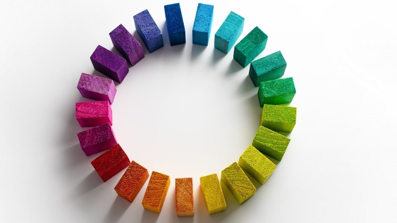
Start by creating a plan with a basic understanding of color theory and use the color wheel so you can add warm colors in a way that achieves the look you want. Interior designer Mary Kate offers a great explanation of the color wheel in The Light of Design. It starts with the three primary colors: red, yellow, and blue. They're primary because they cannot be made from mixing other colors. Next, are the secondary colors, the three colors created by combining two primary colors together: orange (red + yellow), green (blue + yellow), and purple (blue + red). Each secondary color sits directly across the wheel from one of the three primary colors. Tertiary colors are the six colors made from mixing a primary color with one of the secondary colors on either side of it: red-purple, red-orange, yellow-orange, yellow-green, blue-green, and blue-purple. These 12 colors (primary, secondary and tertiary) are also called hues.
Find your inspiration
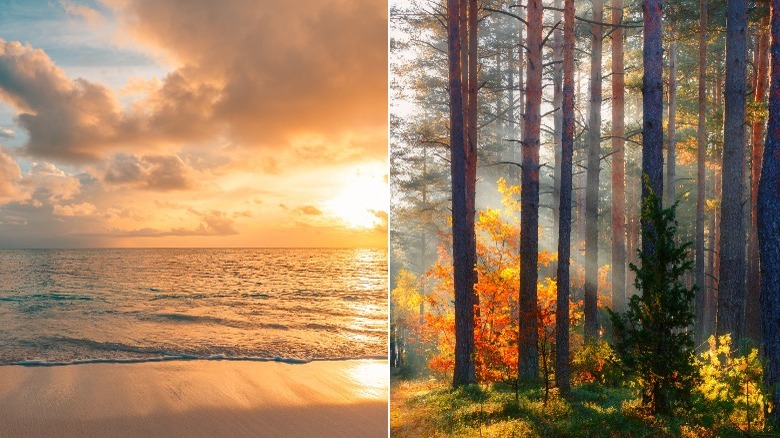
When you look for your color inspiration you probably will think about something that gives you a positive feeling. Maybe this is something in nature such as a beautiful sunset, as interior designer Sally Painter told Love to Know. Or, perhaps it's the rich, warm colors of leaves in the fall that call to you. Your inspiration could come from a photograph, a painting, or even a piece of fabric. If you don't have anything that immediately pops into your mind, you can get plenty of ideas by looking at home design shows on HGTV or by searching Pinterest.
The colors that you really love may be the ones you wear most often, or the accessories that attract you when you walk into a store. You may end up with an inspiration piece that has more colors in it than you want to bring into your room design, though. So, your next step is to find your warm color scheme.
A word on color schemes
Color schemes are simply the organization and choices of colors placed throughout a space (via Study.com). You'll pull the colors from your inspiration piece and use the color wheel to create a color scheme that sets the style and visual feeling that you want. Doing this is one of the cornerstones of interior design, according to The Light of Design. Additionally, a color wheel shows the 12 colors in their full, vibrant state. Your inspiration piece may, for example, have a bright orange in it that you love but you don't necessarily want your room to be overwhelmed by that color.
There are three ways to desaturate the vibrancy of colors, which lets you combine them in ways that creates the mood you want. These are called tint, tone, and shade. Interior designer Nick Lewis explains that adding white to any color gives you a paler tint, adding grey gives you a tone (maybe as in "tone it down"), and adding black gives you a shade. You have the possibility for millions of colors to choose from, says Lewis. Finally, there are three basic color schemes that let you put together colors in ways that work best with one another: analogous, complementary, and triadic.
TIP: A great, online tool to help you generate color schemes is by Muzli from InVision.
Which warm color scheme is right for your design?
Analogous colors are three colors adjacent to one another on the color wheel. A way to bring in warm, analogous colors would be to pick red-orange, orange, and yellow-orange. Together, these colors are harmonious and ideal for monochromatic schemes. Complementary colors are the two colors which sit directly across from one another on the color wheel. Think of blue and orange, or purple and yellow. Complementary colors are often used as an accent color to the color opposite them. Picture the orange and yellow colors in a sunset against a blue sky. Triadic colors are three colors that are located equidistant from one another on the color wheel, forming a triangle with each point of the triangle pointing to one of the colors. These are high-contrast colors that add personality to a space.
Remember, you can combine colors with their tints, tones, and shades in your color scheme without overwhelming your choice of color. A word about neutral colors: Neutral colors are not found on the color wheel. They include brown, tan, white, black and gray and can be used in combination with any other color. One way to introduce neutral colors can be with the color of your choice of wood furniture, metal or paint, per The Light of Design.
Soft white light bulbs add warmth
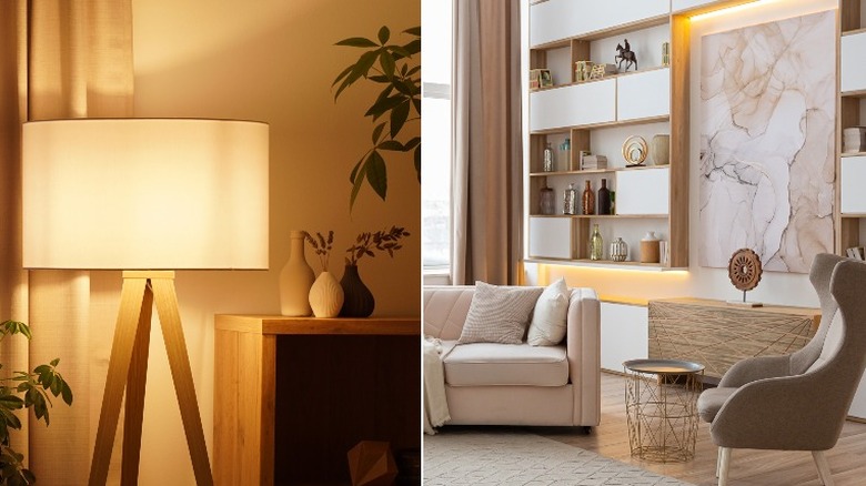
Lighting is another way that you can maximize warm colors in your interior design. When it comes to lighting, color temperature has to do with the appearance of a glow, according to Prudent Reviews. They suggest choosing light bulbs that are called soft white, rather than daylight light bulbs, in areas where you do not need bright task lighting. Despite the name, soft white light is considered a warmer color temperature because of the orange glow it casts and for the way the light interacts with warm colors in a room such as reds, oranges, and browns.
You can add warm lighting by changing the light bulbs in lamps, adding spot lighting above a painting, or by adding under-mounted lighting inside a bookshelf or cabinet. Warm light bulbs can even make a cool paint color look warmer by the way it reflects off the walls.
Add a pop of color
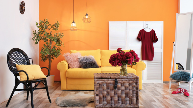
When warm colors are used in your design plan, they can add a lot of energy to a room. Researchers are actually in agreement that warm colors like red and yellow increase your heart rate and hunger, as noted by Daily Infographic. Picture the way red colors are used to represent romance and get your heart rate up! It's also one of the reasons many fast-food restaurants use orange and yellow colors in their décor and signage. By using tints, tones, and shades you can desaturate the color to use it in a way that adds the warmth without bringing in too much heat.
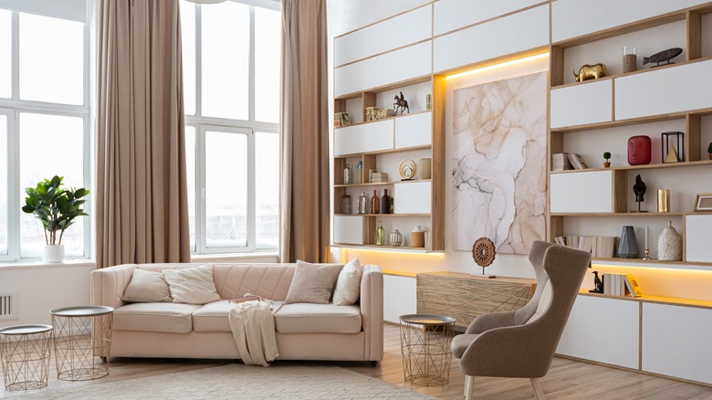
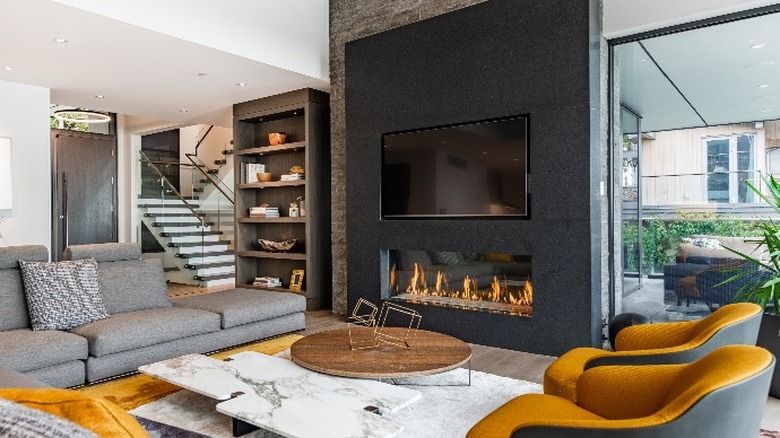
If you need a pop of full-on vibrant color, try adding it with accessories such as solid-colored pillows, the bright color of a patterned rug, or in decorative items, per Love to Know. In the photo above, the golden-orange color has been used sparingly in throw pillows and upholstery, as well as decorative items on the bookshelf. This is a great way to add a warm color, especially to neutral or cool-toned rooms. Finally, when you want to add a bolder warm paint color without overwhelming your room, try to feature it on just one wall, either behind a bed or around a fireplace.
Use warm tints of neutral paint colors
You can use neutral paint colors to maximize the use of a warm color scheme, too. Think about walking into a completely empty room. If you were to imagine that room painted an icy white color it might make you shiver. However, in the world of paint colors, there are even warm and cool whites.
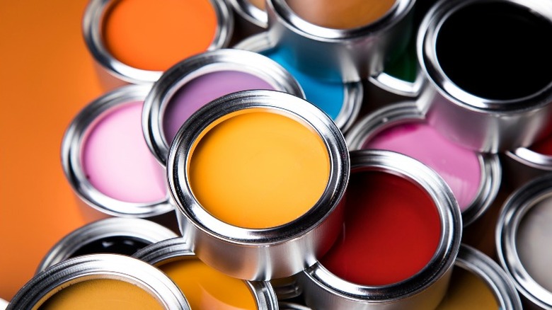
When you look into a can of paint, or at a paint chip in a store, you can't tell what the color will look like on your wall, especially because you need to see it with the light in that particular room, says designer Nick Lewis. He recommends buying a few sample colors and painting them on the wall to see what they will actually look like in your room. It costs a little money to do this but it's much less expensive than repainting a whole wall.
For example, Benjamin Moore's Color of the Year in 2022 is called October Mist. It's hard to tell from looking at a chip that this is a grey with a warm green tone in it. However, if your color scheme does not include green, this may not be the right shade to use.
Use texture to maximize warm colors
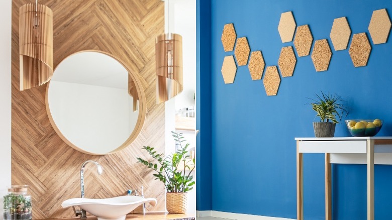
Texture is another way to add warmth to your interior design plan. For example, wood adds a natural warmth, per Urban Ambiance. In the photo above on the left, wood was used to create a feature wall in the bathroom, along with the hanging bamboo light fixtures and a basket on the counter. It brings a warmth to the bathroom and ties in very well with the very modern sink and faucet.
In the photo on the right, simple cork boards were used to create a textured pattern across a wall. The texture and the color of the cork and the similarly colored wood table legs help break up the bold, cool color on the wall. The bowl of bright yellow apples and a spiky plant in a wooden container add more texture and warm colors. Other textures such as faux fur, leather, fabric, and rugs are ways you can bring in your color scheme while adding a sense of warmth.
Add artwork to maximize warm colors
Maybe it was a painting or photograph that was your inspiration piece. A great way to maximize a warm color scheme in a room is by hanging artwork or photographs, says Home BNC. Colored mats can also be used around pictures to add warm colors that complement the picture. Create a gallery wall on an empty or uninspired section of a wall which could use some perking up.
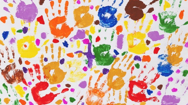
House Beautiful suggests hanging fabric, porcelain plates, or hanging your children's artwork. You could pick out the specific warm paint colors you want to use in the room and have each person create their own masterpiece. Create your artwork on papers which have a tint, tone, or shade that fits your color scheme, too. It's not just children who may enjoy seeing their creativity decorating the walls of home. Have fun using these tips to maximize the use of warm colors in your interior design!