Don't Paint Your Bedroom This Color
When designing your bedroom, it's important to consider more than just aesthetic preferences. Your bedroom is supposed to be a relaxing space where you can escape to recharge. The design you choose can actually promote increased sleep and better mental health, per Great American Homestore. Therefore, every design decision you make in your bedroom should encourage rest. From the furniture choices to the paint colors, you should focus on creating a calming atmosphere.
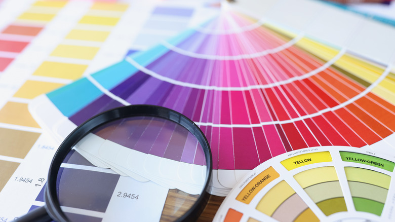
It's safe to say, then, that certain design decisions should be avoided in the bedroom. For instance, if you work or study from home, moving your desk out of your bedroom may actually help you get a better night's sleep. This is because your desk is associated with having to focus and stay alert, which could make it more difficult to fall asleep, per The Ladders. Another important factor to consider is your bedroom's paint color. One color, in particular, has been linked to less rest and poorer mental health.
What color should you avoid?

The number one color to avoid painting your bedroom is red. Red is associated with the devil, fire, and blood, all things that will more likely keep you up at night than help you fall asleep. Further, while red can sometimes represent love and confidence, it's also used as a sign of danger, anger, and increased energy.
It makes sense that red is associated with danger. It's the reason why stop signs and traffic lights display this color, per Very Well Mind. Even nature itself utilizes red as a sign of danger, as demonstrated in the strawberry poison dart frog. Because of this, red is supposed to draw our attention quickly, which may cause visual strain, per the London Image Institute. Red is also associated with anger since individuals get "red in the face" when mad, per Very Well Mind. Finally, red is associated with increased energy. Because it's vibrant and bold, it can cause your blood pressure and heart rate to increase, two things you don't want happening while you're trying to sleep.
More soothing color choices
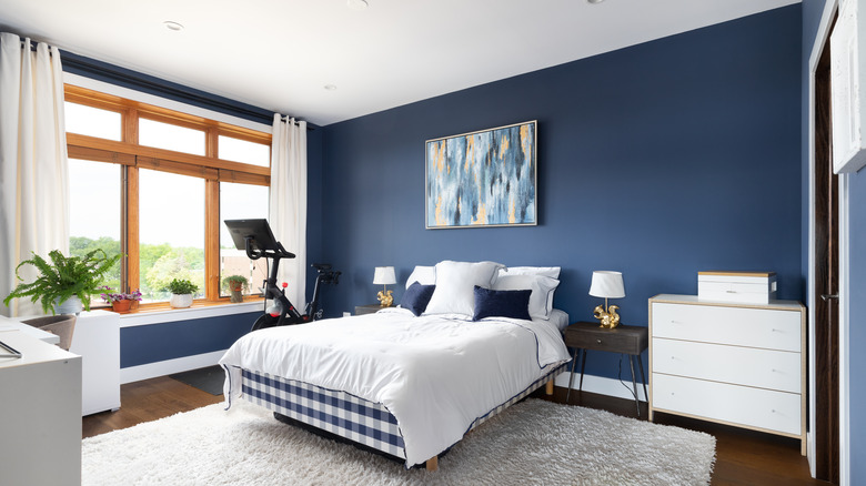
If you're wanting to create a soothing atmosphere in your bedroom, you may want to paint your walls blue. According to IFLS, studies have discovered that navy blue is the most calming color, followed by teal/turquoise and soft pastel pink. Blue may be the most soothing color because it actually calms the nervous system, per Sleep. You could also choose to paint your bedroom green. Sleep says that green has been known to reduce stress. Other relaxing color options include calming neutrals, like white and beige, which both limit distractions, or pink, which has been known to lower blood pressure, per Sleep.
IFLS has also found that the more saturated a color is, the more it's linked to exciting emotions, while less saturated colors are more calming. Therefore, the shade and tone of the color you choose are important. Softer, lighter tones may benefit you more than harsh ones in your bedroom.