20 Triadic Color Schemes That Will Excite Your Soul
Adding colorful décor pieces to a space can be difficult. If you love adding bold, vibrant decorations to your home, you know what I'm talking about. It can be hard to find colors that look right together.
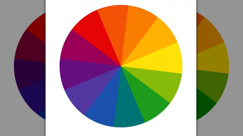
If you're struggling with this, there is a method you could use to pick three colors that look great together. It's called the triadic color scheme. Color Meanings explains it this way: choose three colors on the color wheel that are equally spaced from one another. This allows for four possible color combinations. The first is the primary colors, red, yellow, and blue. The second is the secondary colors, orange, green, and violet. The third is yellow-orange, blue-green, and red-violet, which are pretty popular in home décor. The last combination is perhaps the boldest, and it's red-orange, yellow-green, and blue-violet. To really see these color combinations come to life, find them on the color wheel. If you're looking for some triadic color scheme inspiration, check out the images below.
1. The primary colors in a white room
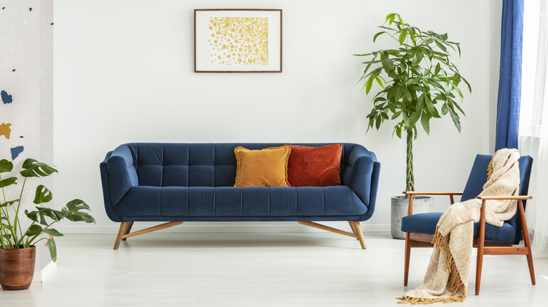
This space showcases the primary colors: red, yellow, and blue. As shown in this room, a great way to add triadic colors is through furniture and pillows. This room is mostly white, but the blue couch, yellow pillow, and red pillow make the space vibrant and fun.
2. Mostly orange, with a dash of green and violet
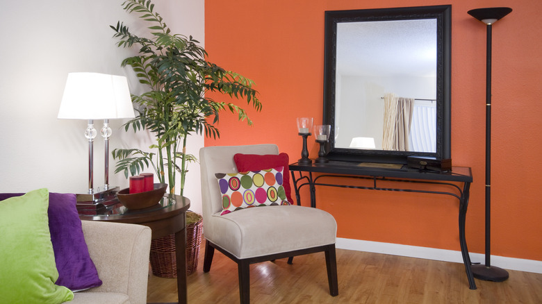
This room includes the secondary colors: orange, green, and violet. It mostly uses orange, as seen by the orange accent wall, but also brings in green and violet through the throw pillows. The pillow in the center of the room brings all three of the secondary colors together.
3. Pops of yellow-orange, blue-green, and red-violet
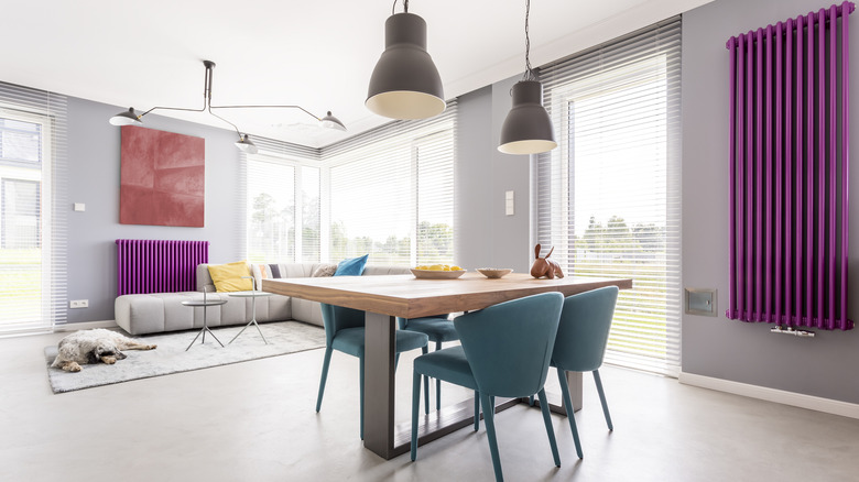
This room is mostly white and gray, but it has beautiful additions of yellow-orange, blue-green, and red-violet. The color that pops out the most is red-violet, as seen on both walls — but the addition of blue-green chairs and yellow-orange pillows ties the room together nicely.
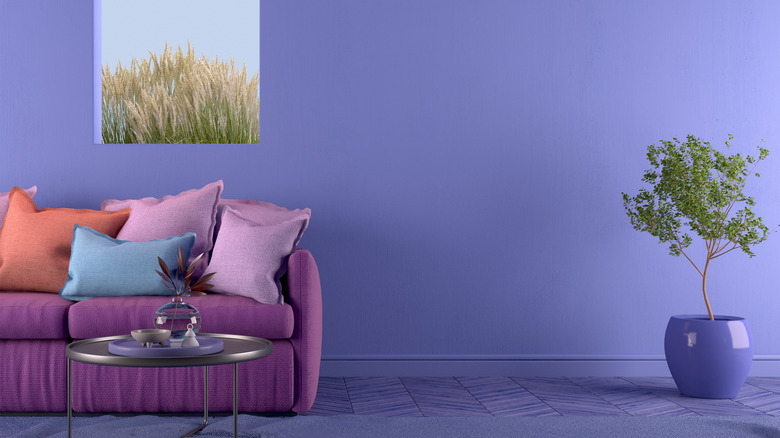
4. A blue-violet wall with a red-orange couch and yellow-green décor
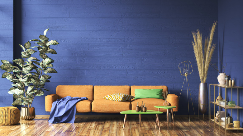
This room is full of color. The completely blue-violet walls were a daring but gorgeous design choice. The dark color of the walls really makes the red-orange couch and yellow-green pillow, and coffee tables stand out.
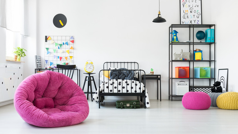
5. Replacing red-violet with hot pink
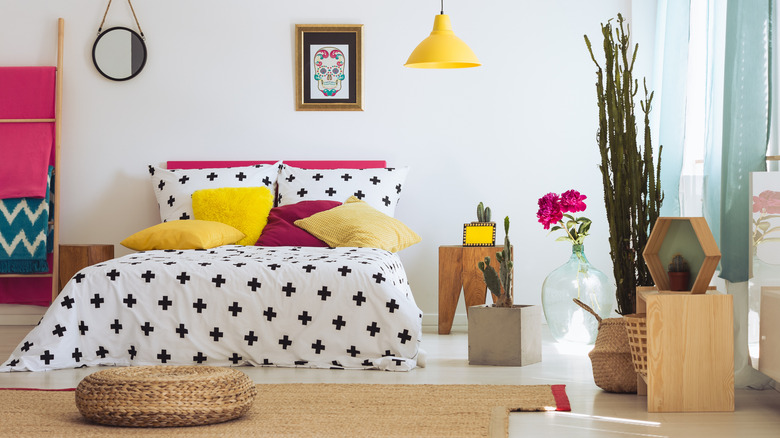
This bedroom demonstrates the flexibility of using a triadic color scheme. While the design is inspired by the yellow-orange, blue-green, and red-violet combination, some creative liberties have been taken. Instead of a truly red-violet color, this room uses a hot pink. Mixed with the blue-green curtains and yellow-orange pillows, and light fixture, this room looks cohesive.
6. The primary colors with a dash of pink
While this room has lots of different colors, it mostly mixes yellow, red, and blue, the primary colors. However, it also showcases a bright pink chair. This room shows how the triadic combinations aren't supposed to limit you — they're supposed to inspire you to add more vibrancy, even if the colors are outside your color scheme.
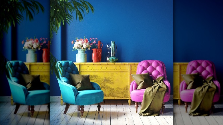
7. Mostly violet with hints of orange and green
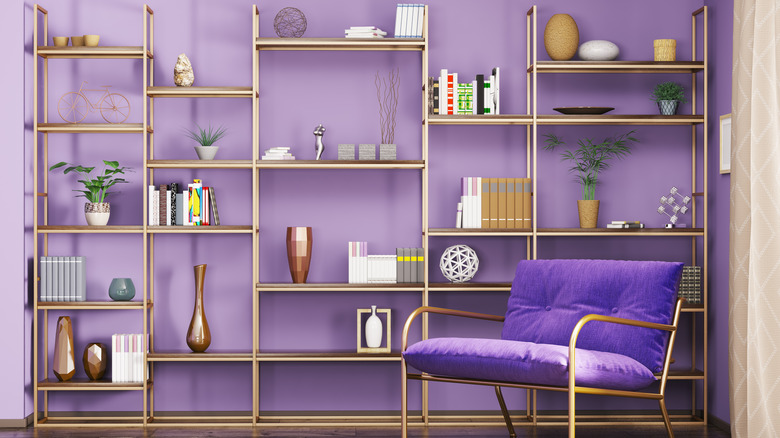
This room mostly uses violet, as seen in the wall color and chair cushions — but it also adds elements of orange decorations and green plants, which bring in all three of the secondary colors.
8. Neutral bedroom with a sprinkle of color
This bedroom is mostly white and black, but it has super bold color choices. The most show-stopping color is red-violet, but there are also dashes of yellow-orange and blue-green around the room.
9. Chic primary colored bedroom
This room is a great example of how chic the primary colors can look together. This room mixes red, yellow, and blue perfectly and ties it all together with the rug, which showcases all three colors.
10. Blue-violet with dashes of red-orange and yellow-green
This mostly blue-violet room also has a pop of red-orange in the pillow, and it brings in yellow-green with the indoor plant and nature scene outside. Using plants to bring in yellow-green elements is a subtle way to stick to your color combination.
11. A yellow-orange couch with colorful pillows
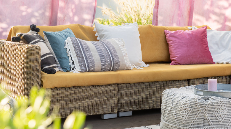
This outdoor space mixes three triadic colors very nicely. The yellow-orange couch holds blue-green and red-violet pillows that make the space look complete.
12. The secondary colors in a rainbow classroom
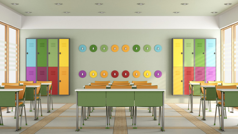
This classroom is very colorful. However, if you look closely, the secondary colors are used most often. Green stands out the most; it's even the color of the walls. Orange is a close second, and pops of violet add levels of intrigue.
13. Mostly yellow-green bedroom
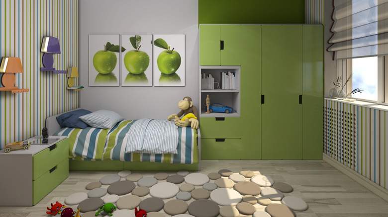
This bedroom mostly uses yellow-green, as seen in the apple pictures and furniture. However, the wallpaper and lamp decorations on the wall bring in splashes of blue-violet and red-orange.
14. Replacing violet with baby pink
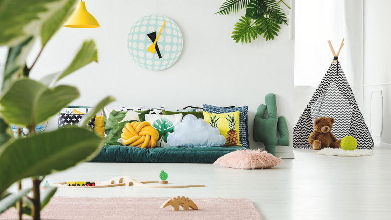
This playroom is inspired by the secondary colors: orange, green, and violet. However, while orange and green are seen throughout the room, violet has been replaced with baby pink.
15. Creating color schemes with throw pillows
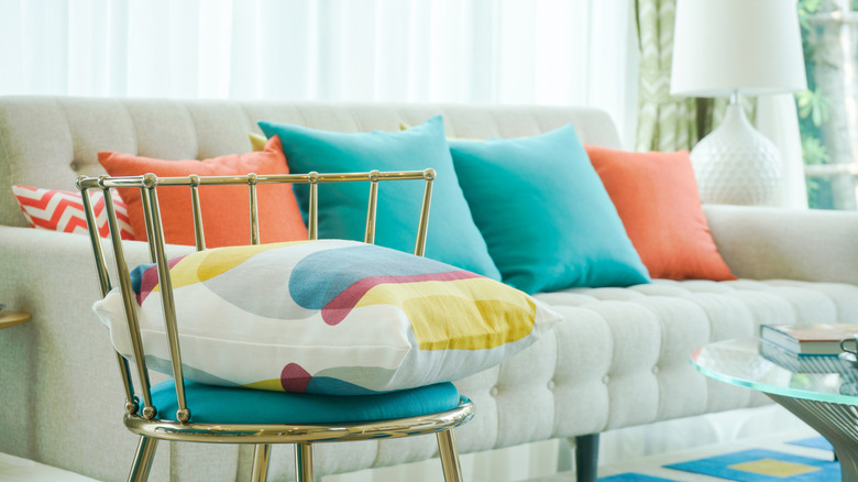
This mostly neutral room holds three triadic colors, all hidden in the throw pillows. The white couch holds blue-green and yellow-orange pillows. The third colorful pillow on the metal chair brings in a splash of red-violet.
16. Gray room with pops of primary colors
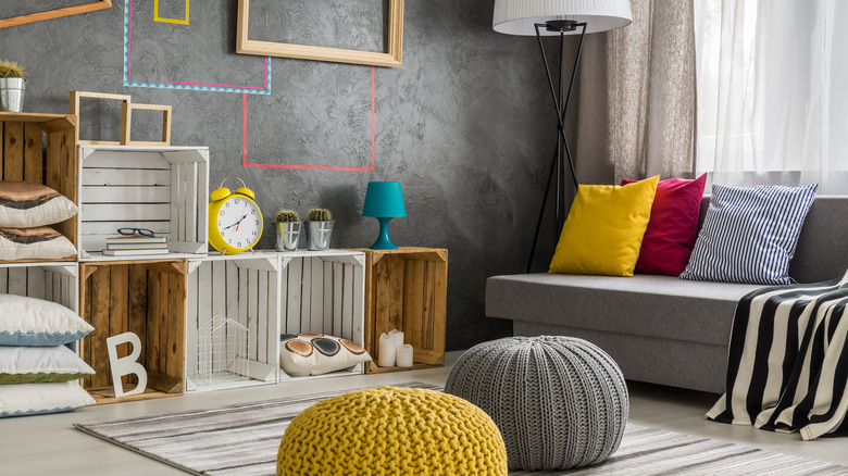
This room is mostly gray, but with the help of the primary colors, it looks vibrant. Yellow, blue, and red work together in this room to make it a fun space.
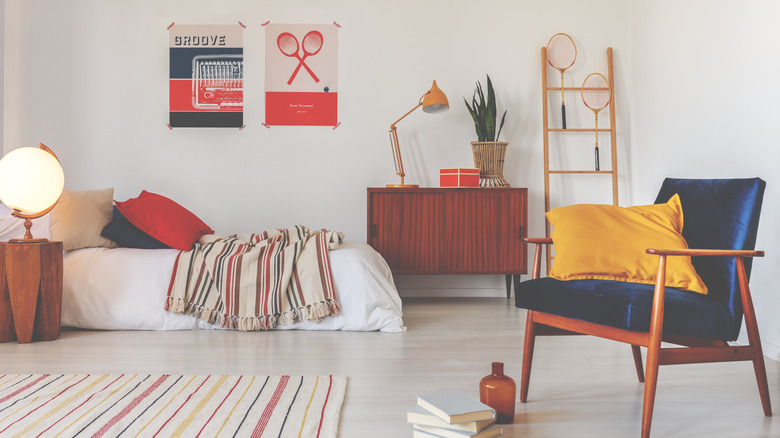
17. Mostly red-orange bedroom
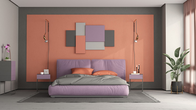
This room takes major creative liberties in its color choices, yet it still stays true to a triadic color combination that looks great. The main color is red-orange, as seen in the feature wall and pillows. Then, it uses lavender (a stand-in for blue-violet) in the bedding and furniture and yellow-green in the plants.
18. Pastel classroom
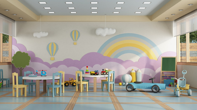
This classroom is an example of how pastels can be used in the triadic color scheme. Every color has many different shades and tones to choose from while still sticking to your color combination. This room is inspired by the yellow-orange, blue-green, and red-violet combination but instead uses light violet and pastel yellow.
19. The primary colors but with pink
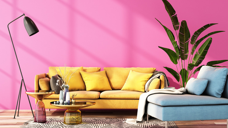
This room has few neutral elements, yet it looks cohesive and beautiful. That's because it mixes the primary colors yellow, blue, and pink (instead of red) nicely.
20. Replacing red-violet with red
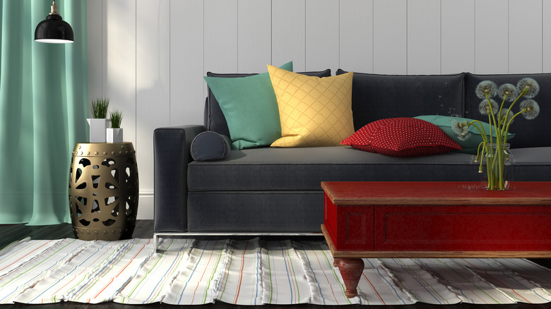
This room also takes some liberties when it comes to the color scheme. Playing off the striped rug, this room mixes blue-green curtains and pillows with a yellow-orange pillow and a red (instead of red-violet) coffee table.