15 Colors That Complement Chartreuse Decor
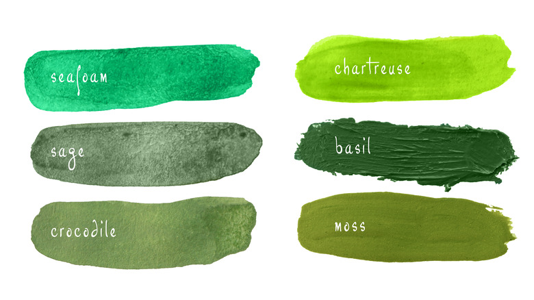
Just about everyone agrees that chartreuse is a unique color. Chartreuse falls somewhere between yellow and green. It sometimes leans more into yellow and at other times looks more green, which makes it very interesting to look at. Chartreuse stands for positivity and reminds the observer of adventure and nature, per Color Meanings. It's also a very bold color. Because of this, it may be a source of energy and enthusiasm.
Because chartreuse is such a bright and vibrant color, it can be hard to know what colors to pair it with. Luckily, there are a number of colors that can go with chartreuse — and they may surprise you. While sticking with only neutral accents will make your chartreuse décor stand out, adding some other bright colors into your space may make chartreuse look like it really belongs. Below are 15 different colors that pair nicely with chartreuse in home décor.
1. White
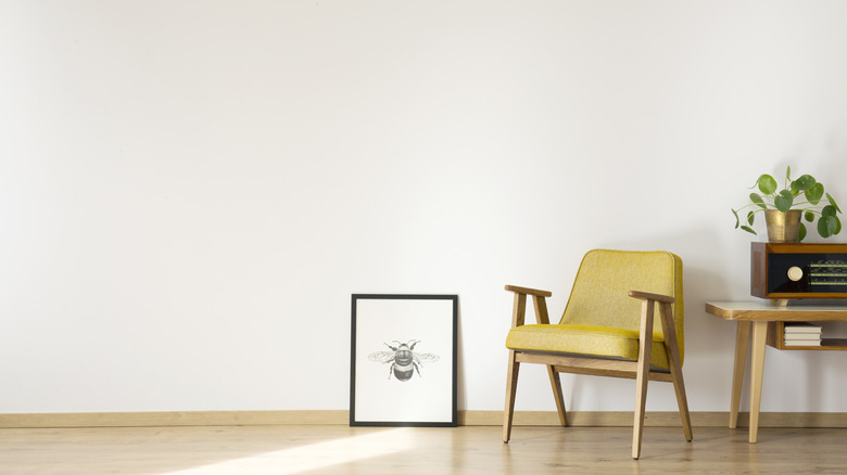
White is a safe color to use with chartreuse. This chartreuse chair leans more into yellow than green and it looks gorgeous in this minimalist space.
2. Black
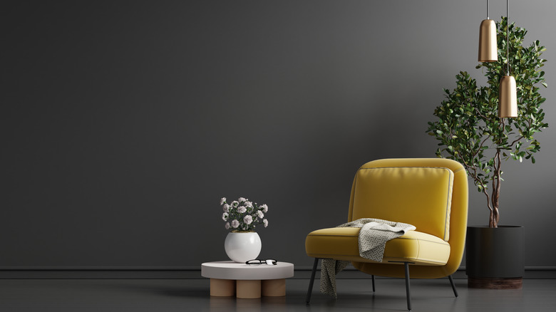
If you really want your chartreuse pieces to stand out, however, try using dark colors like black in your space. This chartreuse yellow chair really pops against the black wall.
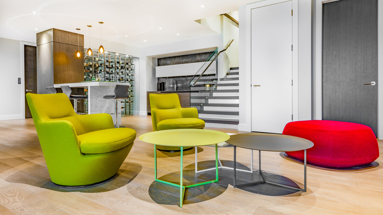
3. Gray
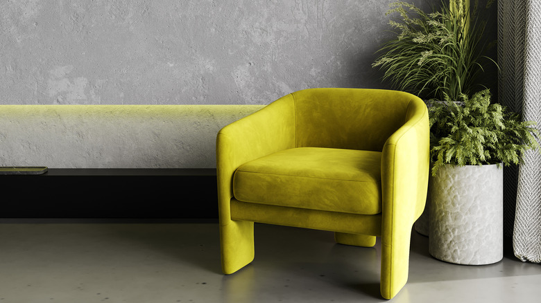
Chartreuse can also look great with gray. This room has both a chartreuse chair and also some interesting chartreuse lighting on the wall.
4. Tan wood
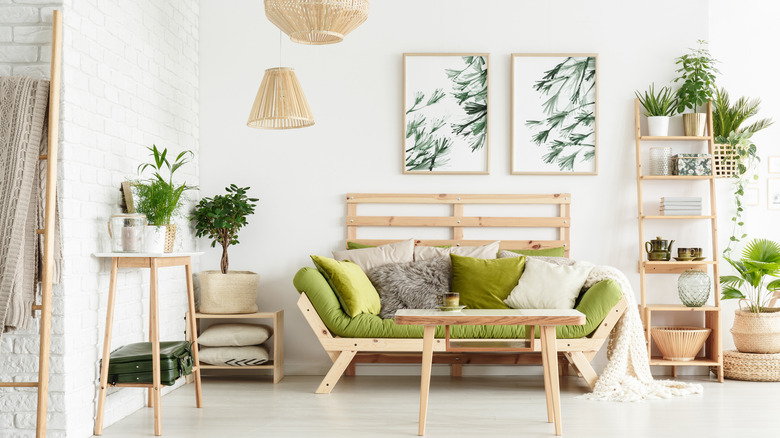
Chartreuse can look amazing with wood accents. This room has all wood furniture, which makes the chartreuse green couch cushions the main focal point of the space.
5. Hot pink
If you want to add another bold color to your space, try adding a vibrant hot pink. This will complement chartreuse and make it look more purposeful in your space.
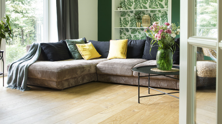
6. Turquoise
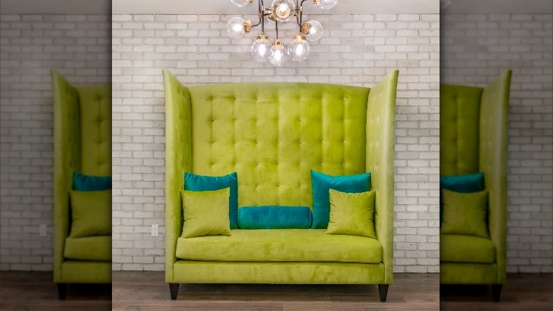
Another bold color you could pair with chartreuse is turquoise. This chartreuse green couch has both chartreuse and turquoise cushions that look amazing together.
7. Light gray
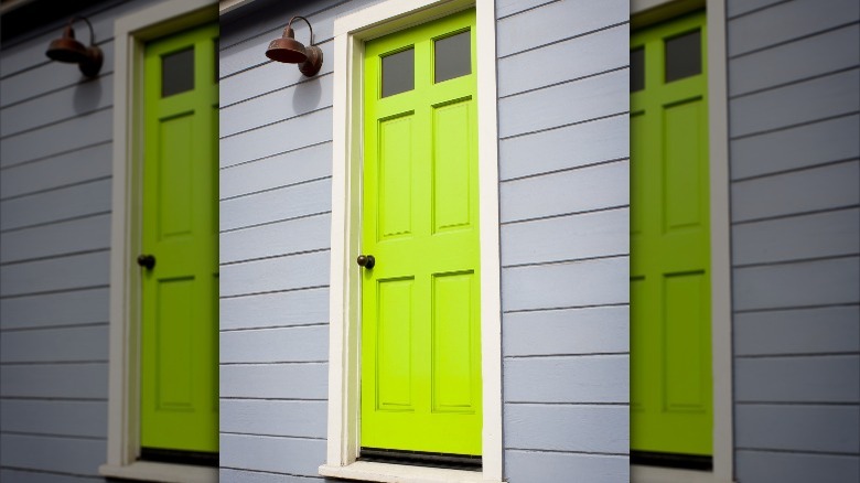
Light gray is also a great option to pair with chartreuse. This vibrant chartreuse green door really pops against this light gray building.
8. Pastel pink
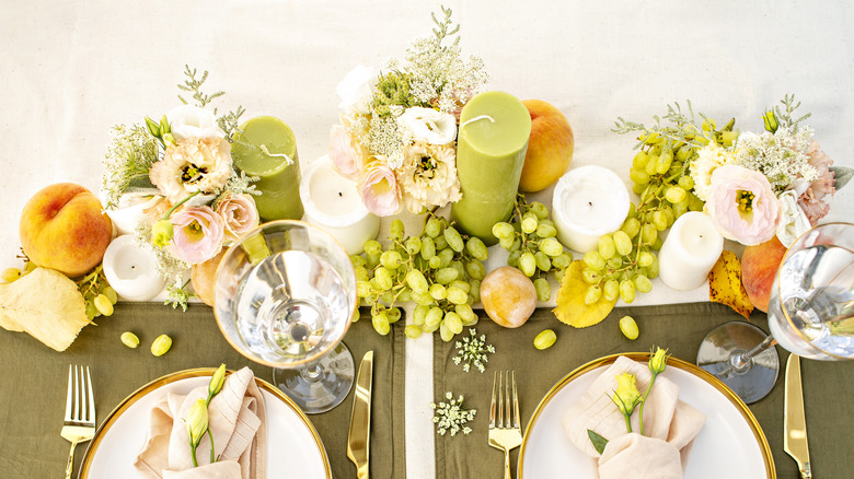
Pastel pink can look especially beautiful when paired with chartreuse. This table setting looks gorgeous with its pastel flowers and napkins and chartreuse candles and decorative grapes.
9. Muted green
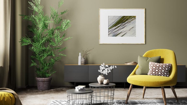
Muted, neutral green can also look great with chartreuse. This room has muted green walls and a muted green cushion, which pairs nicely with the chartreuse yellow chair.
10. Navy blue
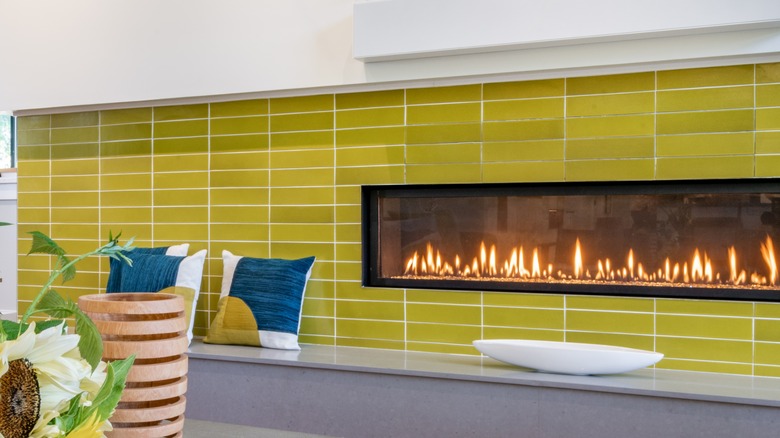
Chartreuse is the main feature of this fireplace. It's paired with accent pillows that contain both a beautiful navy blue and chartreuse, which makes them look especially purposeful in the space.
11. Yellow
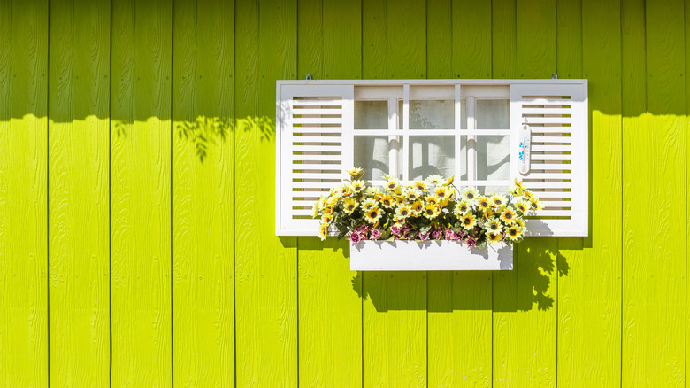
Yellow can also look great against chartreuse green, perhaps because chartreuse has some yellow in it. This wall has a white flower box with light yellow flowers.
12. Pastels
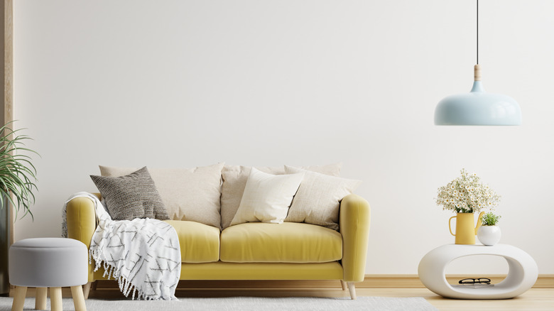
This space is mostly neutral, but the chartreuse yellow couch makes a statement. It's also paired with pastel tan cushions, a pastel blue light fixture, and a pastel purple ottoman.
13. Orange
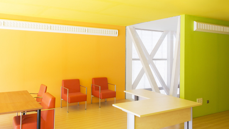
This office space is bright and vibrant. The walls are orange and chartreuse green, and the furniture is light wood and bright orange.
14. Midnight blue
Chartreuse can also look great with midnight blue. This textured couch displays dark blue and chartreuse yellow throw pillows.
15. Forest green
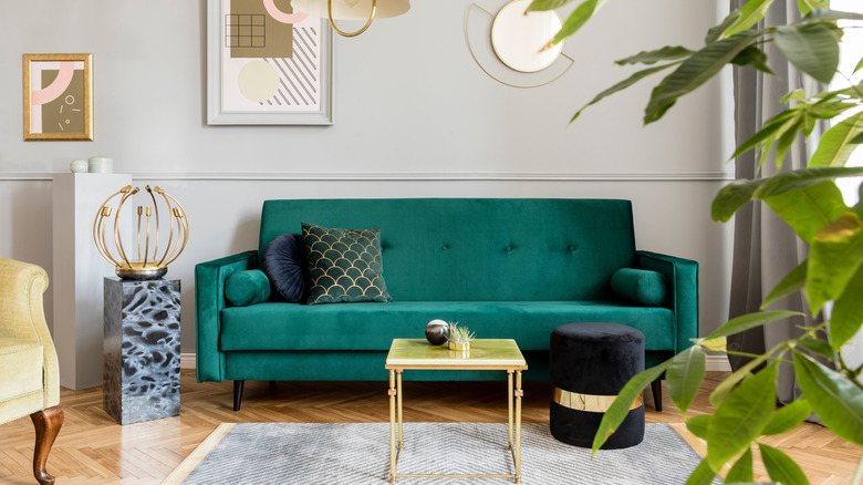
Chartreuse can also be paired with forest green. This space has a forest green velvet couch and a small chartreuse green table.