Emily Henderson Shares Her Tips For Painting A Home

Painting your home can seem like a daunting task. You have to consider color schemes and placement and how those both contribute to the aesthetic feel of the room. Plus, choosing a color palette for the entire space feels even more challenging because you want to make it cohesive as well. For doing so, Home Made Lovely suggests choosing one white, one neutral, and three other colors to create and execute a harmonious look.
But still, the questions remain: How do you choose these hues, and where do you place them in your home? Perhaps you can find inspiration in designer Emily Henderson, who has mastered the art of paint in the spaces she styles. Her tips aren't only about choosing the right shade but also strategically placing them on the walls to give the area the desired effect. So don't underestimate the way that color can transform your space — use Henderson's expert pointers to get the most out of a simple can of paint.
Use darker colors to emphasize size
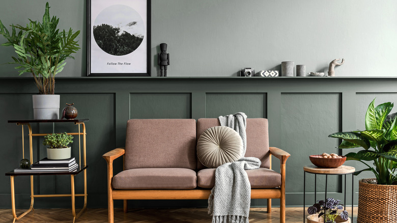
First of all, you want your home to have depth. A room that has too much of one color can look flat and boring; plus, painting an entire room one light shade can make the space feel compressed, especially when you have an open floor plan or rooms that have large openings between them. "I've made this mistake before, where everything is too same same and light, which sounds nice in theory but adding a darker paint color ... on the opposite side of the room (think a dining room you can see from the living room, or built-ins in the corner of your family room) can help draw you into the room and feel grounded," Emily Henderson explained on her website. "It actually makes the room feel bigger. Don't be afraid of a couple surprises."
You also shouldn't feel like dark rooms need to be painted white to open them up. Additionally, natural light doesn't always mean a space is light and bright. "Rooms with very little natural light can feel really 'dead' and cold with just white paint on the walls and no light bouncing around," Henderson continued. "You don't need to go dark, bold, or busy but just consider a warmer or more inviting tone to cozy up the dark space. Lean into the darkness."
Consider the mood of the room
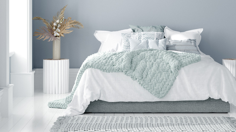
Another important aspect to consider when painting your interior spaces, as noted by Emily Henderson, is the desired mood of the room that you're overhauling. The designer suggests thinking about what you'll be using the area for — as well as how you want it to feel when you're in it — to help guide your color choices. "A room that you want to have a lot of lively fun conversations in might look (and yes, feel) different than a room where you want to snuggle and watch Friday night movies," she revealed. "Also for you maybe it's similar."
Additionally, Henderson shared you'll probably want to be relaxed and laid-back in your bedroom for obvious reasons. "Your primary bedroom should help you wind down and fall asleep, not overstimulate your visual sense," she continued. So make sure any paint colors you select for this space facilitate a chill vibe.
Paint ceilings, casings, trim, and doors, too
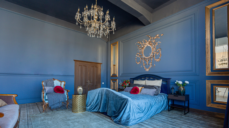
Paint isn't only for the walls, so don't be afraid to use it on your ceilings and other places, too. Emily Henderson believes that painting these areas can add contrast and style to a space, especially if you're not interested in making an entire room a dark or bold hue. "I love when the base, doors, ceiling moulding, and window casings are a contrasting color, while the walls remain a softer neutral," she shared. You can also opt for a complementary shade that fits your home's overall theme.
This is the perfect way to add a pop of color to a room, but Henderson also recommends always keeping balance as a priority in interior spaces. "Like an outfit, if every room is bold and wild your eye doesn't know what to look at and everything becomes competitive and sometimes even visually chaotic," she added. "[In] in your home you should allow some calming visual moments and some transitions spaces between big colors. What color 'calms' you down is up to you (and can easily be black, navy, light gray –- doesn't have to be white or beige)."