How David Bromstad Gets Works Of Art To Pop When Choosing Paint Colors

David Bromstad, host of "Color Splash" on HGTV got his start creating pieces for Disney and designing kids' rooms (via HGTV). It was apparent the artist was inspired by vivacious color and design from the whimsical decorating approach in his televised renovations. He told Chicagoist he was into lime green for its freshness, as well as pink and turquoise — historically popular hues in the series' Miami location. When asked if there was a shade he would never use, Bromstad responded with, "There isn't a color out there that I wouldn't use in a room." He then added, "...it's all in what you pair it with."
While Bromstad might be best known for his bold interiors, he thinks white and neutral walls are frequently the superior choice. "People think white is boring but it's my favorite color to put into rooms because every piece of furniture, every pillow ... is going to be shown in their true form. White doesn't limit you," he explained to Metro Weekly. In addition, Bromstad relayed the merits of gray, which he feels is complementary to anything.
In an interview with HGTV, Bromstad offered homeowners paint suggestions to help with their design dilemmas, for example, how to create a feature wall or make an open floor plan flow pleasantly from room to room. Since his designs often incorporate his custom paintings, one question was particularly compelling. What wall color is the best backdrop for artwork? Let's get Bromstad's expert perspective.
Hang artwork on neutral walls for the greatest impact
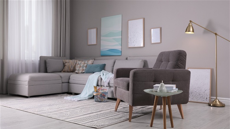
In the HGTV article, a homeowner questions what wall color will optimally highlight the artwork in her bedroom; she particularly wants to know whether it would be best to match a hue that appears within the piece, a clear island blue or green in this case, or stick with a neutral paint color. Because he has great joy for art and color, David Bromstad recommends using neutral tones to paint walls that feature artwork, allowing the art to be the focal point. He explains that coordinating your walls to the art lessens its impact. Any neutral color will work, but Bromstad specifically notes gray and taupe as great options, especially in a bedroom, where the soothing tones promote a restful atmosphere. Yet, he adds that a few matching accessories, such as a turquoise lamp or mint green throw blanket wouldn't be amiss and could bind the color palette together.
According to Saatchi Art, placing artwork on colorful walls is not always a bad idea. The art purveyor claims that a paint shade similar to the piece's background will create a cohesive effect; for an energetic result, choose a complementary wall color (the hue opposite on the color wheel). However, like Bromstad, they concede that a neutral wall can be the most advantageous setting. It permits the piece to be the star, and what's more, it's the simplest to design around.