How To Decorate Your Home Using The Color Wheel
Interior decoration is a task that all homeowners must concern themselves with. Decorating your property is a natural step in the process of making a new home your own. Likewise, it's essential to periodically refresh the aesthetic of your living space to spruce up the environment and infuse the home with a fresh new atmosphere. PaintRite Pros recommend repainting the interior of your home every three to five years. This timeline is essential to keep up with changing trends and to avoid falling victim to a dulling paint job that sets your mood in a constant state of slump. Replacing couch cushions should be done on a much shorter timeline, with Ideal Home suggesting as little as six months between changes.
Whether you're seeking a new paint job or accent features to match a new or existing paint palette, the color wheel provides a great resource for homeowners trying to match color options for the greatest overall effect in each room. The color wheel offers a means of understanding how color tones can interact with one another and either create compliments or contrasts that look great on walls, carpeting, or upholstery. The best part of the color wheel approach is that it's easy to grasp and apply in any context that you might require.
Understanding cool and warm tones best practices
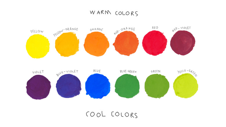
One thing that you should always be mindful of is the use of both cool and warm colors in your decorating pursuits. Benjamin Moore reports that traditional reds and oranges are warm, and blue and green shades are cool tones. Yellows and purples can sit on either end of this dichotomy, depending on what they are paired with. Understanding the partnership between warm and cool shades is all about a knowledge of pairings and contrast — just like many other aspects of color complements. Likewise, white and gray shades can function as either warming or cooling, depending on what is found in the rest of the room.
Warm colors function to produce cozy areas of the home, and bright, warm shades are great for creating a sense of energy and happiness. Alternatively, cool colors produce calm and relaxing vibes in a home. Using the color wheel can help you select a color palette that adheres to one type of shade, or one that traverses the wheel and incorporates a mixture of warming and cooling tones in a single space. Looking inward to determine the desired effect that you want to create in the room can help you select the most appropriate combination of colors and select from either end of the temperature spectrum (or across it).
Consider your style and the traits you are seeking to impart in the home for guidance

Your personal style and tastes can act as an excellent guide when selecting new colors to paint the walls or accent pillow covers or couch upholstery in a room. Your favorite color may very well present itself as the perfect centering force in a room's new color scheme and decorative atmosphere.
If you're unsure, though, it can be helpful to think about the traits that colors impart on a general level. Home Made Lovely notes that there is a nuanced psychology of color that goes beyond complementary shades, warm and cool tones, and other features of color matching and contrast. The theory of color runs deep, and so too does the human brain's understanding of color. The natural world is shaded in a variety of tones and the themes that exist here affect the way that people think about color in a meaningful way.
For instance, pink shades impart a sense of romance, while light blue shades are often associated with tranquility (via Home Made Lovely). Thinking about the ambiance you are trying to create in a room is a great way to approach the construction of a well-designed color palette for any part of the house. Consider these inherent psychological traits that come along with different colors for a deeper connection with the room itself.
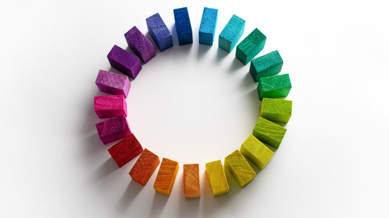
Primary, secondary, and tertiary colors on the wheel

The color wheel is made up of 12 colors that are organized in a circular fashion (via Home Made Lovely). The three primary colors are positioned with three shades in between each other, forming a kind of triangle around the wheel. Secondary colors are found between the primary shades, with a space between a primary and each secondary. The secondary color is then separated by another space, with the other primary color that's blended to create it on the other side of the gap. Within these six final gaps existing between each primary and secondary color are tertiary shades. The tertiary colors are formed by blending the surrounding pairing of a primary and secondary color together.
The distance relationship between each color on the wheel provides you with an understanding of how each color can match up with the remaining shades on the color wheel. Using these 12 color tones, you can easily maintain color discipline when it comes to pairing up similar and contrasting colors for accents and blending within your home.
Using analogous colors
Analogous colors are those that appear side by side on the color wheel. Because of the makeup of this color diagram, colors that touch one another on the wheel are built on the same primary elements. This makes them highly compatible with one another and allows for a pop of different but very similar color shades in your living room or bedroom. Analogous colors can be used in pairings of two, or even a coupling up of three shades to showcase a tertiary color and the two colors that produce it, or a secondary shade and two colors that it can be blended into (via Ballard Designs).
An analogous color palette is a lot like a monochrome coloration in that a simple color scheme forms the basis for the room's visual appeal. However, analogous colors offer a better blend of color options than the purposeful contrast of a bright and dark offset that makes its presence firmly known in the use of monochromatic colorings.
Ballard Designs suggests following a 60-30-10 design rule. Selecting a dominant shade and using it in roughly 60% of the space followed by a secondary and accent tone in successive percentage blends will help you create a cohesive look and feel in the color patterns that best suit your taste.
Pairing complementary colors
Complementary colors take the blending of diverse color schemes to a new level. Instead of matching colors in a way that puts similar shades alongside one another, a complementary color approach makes use of opposites to create a vibrant contrast (via Ballard Designs).
Complementary colors can be used in twos or threes as well. For a pair of contrasting shades, it's best to select a color that you enjoy and pair it with the shade on the other end of the wheel, directly across from it. For three shades, anchoring a room with your chosen color and then complementing it with two colors that are equidistant from it and one another around the wheel will provide the best base to move forward with. Therefore, a green shade will work best with a red or pink hue, or as a trio with a warm orange shade and a deep, cool blue or purple.
Real Homes notes that the focus on contrast that comes along with complementary colors produces a vibrant and dynamic space within your home. Approaching interior design with this color scheme in mind can act as a great means of infusing energy and liveliness into a room as a result.