5 Paint Colors That Go Well With A Yellow Couch
Yellow is a decisive color — it's always bold, cheerful, and inarguably attention seeking. It was a 2022 summer favorite in fashion, per The List. The outlet says like an elevator; it raises a look as an accent or from head to foot. Moving into fall, yellow is a perfect mood booster. Color Matters says it signifies happiness, optimism, and sunshine. CNN Style also informs that bright yellow, aptly named Illuminating, was chosen as a Pantone Color of the Year for 2021.
A couch is a significant expense, and it's understandable to want to play it safe, but like Illuminating, a yellow option is an instant reminder of brighter days. There are degrees to the hue's vibrancy, appearing in pastel, earthy ochre, sunflower, or acid, and all shades in between. How courageous you want to be (you must be at least a little bold) is up to you, and what you pair it with matters, too. But don't worry; below, we feature complementary paint colors highlighting a happy yellow couch.
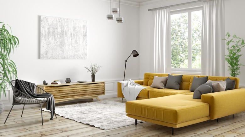
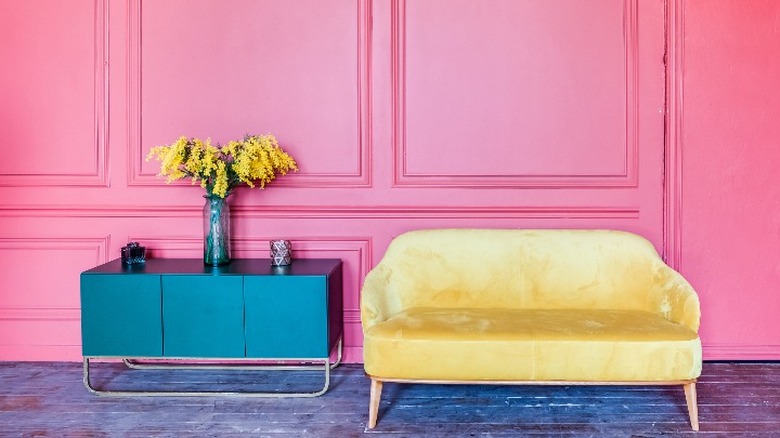
1. Charcoal gray
Charcoal gray is the softer side of black. It instills a graphic punch yet conveys an organic or aged presence that hard-edged black cannot; therefore, it's more amenable to a wider variety of styles and color schemes. Livingetc calls dark gray and yellow a daring and dramatic pair, especially when bright or acid yellows are used. However, the outlet notes the impact can be mellowed by introducing a more subdued shade or adding texture with fabrics and organic elements. Found so often throughout nature, dark gray has an earthy and grounding quality that partners beautifully with brown-tinged yellows like ochre and mustard.
Imagine spent dune grass and mussel shells, falling leaves against wet bark, or autumn mums and dried corn cobs. These palettes call forth the landscape in its many guises but have particular connotations with slowing down and noticing the world around us. Yellow provides a perky foil to the sedate wall color, contrasting with its lightness and possessing certain joviality. Utilize metal and rustic accessories and plenty of warm wood for a modern yet inviting space. And finally, turn up the enveloping vibe with plush textiles and upholstery.
2. Green
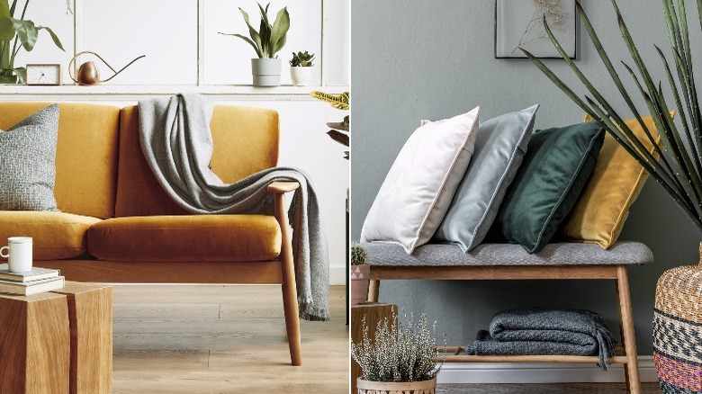
Yellow and green are a natural match. From a color theory perspective, yellow is an ingredient in green, making the hues wonderfully compatible — any combination of them feels harmonious and easy. The duo can be as bright or subtle as desired. For example, Who What Wear charted the popularity of lemon yellow and electric green (a vibrant and unapologetic statement) in streetwear last season. The combo signifies creativity and a take-charge attitude, per Fabrik. The silver sage and yellow topaz above are a muted but dazzling alternative that is more suitable as an interior palette for most tastes. Postcards from the Ridge explain that cool green walls are best for rooms with western or southern exposure to warm them up. Furthermore, the shades are ideal for an entry or built-in cabinetry.
Deep emerald, moss, olive, and teal complement orangey yellows. These schemes lean craftsman or traditional schools of design that often feature stained glass, decorative tile, or florals and plaids. However, the styles can be updated with furniture that offers clean lines and modern shapes without compromising their inherent comfort or luxury. The pairing aligns with a bohemian aesthetic as well, which highlights organic materials and greenery and frequently pits neutral colors against saturated shades. Lastly, mix canary yellow and shamrock green with other brights like grape, cobalt, and tomato red for a retro look, tempering the vivid hues with some black and white, as seen in Sherwin Williams' origin palette.
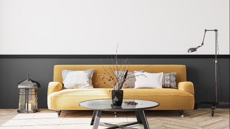
3. Neutrals and wood tones
Paint companies have released their colors for 2023; most are neutral tones that work perfectly with a yellow sofa. White and ivory allow the bold color to take center stage — they are a true Blank Canvas, just like Behr's off-white selection. Perfect Taupe and Spanish Sand are additional shades possessing a terrestrial connection that harmonizes with yellow's sunny quality to create a warm, organic scheme. Likewise, Sherwin Williams spotlights an earthy palette incorporating several complex neutral hues. This includes some with a slightly purple or pink undertone complementary to yellow. Their featured shade, Redend Point, is reminiscent of baked clay.
The available variations for a neutral backdrop with a yellow accent are vast. Brit+Co suggests crisp white and black as an effortless yet energetic combination with a colorful couch. Add chrome metal to underscore a modern theme. Or try a creamy ivory paint and add plenty of textured fabrics such as wool, linen, and velvet — additionally, layer tonal off-whites like ecru and oatmeal for an elegant yet cozy room. Finally, go darker on the walls with taupe, mushroom, or greige to construct a cocooning and moody space. Introduce antiqued brass or bronze metallics through tables and lighting, and accent with rich hues — indigo, olive, or plum, for example. As always, it's essential to swatch paint samples to ensure the undertones bring out the best in your furniture and décor.
4. Pink
According to MyDomaine, interior designer Becca Casey suggests using yellow with other intense hues. "Mustard yellow velvets give a retro nod to some of the more saturated hues of the past. Pair it with burnt orange, cinnamon red, or fuchsia for a gorgeous pop of color." Brit+Co recommends color blocking in a room with a yellow couch, which they describe as highlighting an additional vibrant shade with throw pillows, an accent chair, or a rug. Further, painted shelving or a two-tone wall treatment could be an avenue for more color. Vintage graphic and floral patterns in drapery, bedding, and art are all good means of creating cohesion when combining numerous hues.
The Decoist says that pink and yellow are perfect in a child's bedroom; by the same token, a kids' play space is an ideal spot for the color scheme via upholstery fabrics and paint. And, unlike in a bedroom which should be restful, a playroom allows for bolder choices. Per the outlet, the mix works equally well in an updated adaptation of cottage and English country styles. In that shabby chic setting, mad-cap colors galore brighten dim period rooms like a cottage garden bouquet. Conversely, pastel and muted tints such as rose, slipper pink, buttercream, and honey yellow are extra attractive options that will create a more soothing environment.
5. Pearl gray
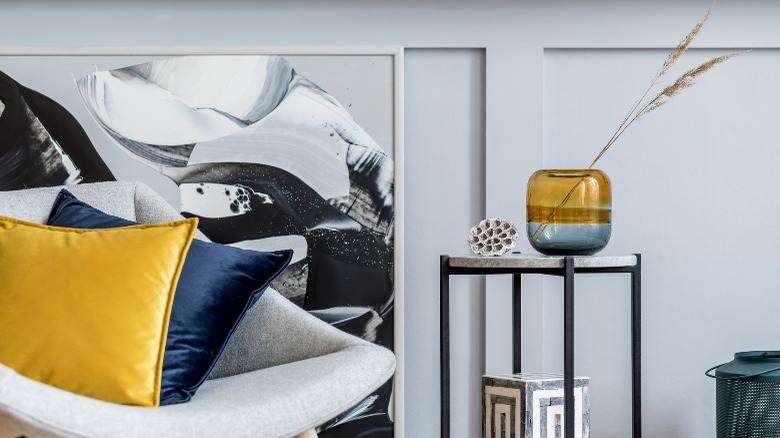
Warm yellow and cool gray play to each other's strengths. While gray is complementary to most hues, it's subdued and can be cold if its undertones lean toward blue or the space receives cool northern light. Yellow imparts a contrasting merry lift. Leatrice Eiseman, executive director of the Pantone Color Institute, described the duo as "Practical and rock solid but at the same time warming and optimistic, this is a color combination that gives us resilience and hope."
If this feels like a tricky palette to get right, Sara Lynn Brennan Interiors recommends implementing something called the 60-30-10 rule. In this practice, 60% of the room should be a predominant color, 30% a less dominant tone or texture (Brennan explains it simply as half as much of the first color), and 10% an accent hue. The gray wall, chair, and artwork are the primary color in the image above, while black and navy, so close in value they can be passed off as one here, are secondary, and yellow is the accent. The cheery hue can be repeated in the curtains and area rug if you're drawn to brighter spaces. According to Livingetc., when the shades of yellow and gray are muted enough, they stand in as calming neutrals, becoming a framework from which other colors can shine.