The Best Way To Find Your Perfect Color Palette Using The Color Wheel
From the infinite spectrum of paint swatches and samples to textiles and chips, color choices can be overwhelming. Whether it's painting or interior design, the decision of color is more than just trivial. Although the process of art is inventive and potentially subversive, there is a structure in the selections of pigment used. Nearly 40,000 years ago, artists were the first to create tints and stains by combining elements such as soil, animal fat, chalk, and charcoal, according to Print. The five colors produced from this process are noticeably red, yellow, black, brown, and white. Over time, the development of color has progressed through experimentation along with scientific innovation. In the mid-17th century, Sir Isaac Newton made the most poignant discovery with the visible spectrum of light, resulting in the birth of primary and secondary colors, per Munsell Color. A common acronym of these distinguished types is the notable ROYGBIV (red, orange, yellow, green, blue, indigo, and violet), thus becoming the catalyst for the world of color.
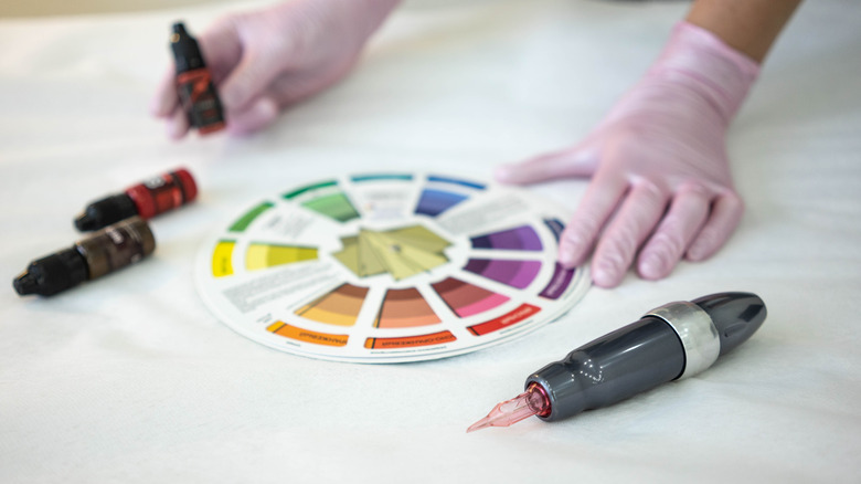
Why use the color wheel? It's a dynamic tool for any designer, artist, or builder. Whatever your project might be, utilizing the color wheel may spark some inspiration by the process of combining various hues towards your graphic goal. It may also assist with balance and harmony within your home or style, especially if you're implementing the style of feng shui. The best way to achieve the perfect color palette you seek is to experiment with the color wheel.
What is the color wheel?
Using the color wheel can be a process, but to help differentiate the right relationships, colors are classified into three groups: primary, secondary, and tertiary. Primary colors are the untainted originals; blue, red, and yellow. Secondary hues are formed from mixing these three in various sets to make green, orange, and violet. Tertiary (or intermediate) combinations are made by blending primary and secondary colors and appear less vibrant as they mingle (blue-green or red-violet). Within the twelve basic hues of the spectrum, the color wheel consists of two main types: warm and cool. Warm includes oranges, reds, and yellows, while cool colors consist of blues, greens, and purples.
Why are there so many colors? When you look at an assortment of paint swatches or a box of crayons, the kaleidoscope of colors seems endless. This is because of the tints, tones, and shades applied. All these elements are basically variations of the hues on the color wheel. If white is added to tints, it gives the color a lightness or value. Black is integrated to make a shade (the saturation). A tone incorporates both black and white (or gray). This process deepens the original color while making it appear abstruse. Overall, highlighting and shadowing are great ways to create colors naturally, per Deco Art.
Why should you use the color wheel?

Whether it's for personal projects or business ventures, applying the color wheel to the process is the central component that will help distinguish your color choices. Colors are synonymous with representing our moods, feelings, and emotions, as well as recognizable objects and products. Therefore, branding and marketing are significant places to utilize this versatile tool. With your audience in mind, the color wheel plays a dominant role in the world of design and color comprehension.
Our eyes perceive color in waves of light. There are a plethora of possibilities in working with color; it's essential to know which ones to make your project excel. Besides interior design and artwork, color is used significantly when it comes to graphic arts, web design, and creating logos. Throughout digital work, the additive color mixing model, or light, assists in creating new colors with the initial RGB (red, green, and blue). For print images, the subtractive model of colors cyan, magenta, yellow, and black are required (CMYK). This combination delivers a broad range of colors to print on paper, per 99 Designs. To withdraw or reduce light from the paper, adjust the colors.
What is color theory?
While the color wheel might be considered the artist's compass, color theory is part of the grand scheme of things. Within this structure, there is a gathering of guidelines that a designer uses to transfer engaging techniques of color through visual connection. When planning, artists refer to the color wheel to achieve a broadened sense of human knowledge and culture through their art or mission, per Interaction Design Foundation.
Color theory is also thought to be a science. Through our perception and observation, various colors communicate to us, like the blue sky or the fall colors. The structure of color theory exists within the visual effects that colors emanate through their arrangement, according to 99 Designs. This occurs when you mix, match, and contrast the hues. Color theory offers an artist to create with color. This stems from assembling color schemes amidst the wheel itself. There are several kinds to explore.
Types of color schemes
There are six types of color schemes that exist within the wheel:
- Monochromatic — This scheme involves using a single color with different tones. It appears subtle yet tedious. Decorate with textured pieces that contain a richer shade of the chosen one.
- Analogous – These colors are vibrant and pleasing to the eye, as they are located right next to each other on the color wheel (i.e., orange, yellow, and green).
- Complementary – Take two colors located directly opposite of each other; they will balance each other out well, but never let one color dominate another, per Better Homes & Gardens.
- Triadic – Bright and energetic, this scheme is the most fun with three hues; one dominates and the other two are accents. This is ideal for living room spaces.
- Split-Complementary – This less intense color scheme also uses three different colors. One is initially chosen, then the others on either side of its complementary color are added.
- Tetradic – A combination of two sets of corresponding colors, which involves a total of four colors to generate a rich result. One color is predominately used, the other three muted.
Creating color palettes

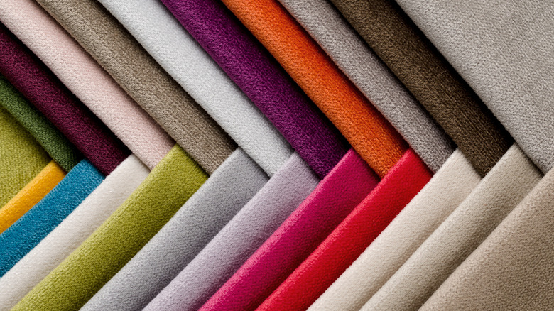
How do you choose the right colors? Creating palettes within the color wheel is the best way to attain what you envision. To discover your absolute palette, you might purchase a small color wheel to use for inspiration and as a quick reference, preferably one that presents the color relationships, per The Spruce. If you are using paint colors, start with a variety of swatches or chips to try out. To find the best shade for the space, evaluate the colors in the room of choice during various times of the day. From dawn to dusk, the room will lighten and darken, as will the appearance of the color. When looking at a swatch, focus on the bottom variation; this one represents the ultimate undertone of the color choice, according to Better Homes & Gardens. You might also try holding the shades up to current artwork, fabrics, lamps, and any other significant pieces. This process will help you home in on the right vibe with just a few samples.
Additionally, make sure to test your paint selections. Applying large sections on the wall at eye level will help determine perfection. Again, leave your selections there for a while to examine their changing brilliance from day to night. Another way to test your colors is to view them at night by the radiance of your lamplight, also noted Better Homes & Gardens. You might also set the stage with furniture and artwork to envision the final show.