The Best Color Palette For A Bohemian Home Decor Style
Boho interiors are nothing new to the trend cycle, but they're becoming more popular. Bohemian refers to a lifestyle that began in Paris in the 19th century, according to Vevano. Many bohemians were artists, writers, and nomads who valued creativity and an unconventional lifestyle. As with all style, bohemian interior design has transformed from its origins, though it does maintain a lot of its roots.
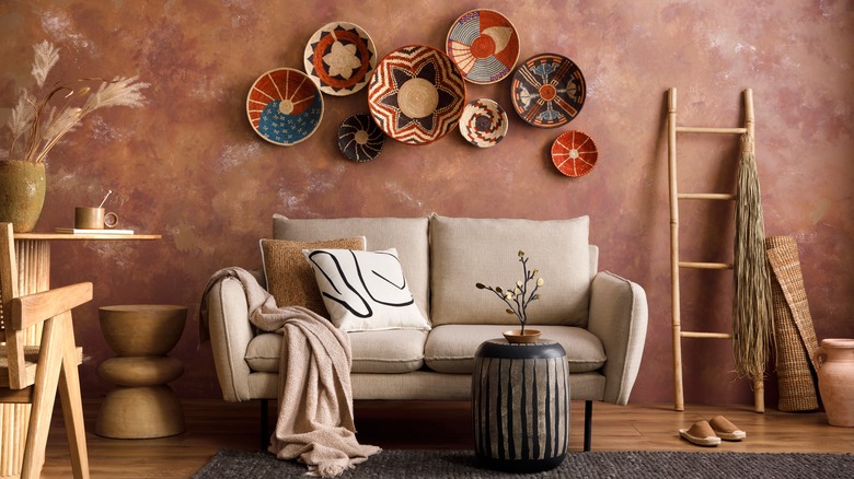
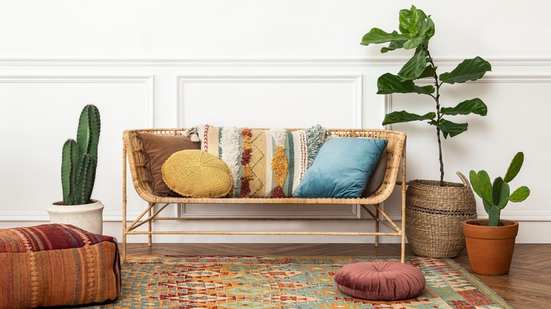
Bohemian, or boho, style is known for its eclectic designs, often with global influences. There's also an emphasis on a connection to nature. Bohemian home decor often has a lot of patterns, eclectic items that make a unique collection, natural textures and textiles, and handmade and antique furniture and art mixed and matched throughout the room. Mastering color is often essential for pulling off a design style and drawing inspiration from these sources will help you create a bohemian color palette to use in your home.
The types of color schemes
Before choosing the exact colors you'll use in your home, take some time to think about the type of color scheme. Many people like choosing three colors that dominate the space, which would be an analogous color scheme, according to Nina Hendrick. An analogous color scheme uses three neighboring colors on the color wheel. Opt to use the 60-30-10 rule, where one color is used as the dominant and the other two are smaller accents. A similar three-color scheme is a triadic palette that uses three colors that are evenly spaced rather than next to each other.
Of course, you aren't limited to only using three colors. Feel inspired to use four or five colors, but be cautious about using too many as the room can look chaotic or disjointed. A color scheme can be flexible, too. Just because one color is dominant in one room, doesn't mean it has to be the dominant shade in every room. So you can swap around the color palette, but using similar hues throughout the house easily creates a cohesive scheme for the entire home.
Choosing bohemian shades
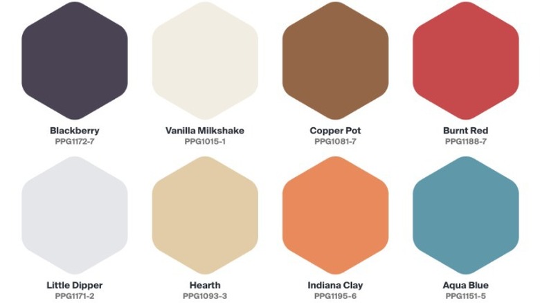
You'll never see an all-white bohemian space. The style is carefree, lived-in, and comfortable, which can often clash with the modern stark-white interior. Bohemian homes feature lots of earth tones like orange, yellow, red, and green as well as jewel tones like blues and purples. PPG shades Blackberry, Burnt Red, Indiana Clay, and Aqua Blue are rich options that offer a lot of depth of color to the space. To achieve a truly bohemian look, softer and muted shades work best.
While boho interiors are characterized by layering colors, that doesn't mean you have to use them all over your home. Creating a visual interruption with warm neutrals can add a well-needed break without the design looking stark and boring. Benjamin Moore shades Opaline and White Dove are two pretty whites that'll look great on walls or as accents. And shades Moon Shadow, Concord Ivory, Venetian Portico, and Stone Brown are warm neutrals that have a tint of color.