The Best Color Palette For A Scandinavian Home Decor Style
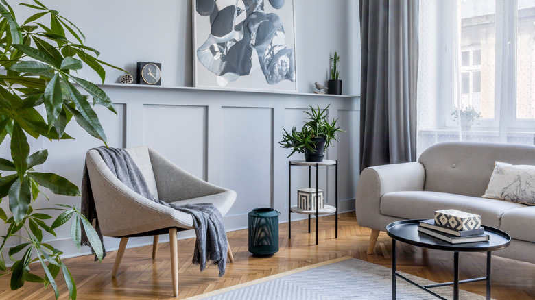
Scandinavian décor could best be described as encapsulating the feeling of a warm hug or a soft blanket. Highly influenced by the idea of hygge, which means a comfortable lifestyle that brings joy, this design always creates a cozy and clean appearance, notes Montana Happy. According to Scandinavia Standard, it's also known for being minimalist, modern, and neutral, with every Scandinavian designer attempting to create a simplistic and enjoyable space that focuses on functionality.
This style became popular in the Nordic countries in the 1950s because it offered up a cozy and snug feel throughout the long and cold winter months, per Veranda. There are a few ways warmth is accomplished in rooms with this design: through furniture, accent pieces like blankets and pillows, and color palette. If you're trying to create a Scandinavian-inspired room and need some help choosing the right shades, below are some of the basic rules about which best create a Scandinavian space, as well as the overall ideal color palette.
Scandinavian colors: the basics
Before creating a color palette, it's a good idea to learn some of the basics about the traditional shades used in Scandinavian décor. First, know that white is almost always used because it brightens any room by bouncing light off the walls, explains Veranda. Additionally, other neutrals, like grays and tan shades, work to create the clean and minimalist feeling that this style is so well known for.
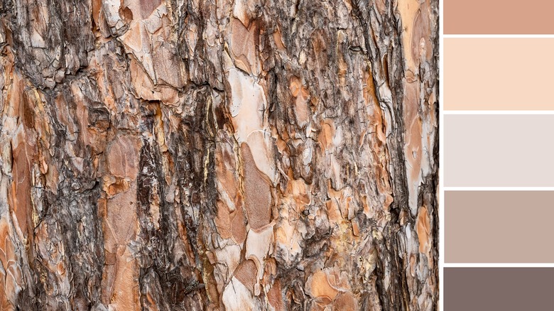
While there is usually a base of neutrals, pops of muted or pastel shades are also utilized to provide a joyful appearance. And, according to Scandinavia Standard, darker colors are sometimes used to create contrast. Because this style mixes modern, cool shades with a warm feeling, both of these tones should be used. However, they should always be light and never vibrant, as this will create a relaxing and cheerful atmosphere. Project Nord summarizes the typical Scandinavian color story by saying it mixes subtle colors, pastels, and dusty tones.
The best color palette
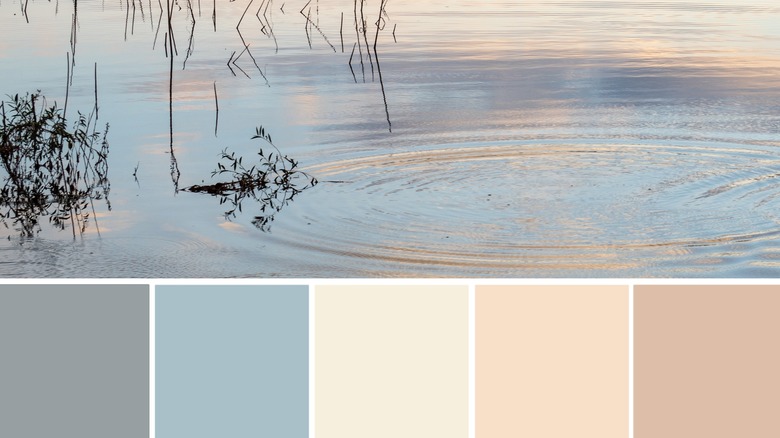
Because this style was created to bring comfort during the harsh winter months, the best Scandinavian palette doesn't only use neutrals and whites; rather, it mixes warm neutrals with muted colors. For instance, pairing a neutral, yellow-tan with gray-blues and pastel pinks creates a space that feels welcoming. This is displayed in the palette above that infuses both cool- and warm-toned shades. At the same time, these colors don't feel overwhelming or vibrant, but are more subtle in tone. Combining white and tan shades with pastels and deeper colors will create a dynamic but still soft color palette.
Sherwin Williams has designated some of its best Scandinavian paint shades, such as blue-grays, deep blues, warm beiges, pastel greens and pinks, and, of course, neutral whites. Similarly, Benjamin Moore pairs a warm white with very light pink, blue shades, and a silver tone. The retailer also includes dark brown to offer some contrast.