The Best Color Palette For A Mid-Century Modern Home Decor Style
Mid-century modern (MCM) is a philosophy of design characterized by architect Louis Sullivan's maxim that "form follows function," explains Vermont Woods Studios. This manifested in minimal ornamentation, geometric and biomorphic forms, earthy hues, and natural materials. In contrast, sleek manmade objects and pops of vibrant color are also hallmarks of the trend. The acclaim of MCM design was its response to what was perceived as old-fashioned or bland American interiors. The movement ushered in a sense of optimism following the war years, representing freshness in design and manufacturing innovations, according to Posh Pennies. Elena Paparozzi, Senior Furniture & Brands Buyer at Heal's said in Living Etc., "Perfectly balancing comfort, style, and functionality have been key to maintaining mid-century design's popularity."
Whether you dabble in or double down on mid-century design, it's beneficial to know how to complement the style within the sphere of contemporary décor. MCM elements create an energetic and interesting space that also conveys warmth and ease. Yet, they beautifully combine with current pieces and trends and, in that way, can be even more compelling. For example, Michael Helwig Interiors notes that modern farmhouse and mid-century styles harmonize well because of shared casual, natural, and spare qualities. He claims it best to feature them with a white or neutral paint palette that incorporates occasional colorful accents. Conversely, Posh Pennies believes MCM was made for those who love bold hues. What then is the optimal color scheme for emphasizing the strengths and styles of mid-century modern décor?
Wood and mid-century color
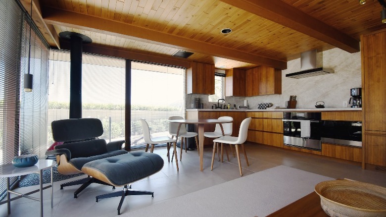
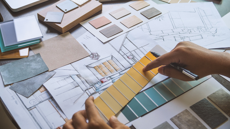
Per Vermont Woods Studios, grounding neutral tones provide a necessary backdrop for the bright colors common in mid-century modern design, such as gold, orange, and turquoise. The custom furniture maker explains that organic hues and textures via stone, pottery, and wood contrast and counter the effects of colorful pieces. They note that objects crafted in MCM style, whether antique or reproduction, might feature various wood species, each with its own coloration and characteristics. For example, the values and undertones between walnut, beech, oak, and rosewood will differ. Make sure to factor these in when choosing paint, textiles, and accents.
According to Kylie M. Interiors, to highlight warm wood select a cool paint color, such as blue, green, a blue-green blend, or dusty purple. Though gray can be a solid choice, she cautions it doesn't accentuate wood's inherent warmth and can read dingy or dull. Neutral walls that lean warm, like ivory and shades of brown, create a more congruous look and downplay yellow-based woods.
Black and white are ideal options to combine with wood and color, either in wall paint, fabrics, or décor. Mid Century Deco explains that cool white is minimalist and clean, whereas warm white provides a soft, welcoming canvas. On the opposite end, black partners with pastels and earthy shades for an enveloping and glamorous space. Regarding accessories, black emphasizes shape and line to elevate functional well-designed objects to sculptural status.
Paint collections
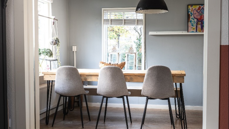
Via Living Etc., dark teak, primarily utilized in storage pieces and tables, is complemented by bold colors. Lighter beech, frequently serving as chair and sofa frames, pairs equally well with rich hues. However, light woods tie in a Scandinavian influence; to align with that aesthetic, choose the types of colors featured in the Scandinavian Minimalism palette by HGTV Home by Sherwin Williams. Pale and foggy blue, gray, green, and blush pink are included in the collection along with creamy beiges and blonde tones.
In contrast, the Mid-century Modern palette by Benjamin Moore highlights crisp white, chocolate brown, warm blue-gray, and a jolt of earthy red. Ochre, orange, and yellow are additional recommended hues for their coloring and how they reference natural wood tones predominantly featured in the style. The paint purveyor spoke with interior designer Jay Jeffers. "I have always used mid-century furnishings in my design," he relayed. "It brings a soulful touch to a room as all antiques do, and mid-century designs give the room a more modern feel that other period antiques might not." As Jeffers relies on mid-century antiques to contribute modernity, he also uses them to provide warmth and a point of history in a contemporary space. To that end, Benjamin Moore suggests complementing the collection with historic hues, such as a duck egg blue (Wyeth Blue) or warm tan (Woodstock Tan), for an eclectic mix.
Modern kids
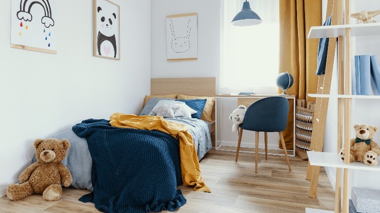
Mid-century style isn't just for grown-ups. The pared-back furnishings are easy and functional, and the clean lines can help a child's bedroom, often untidy, appear a bit neater. The usual color schemes appeal as a compromise for kids and parents alike: neutral tones with splashes of playful or rich hues like mustard, lime green, tangerine, and deep blue. Perhaps it's the perfect place to authentically replicate the fun and funkiness of MCM design.
Modsy suggests starting with a foundation of simple mid-century-style furniture pieces and allowing your child to run with their own ideas. Graphic black and white, a calming monochromatic look, bright and poppy colors, and pastels are all excellent choices — pick the inspiration that best suits your child's personality. Try strong walls and white furniture for a refreshing effect; alternately, for a cocooning space use neutrals and subdued tones with natural wood furniture. Nurseries are sweet in pastel shades with minimalist pale or white furniture and a stylish, comfortable rocker; add artwork for some energy or to create a focal point. Finally, a rug is a great way to reinforce your mid-century modern color scheme while keeping little feet cozy.