5 Savvy Tips For Perfecting The Monochromatic Look In Any Room
Monochromatic rooms, whatever their color, often exude a sense of put-togetherness and intentionality that comes from the dominance of a single shade. Coming in plenty of color options, these spaces can incorporate deep, rich, vibrant shades, always classic neutrals, or soft, muted, relaxing shades. Monochromatic rooms also allow a perfect chance to create an integrated room without a lot of consideration for contrasting and complimentary hues; therefore, the choices are a lot more limited and simple with this décor scheme.
According to Benjamin Moore, there are a couple of ways to do a monochromatic look: One uses the same shade throughout, while the other uses varying light/dark levels of the same color. While pulling your monochromatic room together, there are a few key considerations to ponder. All help you build a stylish and intentional décor scheme but also remain fresh and unpredictable in spirit at the same time. Some key elements can instantly make your monochrome room anything but the expected. However, the choices you make — in materials, shades, depth, and accents — can go a long way toward creating beautiful spaces.
1. Texture
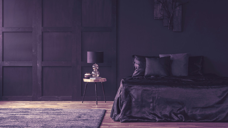
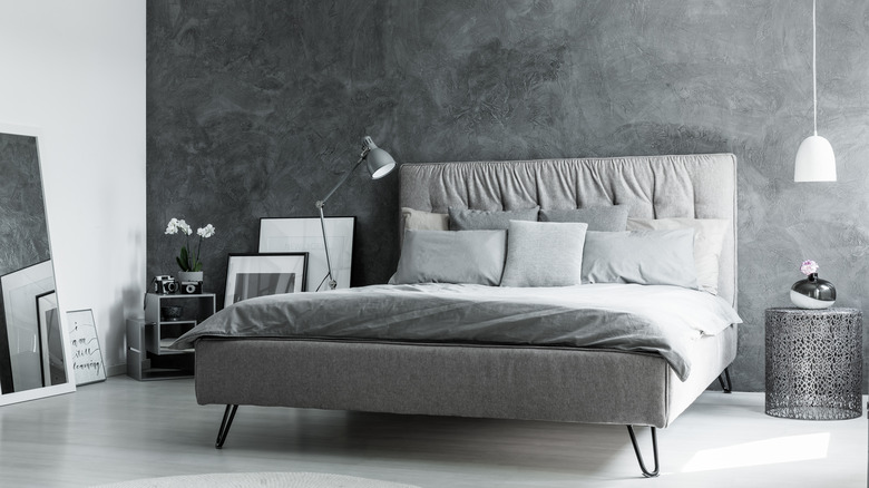
One of the most important things in any monochromatic room, whatever the color, is making sure there is some sense of depth and texture to the fabrics, patterns, and materials. No matter how dynamic in and of itself, a room that is entirely one shade of a color can end up looking a little boring. However, you can add interest by incorporating other shades similar in nature and/or varying textures and materials. For example, a deep royal purple wall and bedcover can be the same shade but adding different textures to the space will make it cohesive and pretty to look at. Likewise, a paler purple shag rug and a violet-tinted wood floor would add even more depth to the room, just like in the image above.
According to Interiors Place, even using subtle variations in texture can add enormous impact. Even if you are employing elements in the same or similar shades, make sure to use various layers. A velvet sofa in gray pairs well with chairs and other pieces in tweed or cotton. A fur rug in rich cream is an excellent complement to an off-white textured sofa. Throw pillows offer an easy and inexpensive way to add texture to what you are working with, coming in an endless array of options.
2. Contrast
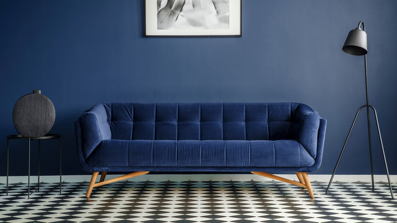
An excellent way to incorporate monochromatic styling without overwhelming a space is actually to use monochrome elements against a neutral canvas. This makes the other, more colorful elements stand out a bit more. For example, a checkered black-and-white floor, along with black lighting and accent tables, form a backdrop for a rich blue wall and velvet sofa. While the floor and accent pieces provide a slight variance in pattern and shade, the blue still steals the show and seems even more vibrant against the floor's lack of color. As a result, it has the look of a monochromatic room without being completely all the same hue.
If you are starting with a neutral space, consider choosing another non-neutral for your monochromatic endeavors. Even a light wall or neutral flooring can enhance the monochrome color palette in various shades or depths. This is especially useful in rentals or situations where changes in wall shade or flooring may not be possible. If in doubt over whether something will work, Love to Know suggests using paint samples and chips to get a feel for the direction you would like the room to go.
3. Sister shades
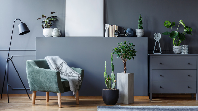
While you can vary your monochromatic style in colors and textures, you can add just a little bit of freshness to a room only using one color by changing up one or two pieces in a shade that is very similar but not quite the same. In the image above, a grey-green velvet chair fits perfectly among varying shades of grey and black on the walls and furnishings, offering a sense of surprise but not calling too much attention to itself. Any single pop of varying color, related or unrelated, can often offer the needed contrast and bring the rest of the décor together, according to Addicted 2 Decorating.
Gray is a particularly great shade for this since any gray base color, like blues and greens, look stunning together. Cream is another shade that offers endless variations, ranging from brown and caramel to shades with hints of pink or orange that still qualify as neutrals. While pushing the boundaries of a monochromatic color scheme, this is a great way to still make a room look well-plotted and intentional, as well as offering a bit of contrast and dimension.
4. Natural materials
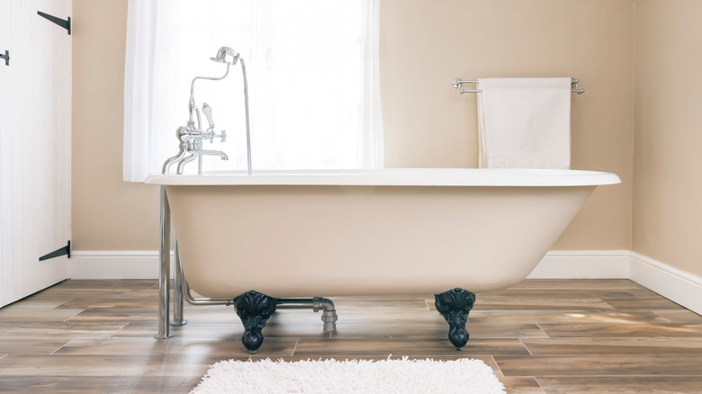
There are also many opportunities to harness natural materials as part of your monochromatic design scheme. For example, while woods, slates, and tiles can form a contrast to monochrome elements, they can also be used as yet another layer in the color palette. Here, beautiful, light, honey-colored floors echo the same shade used on the wall, which is paired with white trim and linens and a soft, off-white tub exterior.
According to Nordic Homeworx, woods are great flooring for monochrome spaces since they come in many different shades, including tinted options. Think of your flooring as the opportunity for yet another layer of color and texture. Gray wood floors look beautiful when paired with various shades of gray and black décor. Dark, warm wood floors can be the base for a room incorporating browns, caramels, creams, and white, all of which echo the same creamy shade but in a much deeper nuance.
5. Beyond neutrals
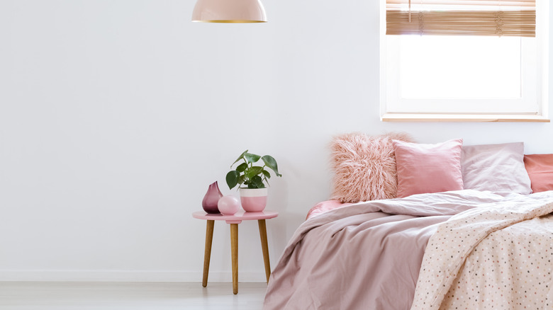
While neutrals are one of the first things that spring to mind regarding monochromatic designed rooms, other colors offer a gorgeous opportunity to use the same layering and shading techniques. Here, while the walls are white, pink bedding, accessories, and pillows form a strong monochromatic look to the room, taking advantage of multiple shades, patterns, and textures. Any color can be the inspiration for a monochromatic design scheme, ranging from saturated primaries to soft, muted shades. According to Livingetc, people often mistake monochrome for neutrals, which isn't the case at all.
Consider pairing colorful shades at the opposite level of the depth spectrum for great contrast, like a pale, barely-there mint with a deeper forest green. Try red or burgundy with similar shades of pink and blush. Navy and light blue are one of the most popular color combinations in styles like nautical-themed and coastal grandmother rooms. Deep purple and lavender are an excellent contrast, as are different intensities of deep and pale orange that mimic a sunset.