How We Created A Dining Room In An Open Layout House
Do you have an open layout home you're trying to decorate on your own? Stumped on how to make it all go together? Sprucing up such a space can seem like a daunting task whether you're just moving in or simply redoing it. When there are so many connecting parts, it's hard to know where you should even begin; thoughts of which colors, patterns, furniture, and accessories to include across all of the interconnected rooms may race through your mind. This can eventually leave you wondering: How are you going to divide the areas into their own separate spaces, yet still have them all complement one another?
The answer is you go room by room. With an established color palette and defined idea of style, the space we're decorating in this home is the dining room. This area is completely exposed to the other great rooms of the residence: the kitchen, living room, entry, and den. Since it's not really independent, the vibe needs to flow with the rest of the spaces for a cohesive design. So just how did we actually accomplish that?
Adopt a cohesive color palette
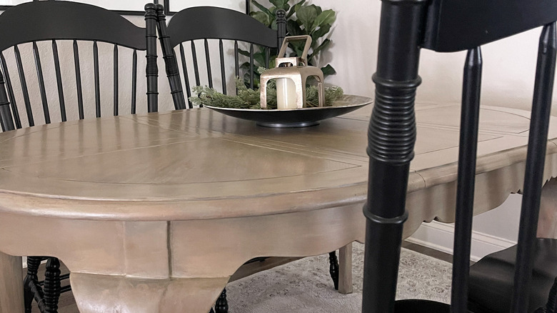
In an open layout home, it is important to establish a color palette early on in the decorating process. Why? So the established base shades can be properly carried throughout the rest of the connecting rooms, then complemented accordingly. To that end, when it came time to create our dining room palette, having a unified color scheme of gray, white, black, and light wood tones really helped guide us on what décor and items to purchase and include.
However, there is one aspect of the overall color scheme that is the same throughout the house: the walls. (Similar to how the same style of flooring relates spaces, so too can the walls.) In order to keep our rooms connected, we opted for the Sherwin Williams paint shade Agreeable Gray. Then, considering the undertones of the gray, we selected complementary hues to add personality; these include black, taupe, cream, brown, and tan. These hues are repeated throughout the furnishings and accent items in the kitchen, living room, dining area, entry and den — not in all the same ways but within the same range. This helped us create a seamless flow from the dining room to the rest of the house.
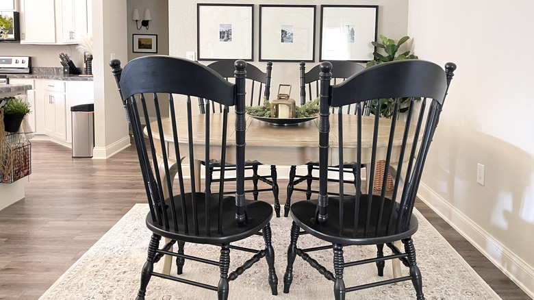
Bring in an oval-shaped table
Our dining room is a square-shaped corner that's open on two sides to other great rooms. Since it is frequently passed by occupants and guests, optimizing the space was a main focus for us. In order to customize the area to the needs of the house, it made the most sense to find a table shape that everyone could navigate around without bumping into any pesky corners. In fact, we think it's where you should begin in your home if you're contemplating a design plan.
While evaluating our needs for the table, we concluded that functionality was prime. It would have to not only fit everyone in the family, but also occupy the dining space without constricting the flow. So, we decided on a wooden table that is oval-shaped with a removable leaf. The rounded edges create movement in a box-shaped space and add a softness to the design. Additionally, the shape has the same benefits as a rectangular table, but actually takes up slightly less space. This makes it easier for a person getting in and out of their chairs without running into corners. And, the light wood tone complements similar shelving in our living room, making it a perfect finish to help coordinate the two areas.
Roll out a new rug
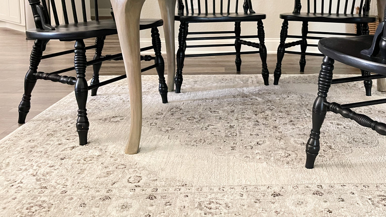
With a dining table shape picked out the next item was easier for us to select, which is helpful since the choices for this accessory are countless. Rolling out a new area rug would not only give the space a whole new appearance, but also help define the room, elevate the furnishings, and situate the area within its surroundings. Since the flooring here is the same vinyl wood with hints of brown and cream throughout the home, the only way to differentiate the room is by layering the planks with area rugs — not all the same in each space, but rather plush floor décor that complements each other in texture, color, and design.
Area rugs add structure and create paths throughout our open floor plan, ultimately manifesting those distinct yet connected spaces we want. Additionally, along with the existing home furnishings like the dark gray sofa, cabinetry, and kitchen island, as well as black accessories, we had a general idea of what color palette to follow when shopping for the carpet. Also complementing the floor and table hues, we decided that a light-colored woven rug with a vintage pattern made the best impression. These details blend into the existing interior shades wonderfully from the floor to the furniture, ultimately making the rug a statement item that bridges the spaces.
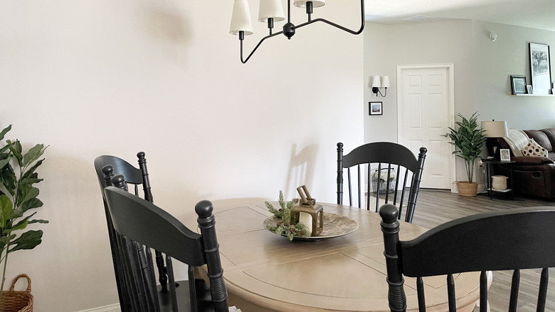
Upgrade the light fixture
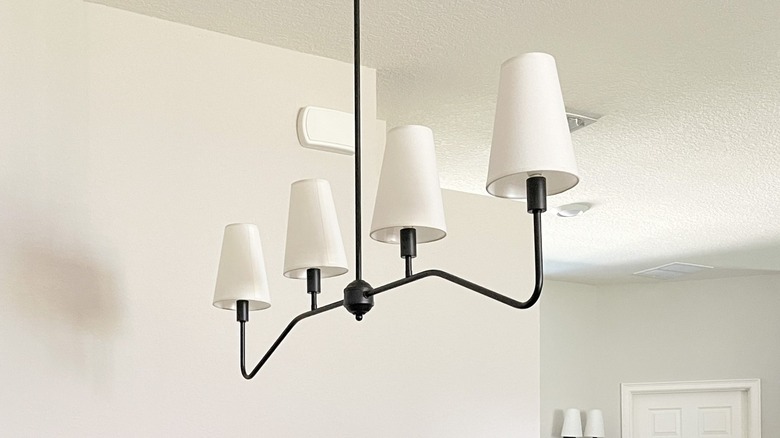
The next element that needed an upgrade in our home was located just above the table. Any bright ideas? Indeed, the light fixture in this space absolutely needed to be replaced. Not only was the previous one dated but the finish and style did not correlate with any other interior element in the entire house. It needed to go! So, determined to complement the overall aesthetic and stay within a reasonable budget with a new option, swapping out the light fixture was one of the simplest choices we made.
Picking a style, however, was not such a simple task. Before purchasing just any fixture there were a few considerations we had to keep in mind: the size of the table and room, the interior style, and the adjacent lighting in the other spaces. Ultimately, we selected a linear, four-light option; it was the lamp shades and its silhouette that sealed the deal. The extended metal frame complements the elongated oval table beautifully, while the cone-shaped white linen shades paralleled both the existing ones on the tripod floor lamps in the living room and wall sconces in the entry and hallway. It also lifted the room's appearance and created a cohesive design across our open layout.
Create a personalized gallery wall
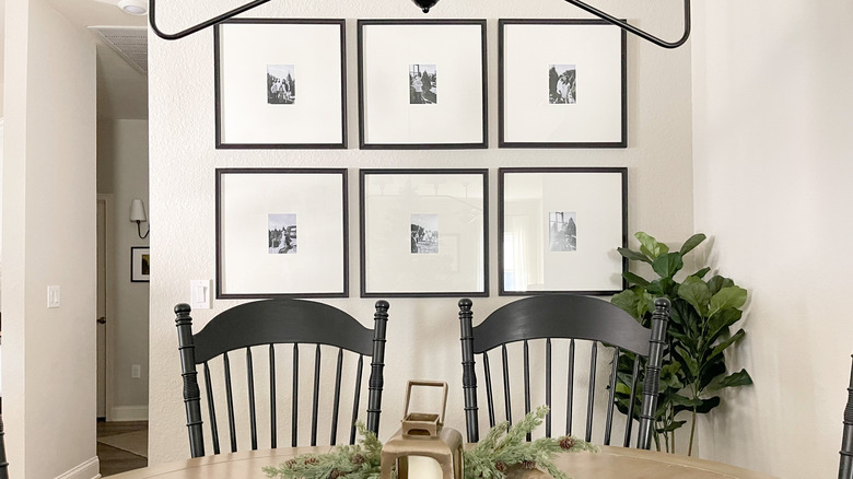
Our dining room has two walls that semi-enclose the space and they needed décor that wouldn't distract from other elements. We determined that adding some personal touches would help turn the house into a home — and what is more personal than family photos? With many years of snaps already printed and photo sessions planned for the future, a gallery wall would never be stagnant.
As with creating any art display, we selected pictures and frame styles that complement the existing color schemes, other art on the walls, and overall interior aesthetic. To prevent putting a bunch of unnecessary holes in the wall we determined the layout of the design, amount of pieces, and proper measurements — all before even hammering a single nail. Also, once we had our frames, we considered how we wanted the display to be laid out off of the wall. This helped us not only visualize the design and make any adjustments, but also determine how many pictures would actually fit. (Pro-tip: If you need to see it on the walls, use blue painter's tape to mimic the artwork.)
Most grid gallery walls have a 1.5- to 2.5-inch gap between frames. Bearing this in mind, we determined that a six-piece gallery wall with frames that measured 30 inches x 30 inches would fit best. As for the photos themselves, we opted for black and white family pictures as the memories we'd feature.