Why You Should Incorporate A Bit Of Purple In Your Christmas Decor
Christmas, in essence, is about excess and abundance. Even if you observe the holiday simply, the season itself is about reveling in heightened sensations: the smell and sight of fresh snow, the warmth and sound of a crackling fire, the lyricism of carols, and the aroma of cookies baking. It would be easy to go on and on, but we have decorating to do. That is another delight of Christmas. Garlands hanging from staircase banisters and fences, a wreath welcoming guests at the front door, and of course the apogee of decorations — the Christmas tree, which started as a Germanic tradition as far back as the 1550s, according to The German Way.
Grand, elegant, rustic, traditional, or fun, our holiday décor is a celebration, as well as an illustration of our personalities. Many of us sink into a method, using the same ornaments, ribbons, and wreaths year after year. Certainly, there are sentimental reasons for that. Yet adding something different or changing up our usual standards can offer a fresh perspective and revived appreciation, a reminder of a loveliness that brought us joy in the first place. With that in mind, trying a new color could be just the switch that dials up the Christmas cheer. And why not turn to one of the most royal colors for one of the most festive holidays?
Purple's royal beginning
Purple, although not associated as emphatically with Christmas as the typical red and green, is in fact a very traditional color for the holiday. Bob Richter, author of "A Very Vintage Christmas" said in Today, "Purple is the color of royalty, and many (Christians) associate it with the King of Kings, Jesus Christ." It's the principal color representation of Advent. Originally, the pigments required to create purple textiles were both extremely rare and expensive, therefore only the elite could be enrobed in the hue. The outlet explains that this changed when a method for manufacturing a mauve dye was mistakenly discovered by chemistry student William Perkin in the mid-1800s. "The world and the color purple would never be the same," Lori Sawaya, a color strategist told Today. "Even though Perkin's discovery democratized the color purple, associating it with wealth, royalty, and mystery carries on. No other color conveys specialness and the essence of sacredness like purple," she explained.
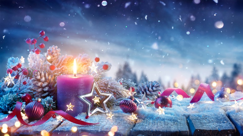
Gold is another tone steeped in religion; it's one of the gifts bestowed by the Three Wise Men and is sometimes viewed as symbolic of the Christmas Star. It's no surprise that purple combined with gold in holiday decorations can hold significant meaning for many while it creates an opulent picture. From a visual standpoint, the tones are almost opposite on the color wheel which means they are complementary, enhancing one another's properties and making for a richer experience.
Purple's regal bearing
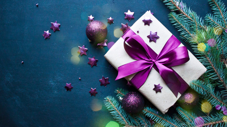
Purple has a legion of fans outside of (or alongside) its religious context. The Purpleologist is a shop and devotional blog, extolling all virtues of the color. They say mixing decorations in purple, gold, and silver creates an effect reminiscent of light shimmering on the snow's surface. They recommend stringing white and purple exterior lights instead of the conventional colors for a bit of magic, tying velvet or satin bows on the tree, and hanging glittery purple ornaments.
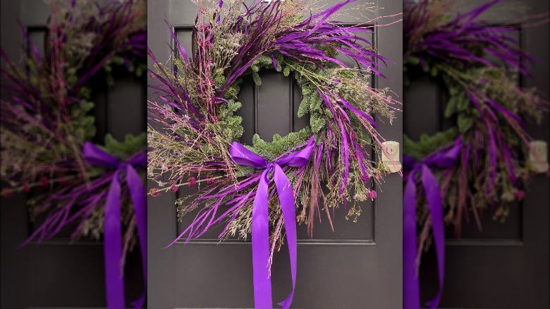
Per the Purpleologist, the combination of purple and green lends a vintage look, however, we at House Digest believe it's all in the shades and application. A wreath festooned with a gem-toned bow, dried flowers, or feathers can be modern and elegant, especially when a vibrant or deep background sets it off beautifully. The color pairing is appropriate for any style of decorating and is equally impacted by materials, patterns, and textures. Consider the traditional elegance of a wide, crisp velvet bow or the simple rusticity of raw-edged, wilting linen. Compare droll polka-dots to Victorian florals. Finally, the tones of purple and green displayed together matter. Both colors share blue as a component, therefore evergreens that skew blue will be harmonious, whereas lime and chartreuse greenery (closer to purple's opposite yellow) will seem poppy and energetic. Incorporate additional shades to amplify your favorite aesthetic: silver, black, persimmon, turquoise, burgundy, and yellow. When you begin with jewel-like purple, the inspiration is jubilantly endless.