HGTV Host Jasmine Roth's Favorite Paint Color Is Going To Give You Major Wall Inspo
Interior designer Jasmine Roth knows the importance of paint for a room. On the HGTV shows "Help! I Wrecked My House" and "Hidden Potential," she stresses how it's the one design tool you can use to give a space a total transformation without spending a ton of money. Whether it's walls, the ceiling, kitchen cabinets, or fireplace bricks, paint can be the key to a new look. However, finding the right paint color for your room can be overwhelming.
Paying attention to the undertones can ensure you get the perfect paint color, according to Home Made Lovely. Undertones are often why a color can feel off, even if you can't pinpoint exactly why the shade doesn't work. But if you can identify the undertones and match them to the other hues in the room, the paint color will feel more harmonious. Sometimes, there are paint colors that work in nearly every space, as is the case with Jasmine Roth's favorite paint color. In an interview with Home & Gardens, Roth shares a paint color she loves using throughout the house and why she loves it.
The perfect neutral
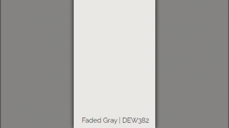
Jasmine Roth loves using this neutral paint color in the homes she designs and even her own home. "My favorite paint color is Dunn-Edwards Faded Gray," Roth tells Home & Gardens. "I probably use [this color for] 80 percent of the walls I paint for interior spaces. I think it's really beautiful; it's not super gray, it's not stark white." Roth has Faded Gray as the wall color in her own office. It creates a lovely backdrop and allows her to express her creativity.
Many experts suggest using neutrals as a wall color because it allows you to highlight other features of the room. When it comes to choosing the right gray, undertones, of course, are an important factor. Dunn-Edwards Paints describes the shade as white tinted with a gray undertone. The color was inspired by the way vintage items gently fade over time. Where stark white can feel cold and unfeeling, Faded Gray adds a touch of warmth without being overwhelmingly gray.
Why choose a gray
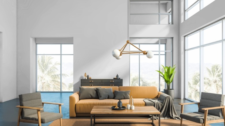
Looking at sample cards in a hardware store, you have a seemingly infinite number of paint colors to choose from. But when it comes to painting your walls, "I would recommend painting a neutral," Jasmine Roth says to Home & Gardens. A neutral color allows the rest of your décor to shine rather than having the walls be the focal point. Neutral colors are timeless, so a beautiful gray will continue to look great even as the trend cycle moves. It will ebb and flow in popularity, claims Stone Gable. For example, all-gray interiors were a popular trend in the 2010s, but, as a whole, the color isn't going out of style any time soon.
Plus, the colors you choose for your walls influence you. "Paint can make such a difference to how we feel," Roth explains. "If your walls are dark and moody, that's fine for some people. That's how they want to feel, and that's how they feel the most productive and the most creative." Gray has the power to be moody and dark, as well as light and airy. No matter how light or dark a gray you choose, it's a reliable color that allows for plenty of customization. Roth continues, "Paint is a great base, and then it's up to you to make it your own."