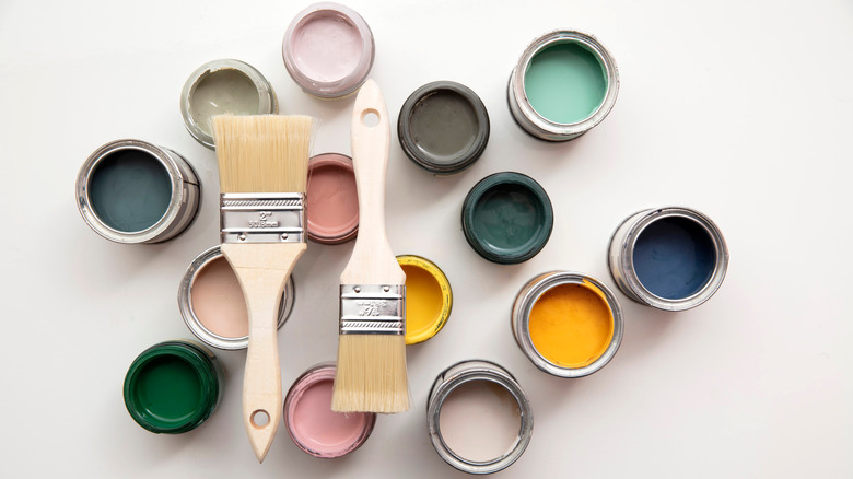
House Digest's Paint Color Of The Year For 2023
Upon reflection, it's been quite a year for home décor and paint color trends. We reveled in nature's healing shades as they pulled us out of winter and pandemic hibernation. Biophilic design became a top trending interior style, and the nature-connected approach supported (or was it the other way around?) the calming, grounding, and fresh tones of green that were 2022's most popular paint shades. We saw a shift from minimalist and cool gray walls to warmer neutrals like taupe, clay, and beige that emphasized down-to-earth and nurturing spaces. They add a layer beyond white and gray, yet allow great freedom concerning the aesthetics of style and period, as well as color complements.
Home as an extension of ourselves seemed to be growing ever more important; we want it to be comforting and nurturing, but not boring. (Wouldn't that mean we might be boring, too?) We also discovered that green is not the only avenue to soothing; rooms that are personal and engaging make us feel alive in them — and there is nothing more profoundly reassuring than that particular joy.
To compare the sweeping roster of 2023 Colors of the Year among paint brands, one gets a sense of the emotionally-driven and eclectic route interiors are heading. Amid the many splendid offerings, we're looking for colors that provide a balance of casual ease and celebration while also promoting independence in decorating. With that in mind, here are House Digest's top choices.
Winner: House Digest's color of 2023
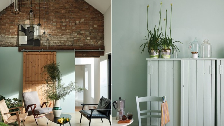
House Digest's paint color of the year is Teresa's Green by Farrow & Ball, one of many pale blue-green shades currently popular for their tranquil effect and subdued color. Pale aquas immediately call to mind a coastal aesthetic, but we think the faded and patinaed hue, reminiscent of aged copper, is just as suited for a city apartment or rural farmhouse. It's perfect for a design point-of-view that prefers a combination of styles and eras, such as a traditional and bohemian mash-up or a blend of classical and contemporary.
Teresa's Green offers a therapeutic tether to nature as do stronger greens, yet it's more related to the sky. Therefore, it feels expansive and airy (while still enfolding) rather than lush and terrestrial. It's a gorgeous foundation for other hues, whether analogous on the color wheel – such as olive or lemon — or opposites like punchy coral or blush pink. In addition, a cool undertone brings out the richness inherent in wood furniture and flooring to create a fresh scheme that is simultaneously instilled with warmth. The shade will change as the light does, making for a mutable space full of life. Farrow & Ball recommend partnering the wall paint with millwork in creamy ivory, lighter mint, and charcoal.
First runner-up
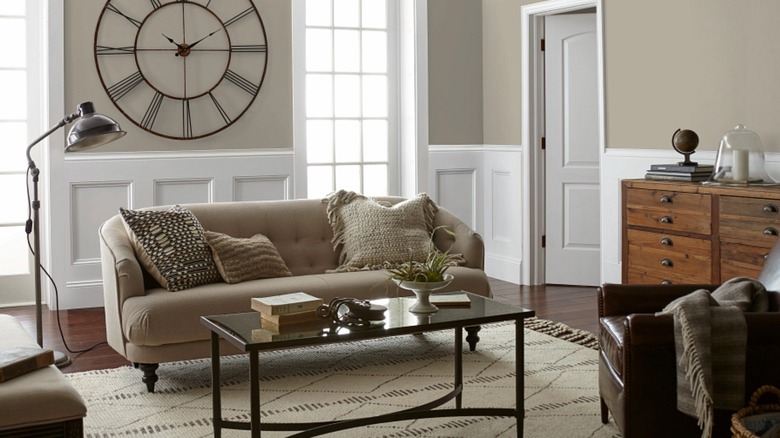
Drawing Room by Kilz is a shade featured in the collaborative Castle Collection formulated by Kilz and Magnolia Home. It's at once cozy and elegant — a tone that reads oatmeal and wool as well as plaster and stone. The gray-beige is a modern, effortless neutral that doesn't impart either an excessively cool or warm cast, therefore allowing muted colors, graphic darks, and bold hues to shine equally. All manner of metals including chrome, bronze, copper, silver, and iron would be complementary. In that vein, the same is true for varied wood tones from modern cerused oak to antique walnut. Marble, with its softness and variability of neutral tones, is a stunning counterpart.
To keep a room this shade from tipping toward boring, add shimmer or sculptural interest with metallic finishes via lamps and accent tables, and make sure to introduce plentiful texture throughout. Further, consider enlivening a subdued palette with statement art, colorful throw pillows, or tactile pottery. Incorporating an element of black contributes a sense of grounding and sophistication; it's a tried and true design trick especially effective in a neutral room.
This elusive color will shift depending on the quality and temperature of light, appearing deep taupe in shadow or pearl gray in bright light. That play supplies a neutral hue depth and intrigue, while it beautifully functions as the backdrop for furnishings, décor, or an amazing view. Kilz describes Drawing Room as a "soft French Gray," yet its aesthetic compatibilities are nearly limitless.
Second runner-up
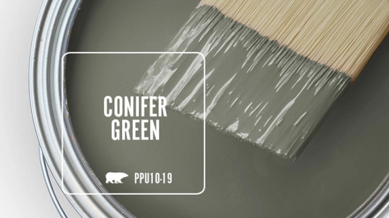
Conifer Green by Behr is a deep, cool gray-green listed among their Color Trends 2023 palette. This shade offers strength similar to other mid-value neutral favorites like taupe and charcoal, yet via green, provides the connection to nature that remains a desired aesthetic in decorating. Combine it with organic elements such as stone, wood, artisan tile, leather, faux fur, and wool for a warm and comfortable space. This earthy and forest color family, evocative of shady ponds and lichen, can feel overly heavy and serious; so include moments of levity and vitality to breathe air into the design — for example, blooming houseplants, vibrant accents, and metallics.
Implementing the 30-60-10 rule in decorating will help ensure the space is balanced and inviting. In this method the décor is portioned into percentages: 60% is occupied by the dominant foundation color, a secondary shade applies to roughly 30%, and an accent hue makes up the last 10%. As an illustration, a wall of painted green millwork would be a perfect supporting shade for a wood-paneled room and could be repeated in fabrics or a patterned area rug.
Of course, this shade is a natural on walls in spaces where a moody, hush vibe is the goal, such as a library, dining room, or walk-in closet. Yet it's an attractive accent on trim, interior and exterior doors, and kitchen or office cabinetry. Conifer Green is an ideal color for a luxurious glossy enamel finish.
Third runner-up
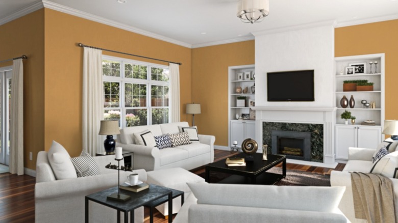
Sherwin Williams' Butternut offers resonance among the previous subtle hues. The straw yellow is neutral enough for a whole-room application, and it's perfect in small doses like this open pantry, a welcoming entry, inside an enveloping cloffice (closet + office), or on molding and interior doors. Golden yellows like mustard, ochre, and turmeric are appearing more predominantly in interiors, where they lend warmth, flavor, and an impression of worldliness. The hues add richness to minimal modern spaces, while on the other hand, they assert a character that is compatible with historic homes.
Natural and organic tones such as those found in spices, botanicals, minerals, hides, and furs are current overriding inspirations for décor and paint trends. Textile companies, slow fashion boutiques, and craftspeople — like artisan quilter @farmandfolk for instance — feature washed marigold, onion-skin brown, and saffron yellows that are the result of dying with plant pigments. By way of social media, their wares have created demand and these colors have begun filtering into our home environments like sunlight.
This particular shade is an ideal blend of color and calm, owing to its earthy quality. Further, its placement on the LRV (light reflectivity value) scale serves as an excellent backdrop for both lighter and darker tones. Natural woods work with it harmoniously to create a grounded monochromatic space, while neutral shades are boldly complemented. Contrasting hues like magenta, emerald, or cobalt via upholstery and décor are luscious potential pairings.