Tips To Choose The Right Size Artwork For Your Space
We may receive a commission on purchases made from links.
Our home is where our heart is, and because of that, it becomes an individual expression of ourselves, as per Artwork Archive. This is precisely why we need artwork in our houses, but choosing the right size is something of a science. Having the right size and shape is key to your design's overall impression, blending symmetry and style in one. But figuring out your room's scale is tricky, and filling up wall space isn't intuitive. Picking the wrong measurements can dwarf your room size, make your room feel cluttered, or be the difference between elegant or amateur styling.
To do this flawlessly, you don't have to hire a professional designer. However, you do need to learn their secrets! If this interests you, keep reading. We're going to discuss scale, the golden ratio, industry rules on spacing, and more in these tips to choose the right artwork size for your space.
Choose the shape first to determine the correct size
The first step in choosing the right size artwork is understanding the shape of the space you want to fill, according to In My Own Style. This step is crucial and is not as simple as it sounds. Is your empty wall space in the shape of a horizontal or a vertical rectangle? Or is it a perfect square? Figuring this out will help you decide what shape and size of art to purchase. For instance, if you have a horizontal rectangle to work within, anything you hang should create a horizontal rectangle outline.
This doesn't mean you're limited as much as you might first think. You can group several items within the space, as long as together, they form the same shape. Say you have a space between two bookshelves, but there is a bench between the bookcases. The empty space is in the shape of a horizontal rectangle, but you don't have to limit yourself to choosing only large horizontal canvases. You can also pick out three vertical frames of the same size, and group them so their outline creates a horizontal rectangle. But this is only the first step!
Figure out the scale of the room
According to Masterclass, another vital step in understanding how to choose the right artwork size is figuring out its scale. Scale refers to how the size of the art relates to the size of the room and the furniture within the room. For example, if you have a large room with oversized, chunky pieces of furniture, you'll need to focus on large canvases. But if you have a small room with more petite furniture, an oversized canvas would feel wrong. On the flip side, if you have a small room with large pieces of furniture — like a wide coffee table and sprawling couch — a large painting would work best because it's scaled to the surrounding furnishings.
Additionally, consider scaling the design elements of the space according to the room's ceiling height. If your room has high ceilings, choose larger, high-end artwork. Rooms with low ceilings warrant smaller, more modest paintings. You can even design the space around a central piece of artwork if you like, but be sure to scale the rest of the room appropriately.
Have the art fill 60% to 75% of the available wall space
The next tip we'll discuss is how large of an area your artwork should take up. This tip is for wall spaces that have no furniture in front of them. Looking at available wall space, the general rule of thumb is to use 60% to 75% of it, per Under The Roof Decorating. And if you're not so great with math, there's also an easy way to calculate the size of artwork needed. First, measure the length and the height of the empty space you have to fill. Then multiply each by 0.7, which will render the artwork's dimensions needed for the area.
Remember to consider the shape as well as the scale, and then you can decide whether you want one large piece or several smaller pieces. Try outlining the size with painter's tape to help you visualize how the finished results will look. By following these very basic tips so far, you're well on your way to creating a professional-looking interior in every room of your house.
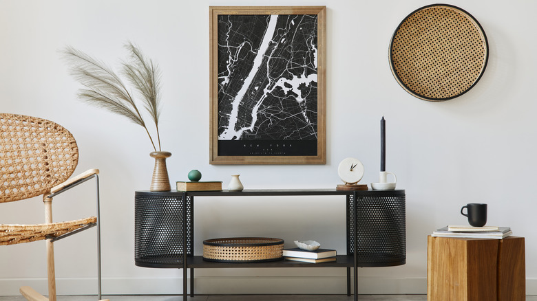
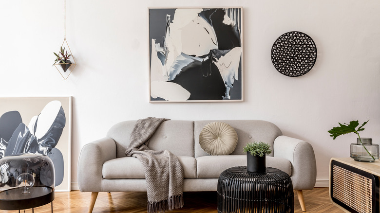
Artwork should be ½ to ⅔ of the furniture width
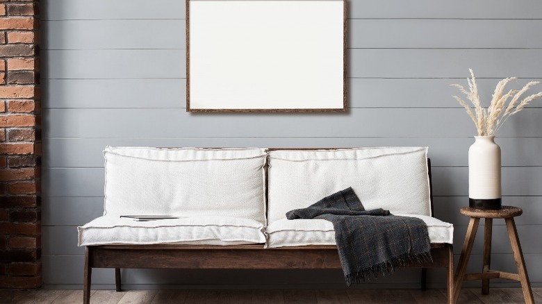
But there are still more tips to utilize in relation to size. According to Parima Studio, if you're looking to fill the space above furniture, a good rule is to place the artwork centered above it at ½ to ⅔ of its width. So, since most regular-size sofas measure around 84 inches wide, the painting would measure between 42 inches and 60 inches wide. This general rule can be applied to any large piece of furniture in any room.
For instance, say you're in the bedroom and have space above a king-size bed. Say the width of the bed is 80 inches, so in this case, the artwork would be between 40 inches and 53.5 inches wide. Above a large dresser, which can measure 60 inches in width, the artwork should measure between 30 and 42 inches wide. You just multiply the width of the furniture by 0.67 to get ⅔, which can be your maximum width guide.
Special 80% rule for art above the fireplace
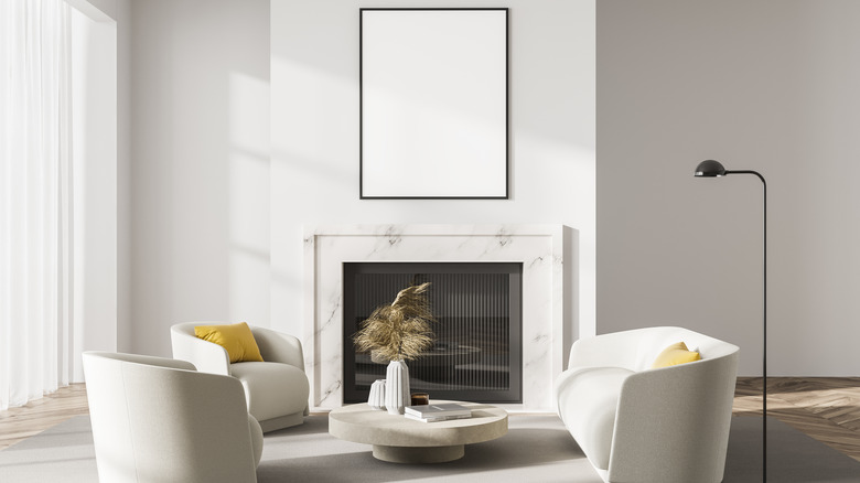
According to David Wilkins Photography, special rules apply if you're interested in hanging artwork above the fireplace. Generally, a piece of artwork above the mantel or firebox should be about 80% of the width of the mantel. Now, this can vary as far as what the painting is composed of because, as we all know, the mantel is also a great place to put other objects for display. For instance, you can place two taller items on either end of the mantel and a painting in between. However, ensure the painting still occupies 80% of the available space between the two ornaments. This brings us to the next point!
Now you may be saying, ok, then how high should you hang artwork above the fireplace? You should have 66% of wall space above, between the top edge of the frame and the ceiling, and 33% below, between the bottom edge of the frame and the mantel. Another design tip is that artwork should be hung a minimum of 6 inches and a maximum of 12 inches above the mantel.
Follow the same basic rules for gallery walls
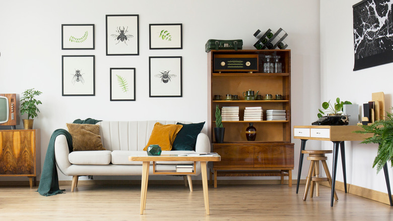
Say you want to create a gallery wall, but you're wondering if you should use a different formula. The simple answer is no; you stick to all the tips given so far (via Frame It Easy). When you decide on the space where you want to hang a gallery wall, remember to group the items in the correct shape. If there is no furniture in front of the wall, fill 60% to 75% of the available space. If there is furniture, you want the frames to take up ½ to ⅔ of the furniture width. Deciding on the frame size will depend on how wide the empty space is and how much space you leave between each frame. Generally, there should be a 2 to 3-inch gap between each frame, so subtract that from your total to figure out your sizing options.
Having a gallery wall has become even more popular in homes than ever. There are many creative ideas for where you can put a photo cluster, such as in a hallway or along a staircase. But you don't want the space to look crowded, either. So generally, it's advised for galleries to fill about half the area with pictures if working with a large open wall. If you're using a smaller wall area, leave even more negative space to avoid the crowded look.
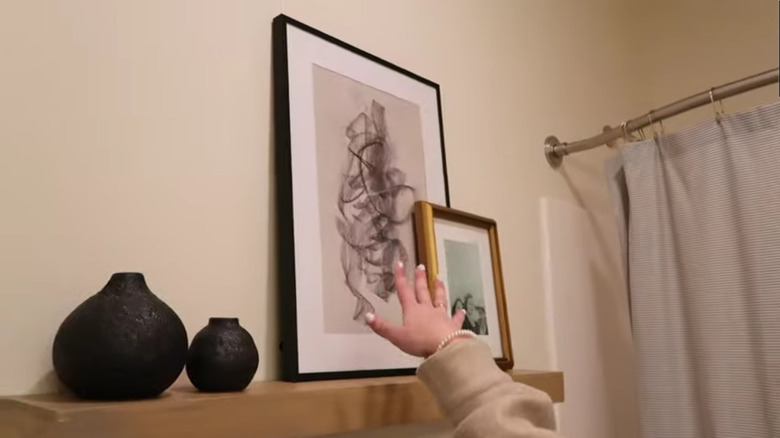
Use the golden ratio rule when layering
What if you're layering artwork and can't decide on the size of the second or third piece? To select the correct size, incorporate the golden ratio into your design. According to Homes & Gardens, the golden ratio is a mathematical ratio that occurs naturally in nature and looks pleasing to the eye due to its symmetry. It has a ratio of 40:60 and is a rule that can be implemented anywhere from choosing art sizes to hanging canvases at the proper height. "You can use the golden ratio to get the picture height right, too," said Homes & Gardens Editor in Chief Lucy Searle, explaining there needs to be 40% negative space between the bottom of the frame and furniture, and 60% negative space between the top of the frame and ceiling.
This same concept applies to layering multiple frames in front of each other on a piece of furniture. To make the cluster look balanced, choose one oversized frame and two smaller frames. The smaller frames should be 40% of the height of the larger canvas, so when layered in front, only 60% of the larger canvas is visible (via Julie Dahlum). This composition is more pleasing to the eye than creating a 50:50 or 70:20 scale, for example.