Martha Stewart's Biggest Design Blunders Of All Time

Martha Stewart has worn many hats throughout her illustrious life as a public figure. She was a stockbroker earlier in her career, but seemingly found her true passion while restoring an early 19th-century farmhouse with her husband (via Achievement). It was in this home that she wrote her first book and launched her catering business. From there, Stewart enjoyed a rapid rise in prominence, popularity, and notoriety.
After her first book was published, she went on to publish over 100 more. These have meandered through cooking, gardening, and household and lifestyle topics. She's tackled holiday decorating, party hosting, and all things modern living. Even still, Stewart has made a few design faults throughout her time in the public eye. The truth is that no one can completely avoid stumbling from time to time. These design blunders can be a fantastic learning opportunity for any homeowner looking to improve their living space.
Hanging pots and pans over her kitchen's workspace
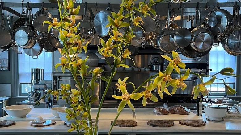
Martha Stewart is most famous, perhaps, for her culinary contributions. Many of her written works are cookbooks and center around the kitchen, and she even partnered with Home Depot to create kitchen cabinets. However, even with her prowess in the kitchen, her own organization of pots and pans is somewhat lacking.
Kitchn reports that minimalism and a mise en place mentality are critical for maintaining a functional and efficient kitchen in your home. And hanging pans is decidedly not a part of the minimalist ethos! Cooking in a messy space that feels cramped can dissuade even the most avid home cook from exploring the depths of flavor in their kitchen. The allure of takeout or eating at a restaurant is always there, and a cluttered kitchen makes this decision all the more enticing.
Hanging up pots and pans above your sink, stove, or against a wall can add a unique aesthetic to a kitchen, to be sure. But this adds depth and character only if your cookware is new or high-quality. Displaying charred or burned pots and pans doesn't hold the same appeal.
Letting vines flourish

Vines are a staple part of any Martha Stewart property. From iconic rose vines to ivy walls, creeping foliage has always been a hallmark here. These plants can produce a luscious green addition to any home, but they require extensive care, according to Angi. Vines left to grow at their own pace (and in their own direction) can eventually get out of control and take over the property. Vines that have been growing untamed for long enough can even become exceedingly heavy, potentially ruining walls. A substantial enough vine system can develop thick underground roots that can potentially crack your home's foundation. Cracks in the foundation can spell disaster for the house itself, but can also create cosmetic issues, like showing up as ceiling cracks or crumbling bricks.
They can also upend garden decor — covering decorative shutters or swallowing statues — and potentially cause wood rot. You must consistently prune them to keep them in check, adding another chore to a homeowner's list.
Adding an office to your kitchen
Stewart is constantly on the move regarding her business, whether designing homeware or whipping up new and exciting recipes. As a result, she added an office in her kitchen. This works for her, and in her home tour with People, it's evident that she uses the workstation consistently.
Building a home office is all about introspection, however. For Stewart, much of her work centers around this part of the house, so it makes sense to put her office in the kitchen. Plus, she can carve out a space there because she's a multimillionaire with a lot of square footage. Her home is graced with an enormous kitchen with multiple state-of-the-art ovens, a row of commercial refrigerators, and a deep fryer. There's more than enough room to add a command center.
This isn't a real possibility for the average homeowner, and even if it was, Design Basics notes that placing your workspace in an area that experiences heavy traffic throughout the day is an easy way to lose focus and productivity. Finding a backroom to work in is typically going to be your best bet in this regard.
Mixing woodgrains and color selections can be distracting if used without contrast in levels
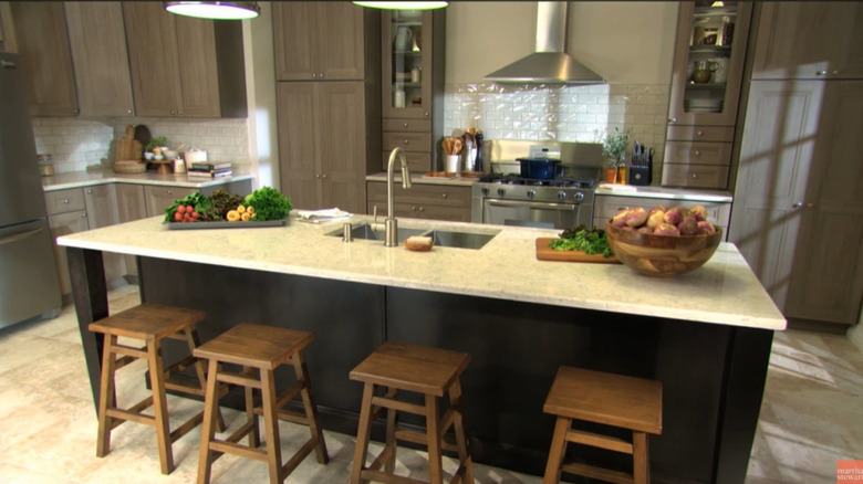
Stewart has a knack for mixing modern accents with antique and heritage pieces that really exude a sense of history and class. However, in Stewart's kitchens and in your own, mixing and matching styles in this way can lead to a disconnect in wood grain and color palettes.
Lick notes that different wood shades work best with different wall colors and aesthetics. For instance, dark wood cabinets and islands feel less heavy when paired with bright wall colors. Similarly, a blonde or bleached wood pairs well with deeper paint colors to create contrast in the space. In this Stewart-designed kitchen, the wood seems to blend together without much contrast. The dark wood cabinets are paired with an even darker island, accented with dark wooden stools. This is matched with beige floors and countertops, creating little visual interest.
Using shingle siding
Stewart's famous farmhouse includes unique shingle siding that gives the property character. Siding is a common sight on houses in northern regions of the United States, but using this shingle design might be more trouble than it's worth for the average homeowner. A1Everlast reports that clapboard is likely the best wood siding option for most homeowners. That's because it's relatively easy to install, requires less maintenance than the smaller (and thinner) pieces used to form shingles, and looks fantastic as it begins to age — if maintained properly, of course.
Some homeowners like shingles because they add a rustic, heritage look to the house. They also can give you more stylistic options, since you can cut them into different sizes, adding visual variety to the home's exterior. But this type of siding requires routine cleaning and resealing, which can add to the yearly cost of upkeep or annual to-do list.
Not incorporating pool safety features
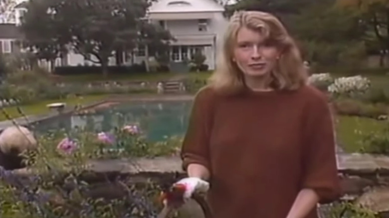
Pool safety features are an important part of any home with a pool. These might not scream luxury, but installing a safety screen or fence around your pool can be a lifesaving tool that will pay dividends throughout your entire life. The CDC reports that drowning is the leading cause of death among children between one and four years old, and roughly 4,000 people die from drowning yearly in the United States.
Parents.com suggests installing a safety fence around your pool that's at least four feet high. This can drastically reduce the chances of a loved one or guest falling in. Stewart's East Hampton home includes a beautiful pool but lacks a fence. The truth is that even if you don't have any children or pets at home, or your young ones are adept swimmers, a tragedy can strike at any time. Including a lifesaving feature is always a good design idea, even if it isn't the most visually appealing part of your yard.
Using glass-faced kitchen cabinets
Every kitchen demands storage space for food and appliances, and most use cabinets. They can be made of various materials and have a variety of finishing touches and stylistic flourishes. One option is glass-faced cabinet doors, which Stewart created for a kitchen line with Home Depot. Glass faces on kitchen cabinets are often seen as a mark of luxury and can help display some of your favorite serving ware. However, they are costly compared to other design choices, and they limit your options when it comes to door construction.
In addition to the cost, the average household might also struggle with increased clutter and general chaos in the kitchen by installing this design choice. Not only will you have to chase away fingerprints and smudges from the glass, but you also might end up displaying your kitchen clutter rather than your best china more often than not.