The Color To Avoid For A Less-Stressed Space
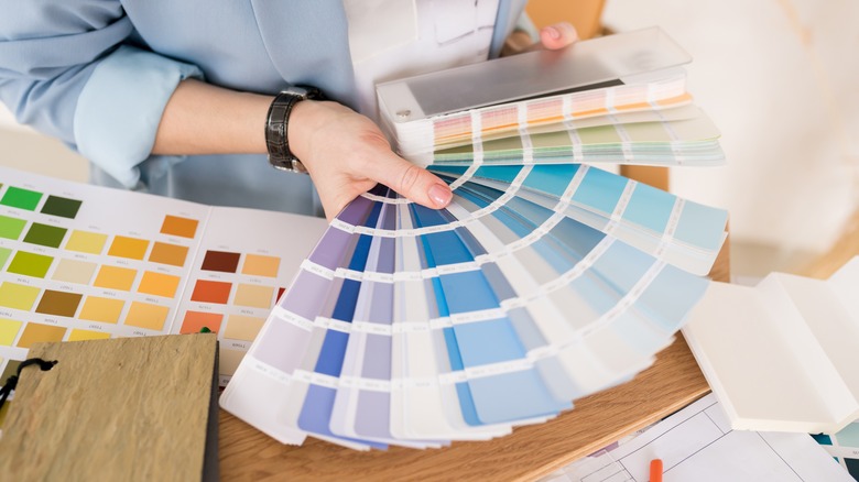
Design is almost all a matter of personal choice. No matter what pieces, patterns, and pigments you choose for your space, you're sure to be satisfied if they align with your individual style and tastes. With that being said, however, there are subtle ways to set the tone of a room through the use of color — even, sometimes, subliminally.
According to a study from Frontiers in Psychology, empirical research on the psychology of color has been conducted since the early 1800s, with many scholars agreeing that the tones we surround ourselves with have a powerful impact on how we feel. Certain colors can soothe and relax us, while others embolden us and heighten our emotions. Because of this, selecting the right colors for your relaxing spaces can help to increase their impact and slow the racing of your mind at the end of a long day. Opting for another hue, however, might leave you restless and irritated.
Why to avoid red in your interiors
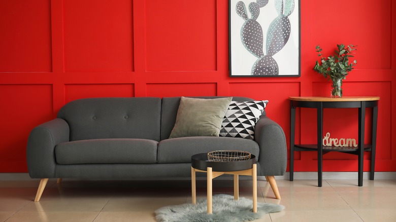
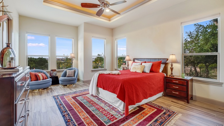
There are no bad colors when it comes to interior design, but if you're painting the walls of your bedroom or creating a soothing breakfast nook, you might want to avoid red. The field of color psychology studies both our natural reaction to color and our long-held cultural associations with it, and red is invigorating on both fronts. According to Very Well Mind, red's visibility and bold saturation, coupled with its associations with danger, anger, and passion, make it one of the least relaxing colors out there.
Because of this, if you're a long-time lover of red and are dead set on covering your walls with this bold hue, it's best to keep it contained to high-energy spaces, like the home gym or office. Red can give you just the kick you need to finish that last rep or push through the afternoon slump, but it might leave you with some issues falling asleep once you settle in for the night.
How to incorporate red without feeling overwhelmed
When it comes to bringing red throughout your home, it's best to do so with moderation. Painting an entire wall with this bold color can be a bit overwhelming, but accents here and there aren't going to completely derail your zen space. Try incorporating subtle hints of color in patterned pillows, rugs, or wall art, being sure to balance it out with more calming tones, natural textures, and relaxing accents. Light blues, greens, and browns can do a lot to cool red's fiery nature, allowing it to stand out as a fun pop of color rather than dominate a room.
Another way to temper this color's energizing effect is to decrease the saturation a bit. Going for a muddier, deeper shade like burgundy or terracotta can create a more natural, cozy vibe, especially when paired with other earthy décor — a major trend in 2023. Red is a powerful shade, but as long as you use it carefully, you'll still be able to create a peaceful home.