How To Implement Hilary Farr's Dessert-Inspired Palette Into Your Home's Decor
Designers often use the world around them as inspiration. Hilary Farr from HGTV's "Love It or List It" says that everyone's favorite hot-weather treat is the best place to pull colors for the summer. In a segment on TODAY, Farr shows off a palette of colors that you may not want to keep all year, but will always add a pop to your summertime decor. "So, think of gelati, think of pistachio ice cream. It's just lovely colors that are soft," the designer says of a collection of pastel pink, blue, and green vases. "It gives interest to a summer table because it's pared down."
The simple shades can brighten up any space, and though Farr says they may not be feasible as a permanent color scheme, there are ways to make these colorful shades work year-round. As many homeowners move away from neutral palettes and infuse more color into their spaces, these pastel shades are ideal for a fresh and happy home.
How to incorporate pastels
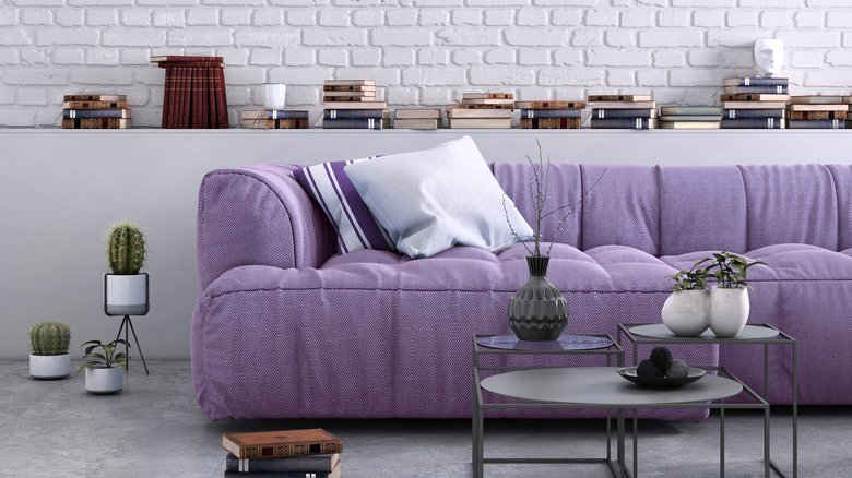
Pastels are soft, which can help create a calming atmosphere while providing a pop of color to a light and airy home. However, decorating with pastels can also be tricky, as the design can easily become washed out or even look childish. That doesn't mean these shades are impossible to make work in a stylish space.
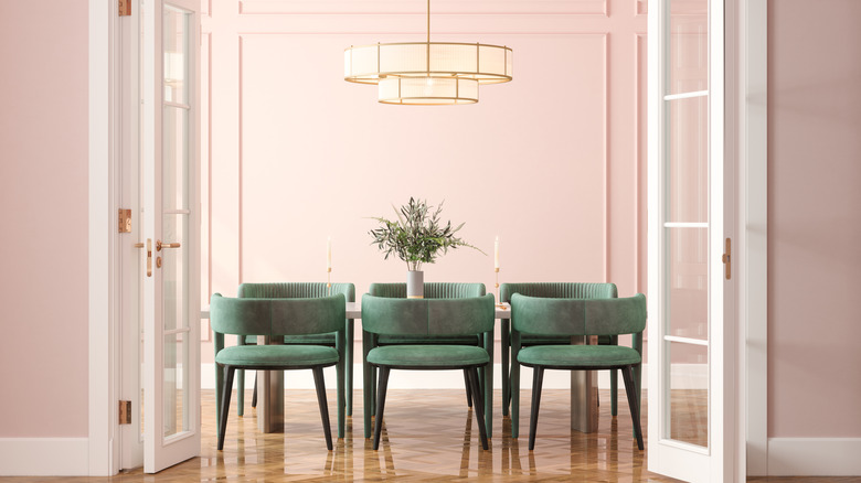
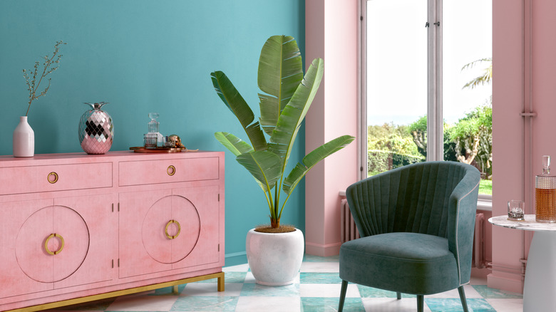
Ground pastels by using darker or more saturated colors as a contrast. Shades like navy, hunter green, or mustard yellow can continue to add color without making a room's color scheme feel like a giant Easter decoration. Even some neutrals like gray, black, and taupe, as well as natural wood tones, can be great options if you're not looking to add more color.
Monochromatic pastel color schemes can also look chic. Play with lighter and darker versions of one shade to create a stylish monochromatic scheme. This will ground the pastels, preventing them from making a room look too childish.
Popular pastel aesthetics
From a quick glance at social media, it's clear that pastels are definitely having their moment. Danish pastel and modern pastel are taking the design world by storm, embracing the colorful and playful feeling of pastels but with an artistic edge. These viral aesthetics unapologetically put pastels at the forefront of the designs. Modern pastel takes the clean, sleek lines of modern interiors but replaces the neutral-on-neutral scheme with brighter colors. Danish pastel takes inspiration from Scandinavian design, again, with a lot more color.
Both of these aesthetics often feature uniquely shaped candles in colorful pastel finishes. Main pieces of furniture, such as coffee tables, sofas, and nightstands put these soft shades at the forefront while decorative objects, art, light fixtures, and mirrors incorporate pastels as well. And, of course, accent pieces like blankets, pillows, and area rugs feature all different pastel hues.
The difference between the two aesthetics comes down to the details rather than the colors. Modern pastel is sleeker, with straighter lines, and incorporates more natural woods and neutral shades. Danish pastel, in contrast, features more curvy lines, abstract shapes, and much more color than it does neutrals. However, both of these aesthetics show how pastels can be the stars of an interior design scheme.