Why Red Paint Is More Temperamental Than Other Colors
Red is bold, bright, and dramatic, but when it comes to painting, it's the problem child of the pigment world. This energetic color earns its diva status because of how much work you need to put into using it. Although it's a strong color, it doesn't hold up to the elements, and it also requires more than a few layers to give it a nice, rich color. It's also difficult to make everything blend together, which can leave you with an uneven and unprofessional-looking paint job.
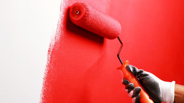
One application tip that's particularly helpful when working with this demanding vermilion hue is called the wet edge method. This technique ensures that the paint blends together seamlessly and reduces the risk of creating noticeable lines, which are also referred to as lap marks. Using the wet edge method involves continuously rolling the paint without allowing it to dry in between sections. When you're painting with red, this will help you achieve a smoother and more uniform finish.
How to work with red paint
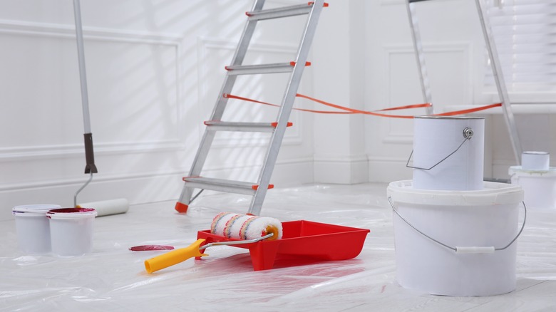
Dealing with the quirks of red paint can be a bit of a ride, but there are still some tricks you can use to make it work to spruce up your humble abode. One trick is to opt for lighter shades of red that keep things more subtle and versatile. You'll still get that energetic vibe without feeling like you've walked into a circus tent. In addition, choose high-quality paints and pigments when working with high-maintenance colors like red. Premium products often contain better formulas and have a higher pigment concentration, which can give you more coverage and better resistance to fading.
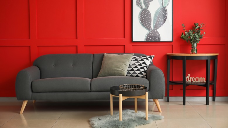
Always apply a primer before going to town with your red paint and brush. It's recommended to apply a gray-tinted base coat as opposed to one that's red-tinted because gray-tinted primer improves overall coverage. It also makes touch-ups much, much easier. If you have a red that might be a bit too overwhelming for a room, consider using it as an accent color or use it in small doses. Think furniture, art pieces, or cool decor items that bring in that fiery energy without going completely wild. Red also pairs well with beige and gray.
Don't cross the red line
While red paint has the potential to create an energy-infused atmosphere, it can still bring a lot of challenges along for the ride. The primary issue is achieving a nice, even coat. Despite using the appropriate rollers, this painting step can prove challenging because red pigments, particularly the darker shades, tend to have a lower opacity and a translucent base. This means that you'll run into trouble getting the paint to adequately cover your wall, which will result in uneven color distribution. As a result, the underlying surface might show through, which will create lighter or patchier areas. To get that nice, uniform finish, you'll have to use multiple coats, which means more time being wasted and also more money leaching out of your wallet.
Additionally, red paint doesn't play well with sunlight. So once you've finally finished that nice, bold crimson accent wall, you'd better hope there's no window letting the sun's radiant golden rays shine directly on it. That's because the color red, along with yellow and orange, tends to fade and lose its punch when it's exposed to too much light.