The Design Mistake You're Making When Selecting Curtains Is Playing It Too Safe
If you're on the precipice of initiating a new design story in your home, that's an exciting place to be because there are so many possibilities. You can create a whole new world by switching up your furniture, paint choices, and decorations. You could also trade in your window treatments for something wholly unexpected — if you dare. Most of us have been conditioned to think that color matching is crucial in design. For example, we may choose a neutral decoration because it will match everything, or perhaps we steer clear of a certain color because we've been told that it would clash with another tone in our home. When following this rule, we can play it way too safe when making decor decisions. Instead of making a design mistake with your curtains, get inspired and consider using different-colored fabrics on your windows.
However, a word of warning: becoming more courageous with your color choices still requires an ordered approach. Thoughtlessly throwing differing colors together for the sake of novelty could create a nightmarish and exhausting room. We encourage you to think like an artist. Artists aren't afraid of color, but they choose to use them in deliberate ways.
How to make bold design moves with your curtain choices
You can implement this design aesthetic at differing levels depending on how eclectic you are and what your tolerance is for taking design risks. For maximum boldness in a room with multiple windows, we love the idea of using identical curtain panels that feature different colors. An important caveat here is to of course take the colors of all your existing decor — furniture, artwork, rugs, and walls included — into account. Ask yourself if your room's palette is predominantly warm or cool. We suggest that you choose window treatment colors that live on the same spectrum of warmth or coolness to maintain harmony. For instance, red, orange, and yellow are all warm and harmonious, while green, teal, and blue all work together on the cooler side.
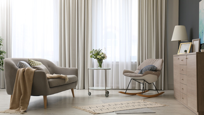
Saturated hues might feel too intense. Instead, you could get sheer panels, which create a lighter feel, or ones in pastel tones. If you'd prefer to only use one uniform color for all your curtains but still want to shake up the vibe, a daring choice is to get identical colors but in completely different textures and patterns, like cotton and boucle curtains in the same soft yellow shade. Since you want to allow in the light, extremely dark curtains may not be ideal in the living room; otherwise, the sky's the limit.