Bedroom Paint Colors That Will Be Huge, According To Our Paint Industry Experts
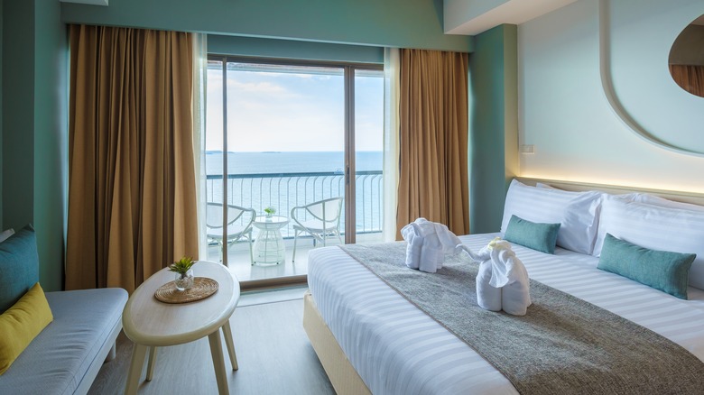
A comfortable bedroom is essential for good sleep. Part of creating that relaxing bedroom is fostering an environment that aids in calmness and relaxation. One of the best ways to control the environment of your bedroom is with the color you surround yourself with. Color can impact mood, so choosing the right paint color for your bedroom is essential. In general, warmer shades are stimulating and energizing, while cool colors are more soothing. However, with thousands of shades of a single color available, it can be hard to settle on that perfect one. Luckily, paint and color experts have insight into what the best shades for the bedroom are.
The shades are unique takes on popular colors that will help you relax as you unwind in the bedroom. Sue Kim, the Director of Color Marketing at Valspar, and Ashley Banbury, the Color Marketing Manager for HGTV Home by Sherwin-Williams, spoke exclusively to House Digest to share the colors that are certain to be favorites in the coming year. These paint shades work in primary bedrooms, kids' bedrooms, and even spaces for guests. Whether you paint one accent wall or color-drench the space from ceiling to floor, these are the bedroom paint colors to consider.
Renew Blue
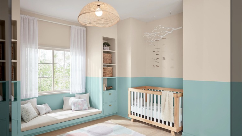
The epitome of a calming paint shade is Renew Blue by Valspar. The shade is Valspar's Color Of The Year 2024, so it makes sense why it's expected to gain popularity for bedrooms in the coming year. "This nourishing, green-inspired blue brings a calmness to the home," Sue Kim, Valspar's Director of Color Marketing, says exclusively to House Digest. Blue is one of the top colors that creates a relaxing environment and is ideal for any bedroom.
Kim believes this is the perfect choice for a soothing baby room. "When a water-inspired color comes into the baby's room, the color can nurture growth and inspiration. Try using two colors to create visual interest with a grounding, earthy shade like beige. Bring in natural materials like wood to help elevate the airy mood." As Kim states, the color pairs well with light neutrals and earthy shades to help create a calming space.
This color would work well on the ceiling to be reminiscent of the sky with neutral shades on the lower half of the room. Give the paint a modern touch by bringing the color on the ceiling down a few inches, which can also help the room appear and feel larger.
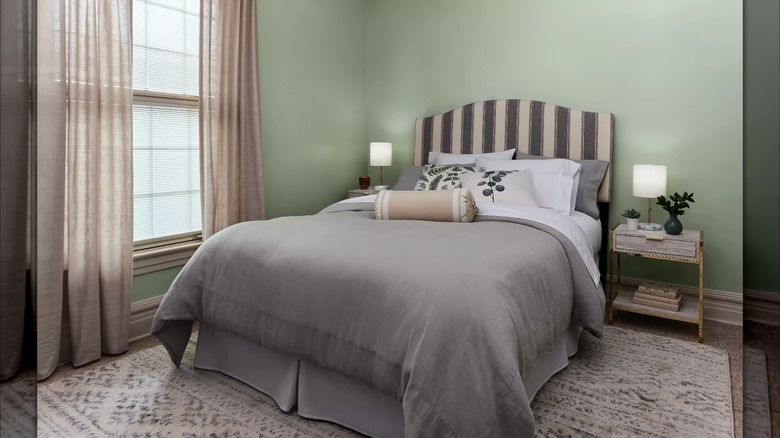
Utaupeia
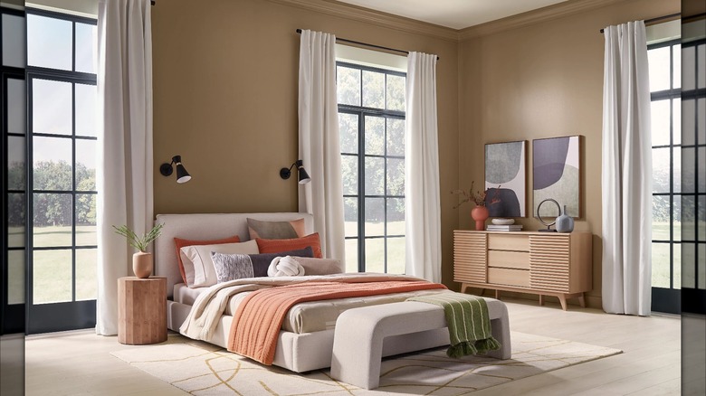
A neutral color palette helps to create a calming atmosphere by not overwhelming the space with potentially competing colors. Neutrals are also incredibly timeless, so the space will remain soothing for years to come. Utaupeia is "a modern neutral rooted in comfort, perfect for creating a restorative aesthetic in the home," Ashley Banbury, HGTV Home by Sherwin-Williams's Color Marketing Manager, says exclusively to House Digest.
While cool neutrals, in particular, grays, were once popular, beiges and greiges have become interior favorites. "Warm neutrals are getting reintroduced back into the home and have a new appreciation, creating modern comfort," says Banbury. "This hue is perfect for creating a backdrop for artwork and decor. Pair this warm brown tone with soft white linens and pops of color to add a layered look with your favorite accents." The comforting neutral is the perfect base to create a serene bedroom. Warm light to medium brown wood furniture will add the perfect accent to this space. Other warm colors, such as oranges and reds, will complement the tones of Utaupeia.
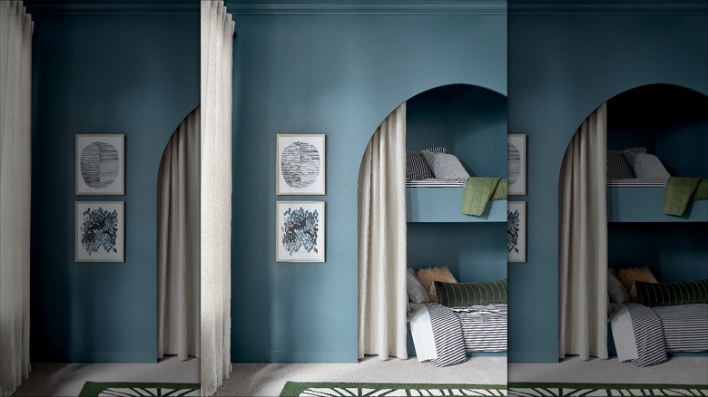
Mountain River
Darker shades of paint have been trending, and that isn't going away. Take the standard calming blue and give it a darker twist with Mountain River from Valspar. "A rich and dark shade that provides a peaceful mood in bedroom spaces," Sue Kim explains exclusively to House Digest. "This midnight shade can embrace large spaces with low bedroom lighting, creating a calming space." Dark paint can also aid in being well-rested by keeping the room dim. Darker spaces have been found to help people sleep better and wake up feeling more rested. So, not only will your bedroom be stylish, it can help you sleep better.
However, many homeowners are nervous about committing to such a bold and dark color. Lean into the boldness by color-drenching the room, painting the doors, built-ins, and other accents of the room. Or opt for a statement-making feature such as painting the ceiling. "Focus on the high and low textures of bedding and pillow to capture focus during the quiet moments," Kim suggests. Lighter bedding with a variety of textures can also soften the dark shade of paint.
Waterloo
A misty blue is a great option if you want a darker shade of paint but want to play it a little safer. Waterloo from HGTV Home by Sherwin-Williams is "a medium blue with depth that wraps you with comforting color," Ashley Banbury says exclusively to House Digest. The warm gray tones help soften the color without taking away any of its depth. Reap all the benefits of a darker blue in the bedroom without feeling like it's so dark or cave-like.
The shade is also extraordinarily timeless and versatile. "A hue that balances playfulness with elegance, a perfect shade for a kids' room that you want to grow with them," Banbury explains, "Pair with supporting blue patterns for a new play on monochromatic look; add fun natural greens to create a dimensional look." HGTV Home by Sherwin-Williams suggests Mountain Air as one of the coordinating colors for Waterloo. Pairing this shade can offer a pop of brightness that balances out the moodiness of the darker shade. Waterloo will also pair well with bright whites and light-toned wood furniture. Opt for warmer pieces that will complement the warm gray undertones.
Garden Flower
Green is reminiscent of nature, and using it in the bedroom creates a tranquil environment. "The presence of green in the bedroom helps align our body and mind with natural cycles," Sue Kim says exclusively to House Digest. The softness of Garden Flower by Valspar fills that role perfectly. "With an abundance of nature, the green helps the space to feel expanded beyond the wall and brings the outdoors in." The lighter shade will help make a room appear larger without losing any depth of color.
Garden Flower will go well with a variety of neutral tones that will help ground the shade. Using natural materials, such as wood, jute, cotton, and rattan, will create a space that feels connected to nature. "Pair with warm grays and patterns from nature for a good night's sleep," Kim suggests. Opt for accenting wallpaper of floral motifs or forest scenes to bring visuals of nature into the room. Consider easy-to-care-for plants such as philodendrons, English ivy, and pothos to add a living element.
Aloe
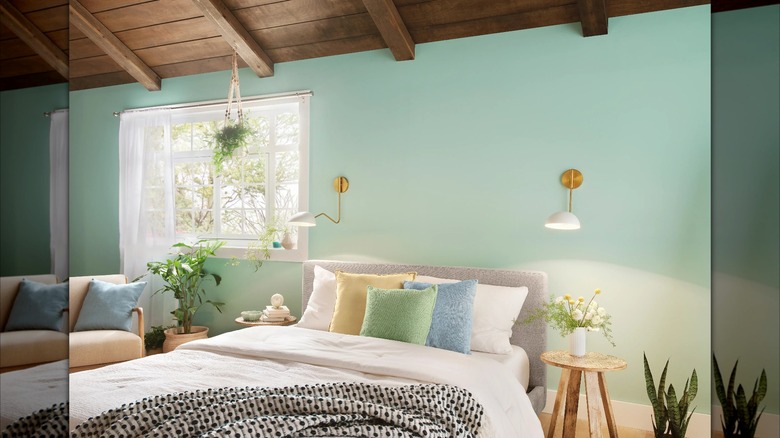
Another way to embrace nature is with Aloe from HGTV Home by Sherwin-Williams. Inspired by the healing plant, this paint color will give a similar feeling of relief to a room. Ashley Banbury exclusively tells House Digest that the color "is a soothing green tone with blue notes, a shade that adds tranquility and calmness to a bedroom." She adds that it is a "well loved hue that has the ability to brighten up a room but also create a vibe that feels restorative." It's a bit lighter than Garden Flower, so it works for those who want to work with green but add an illuminating touch.
For styling, "Accent with live plants to embrace the calmness and layer in texture of woods and linens to create a space you never want to leave," Banbury suggests. Soft materials like cotton and linen bedding and pillows with lots of texture complement the softness of the color. You can even bring in a little glamour with brass finishes for light fixtures and decorative objects.
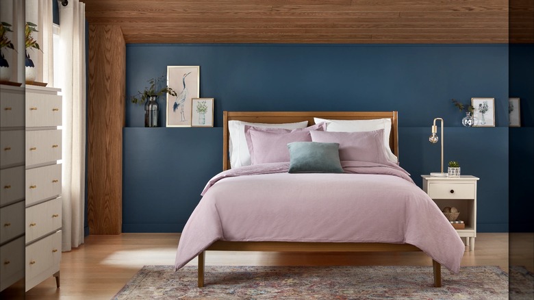
Dusty Lavender
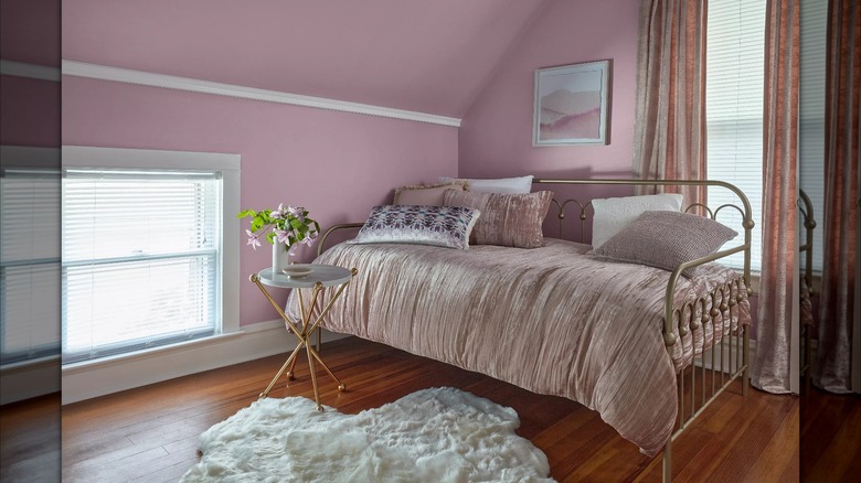
Purple, as a cool-toned color, has many of the calming elements of blue with a slight feminine touch. Dusty Lavender by Valspar is a dreamy shade that can make a bedroom look a bit more interesting. Sue Kim describes Dusty Lavender exclusively to House Digest as "a playful pink with purple undertones that make the bedroom feel alive." She continues, "With the recent trend of Barbiecore, the pink shades are getting more attention within the home." Embrace femininity by pairing this paint shade with other soft elements like velvety, plushy bedding and pillows and soft, curved shapes with the furniture. Choose similarly soft materials for rugs and curtains.
This shade of paint can also lean a bit more dramatic and glamorous with the right materials. "Try pairing the purple-toned pink with warm metallic touches to bring an elevated look to the room," suggests Kim. Use gold accents in places like the headboard, nightstands, light fixtures, and decorative details. Pair with whites to add a crisp element, or lean totally into femininity by using a variety of shades of pink and purple to create an updated monochromatic bedroom.