Jenn Todryk Explains How To Add Contrast To Your Kitchen Without Overdoing It
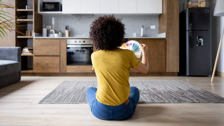
Creating contrast in an interior space is all about finding ways to combine opposing features in ways that make sense. While it's about the two different sides, it's also about balance and achieving harmony. On a Season 3 episode of "No Demo Reno," Jenn Todryk was tasked with accommodating differing preferences in a household where the wife liked bold finishes and the husband liked a more natural vibe. The wife requested a high-contrast design in the kitchen, and Todryk decided to balance the tastes by contrasting light tan and dark gray instead of black and white.
She successfully struck a happy medium by combining dark countertops with a very light backsplash tile. "Lisa, you wanted that contrast. But instead of stark white and black, I softened it with a tan," explained Todryk (via Realtor.com). The kitchen's previous design had plain black appliances and very washed wooden cabinets so by using neutrals close to black and white, she was able to create contrast without the visual harshness of having two strong, opposing shades together.
Play with in-between colors
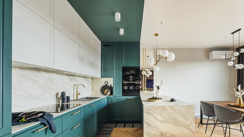
Color is one of the main ways to create contrast. It's easy to choose colors on opposing sides of the color wheel because those clashes are guaranteed to create visual interest in a space. Two complementary color combinations that will transform your kitchen are red and green and orange and blue. Black and white are, of course, another major combination that comes to mind. These are strong colors and shades that create high contrasts; however, it's so easy to overdo it. Jenn Todryk's clever method of going for the in-between colors, as seen on "No Demo Reno," helps to tone things down.
The way to do this is to move away from complementary color combinations and use analogous color schemes, which involve the colors that are next to each other on the color wheel. Instead of the stark contrast of orange and blue, for example, move to the neighboring colors that bring them closer together, like green and yellow, and you'll create a softer and more harmonious contrast in your kitchen. Take it further by exploring neutrals and more subtle shades so you can think in terms of coolness and warmth.
Cool and warm colors and shades
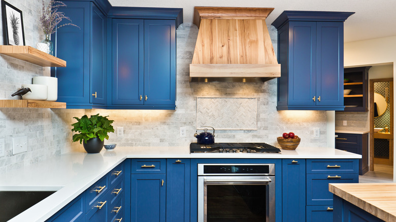
Jenn Todryk's use of dark granite and tan tiles is a great example of contrasting cool and warm neutrals to achieve a softer contrast. One combination we recommend for your kitchen is light brown and navy blue. You can use the deep, richness of navy blue for the cabinets and a warm, natural brown for the countertops. Look up detailed color wheels that show color families to get more ideas on what you can combine.
As you try to balance different colors and shades, know that you don't have to achieve a strict 50/50 division of coolness and warmth to achieve a good contrast. It's completely fine if you end up leaning a bit more toward one side. Todryk models this by sprinkling in some wooden elements, which increase the warmth in the space. Other elements in the room like the accent pieces, metals, and furniture are great ways to use neutrals to casually increase the warmth or coolness as preferred. Metal finishes and accent pieces like bowls and vases can be used for this purpose and will immediately add life to the color combinations you choose.