The Viral TikTok Home Decor Trend That Is Polarizing The Internet
TikTok has been a hub for interior design trends over the last year. The social media platform has been a place where interior designers have shared tips that people have tried in their own homes, ultimately creating the latest trend. The name for it is the "Unexpected Red Theory," as shared by interior designer Taylor Simon, who goes by @intayriors on TikTok. As Simon explains in the video, "The Unexpected Red Theory is basically adding anything that's red, big or small, to a room where it doesn't match at all, and it automatically looks better."
Simon shares images of unconventional red accents, such as red pedestal sinks and wall sconces, as well as color combinations that are uncommon, like red paired with teal and red next to purple. "Normally, you wouldn't think of pairing red and purple together," Simon continues. "But I'm petitioning for red to be a neutral color because it just looks good with everything."
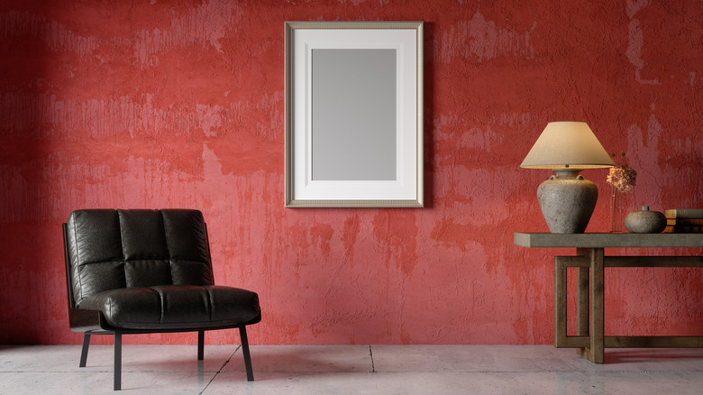
In fact, red is often a polarizing color because it's so bold and energizing. In a world where Japandi style and minimalist designs have become increasingly popular, adding a pop of red can be a really foreign concept. But with a variety of red shades available, finding the right one for your space and interior design style isn't as much of a challenge as it initially presents. What may seem like a random pop of red can actually be a thoughtful way to make a space more interesting visually.
Choosing the right red is key
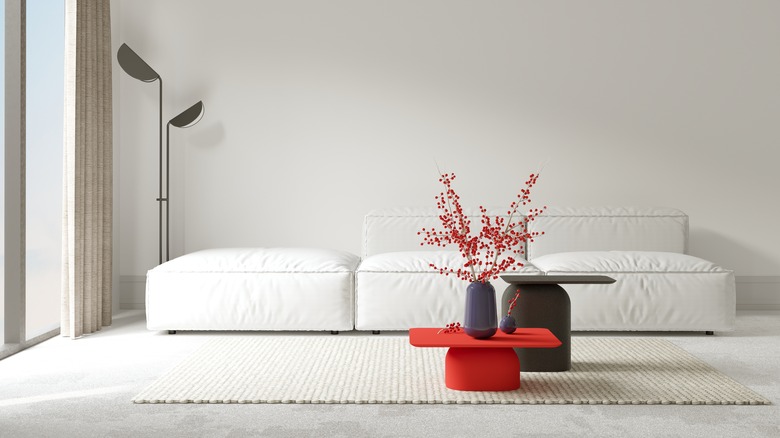
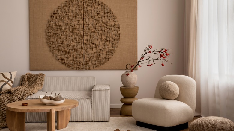
The idea of a pop of color isn't new when it comes to interior design, and the Unexpected Red Theory is a play on that. In the video where interior designer Taylor Simon explains this theory, she shows images of rooms with a pop of red from a light fixture, a piece of art, and a statement sink. While it may look like a surprising choice, in most cases, the shade of red is most likely well-thought-out. That specific shade was chosen to complement the other colors in the room, and the entire color scheme of the space looks unconventional but cohesive because of color theory.
Color theory is how colors work together and how they communicate a message. Red's connotations with boldness and passion make it an ideal color to use as a statement in a room. As for pairing colors, this is where a color wheel comes in. The six types of color schemes can help you choose what shades to have around the red accenting piece for the most pop.
For example, Simon provides an example of a piece of red art on a wall painted purple. Though they may not be two colors often paired together, red and purple are analogous to each other, which means they sit next to each other on the color wheel. Using the color wheel can help you choose colors that will complement the red, so you feel more confident about having such a bold statement piece.
The power of red all comes down to the 'unexpected pop'
According to the Unexpected Red Theory, practically anything in your home can provide that "unexpected pop." So what you choose to be that red accenting piece really has to do with how much red you want to show off in your home. One of the easiest ways to make a statement is, of course, paint.
Classic Burgundy from Benjamin Moore is perfect for adding a moody touch to a room and would pair well with deep purples or oranges. Or opt for something a little softer with Farrow & Ball's Rectory Red that would complement pinks and other delicate shades. Consider painting built-in shelves or wall trim to give the room something red. You can also paint picture frames if you want a smaller, more decorative accent.
Draw the eyes upwards with a bold light fixture, like this retro pendant light from Homdiy. The bold red color paired with the sculptural shape makes an instant statement when hanging in the center of a living room over a dining table. Or be more subtle with a wall sconce: the Loa Sconce from Sazera Stitches would give a pop to a cozy reading corner, especially with an accent chair and a side table to create a decorative vignette.
An interesting way to try this trend in your home would be to lean more on the natural side and opt for naturally red woods. Bloodwood, Eastern red cedar, and cocobolo have naturally red tones that can achieve this trend in a more subtle way.