The Paint Colors HGTV's Jasmine Roth Swears By For Minimalist Homes

If chosen correctly, neutral paint colors will create a calm vibe throughout a home, but it can be difficult to get the colors exactly right. Too dull, and your home can look uninspired. Too dark, and it can look gloomy. Too light, and the colors will barely have an effect. Enter Jasmine Roth of HGTV's "Help! I Wrecked My House," who kindly shared her go-to neutral paint colors for achieving a minimalist look without any of the dullness.
Making over a three-bedroom home for a couple and their six children, the colors Roth used throughout the house were Greek Villa and Egret White from Sherwin-Williams and Eastwood from Portola Paints. She also opted for almond and ivory matte porcelain tiles from Bedrosians. In the blog post accompanying the episode, Roth noted, "With six kids running around the house, Sarah expressed her desire for a very calming, neutral, and earthy color palette in the home. I decided to go with a classic minimalist look so that nothing in the home would compete for attention."
Here's how to incorporate Jasmine Roth's chosen neutrals into your own home
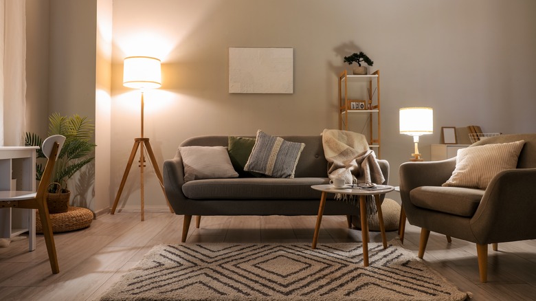
Described by Sherwin-Williams as a "sunny white," Greek Villa evokes exactly what its name suggests — a breezy European summer. It has creamy undertones that will infuse warmth into a room. We recommend using this color in your living room. Perfect for matching with pops of color to liven up your neutral color scheme, we love how it will bring a classic cozy feeling to one of the most used rooms in the house. Depending on the light in your living room, this color could come across as more green, so swatch before going ahead.
On the other hand, the gray undertones of Egret White give it extra dimension. We think it would be an especially good choice for a kitchen due to its grounded feel. Eastwood from Portola Paints is a light greige that will add depth to a space. We think it's the perfect calming neutral for a bedroom. Give your room an antique French feel with cream wooden furniture and pale blue accents in the form of cushions or bedding for a true Parisian vibe.
Tiling is also a great way to incorporate soft neutrals into your home
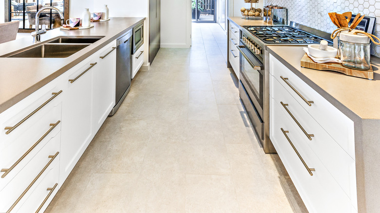
The second batch of neutral colors Jasmine Roth chose lies in tiles from Bedrosians — the Thaddeus Matte Porcelain Tile in the shade "Almond," and Clara Matte Porcelain Tiles in "Ivory." While Roth didn't share where exactly she used these tiles in her blog post, we recommend this type of tile for a kitchen. Porcelain tile makes for an excellent kitchen flooring choice. Not only is it durable, making it an ideal pick if you have small children like the couple Roth helped renovate their home, but it is also waterproof.
In addition, porcelain tile is relatively stain resistant, not to mention low maintenance. If you're worried about the tile being cold underfoot, add a rug for both aesthetics and practicality. All of the colors Roth outlined will work very well with one another, creating a cohesive look throughout your home. The earthiness of the shades will instantly bring a relaxed feel to a room, just what you need if you want to make a minimalist haven.