5 Colors You Should Never Paint Your Dining Room

From intimate dinner dates at home to boisterous gatherings with extended family, time spent in your dining room is often full of memories. The color in the background of those events often impacts the feeling of the space. Some hues create an inviting, happy space that makes people want to gather around your dining table. Others can have negative effects, from making you want to eat less to being too boring. Colors that designers often skip for dining rooms include blue, bright white, vivid reds, and overpowering shades of black. Choosing the color for your dining room walls is about more than selecting your favorite color. There's a psychology behind it that describes the way certain colors make people feel. Red is often thought of as an energizing color that could lean toward encouraging anger while green represents the calm of nature. Thinking about how you use your dining room and what feelings you want to evoke can help you decide on colors you should or shouldn't use.
Knowing which colors to avoid also depends on the details of the dining space. If it's open to other rooms, such as your kitchen or living room, the wall colors in those adjoining rooms should work well together rather than creating friction. If you already have a dining table or decor that you love, consider how different paint colors will complement those pieces. Once you eliminate the colors that don't work, you can focus on the hues that will make a statement in your dining room.
Blue could suppress your appetite
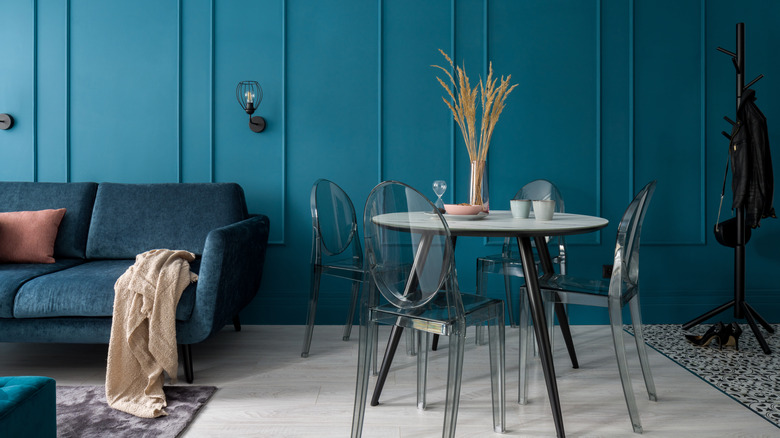
Blue hues are said to bring a calming, serene feel to your space, which might make it seem like an ideal choice for a dining room. After a long day, a peaceful meal sounds like the perfect option. Plus, it could keep conversations calm when you gather extended family members with different opinions. However, the reason some designers recommend avoiding blue in dining rooms is because of its potential effect on your appetite. The color is thought to suppress your appetite, which contradicts the purpose of a dining room. Some speculate that blue might be an appetite suppressant because it's not a color you see in nature as often. Another theory is that people associate blue with spoiled food because of the bluish-green fuzz that grows on older food.
If you're looking for ways to incorporate blue into your home decor, consider using it in a bedroom or bathroom, where you'll likely want a calm space. Touches of blue in the accents in your dining room can introduce some calm into the space without being overwhelming. Another option is to choose green as your wall color in the dining room. It's also known as a serene hue, and it offers an earthy vibe to the space.
White can seem too stark
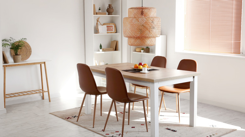
Crisp, clean, and modern come to mind when you paint a room white. It's an easy color choice that goes with all of your decor. But it also lacks personality and creativity. In a room meant for warm interactions with family and friends, white can come off as too sterile, cold, and boring. White walls also get dirty easily, which makes your dining room more difficult to maintain. If you have kids who get messy at meal times, splatters of food or greasy could make quite the impression on white walls — and not in a good way.
Going with brighter colors on the wall adds personality to your room. It can generate excitement and encourage conversation in a space that's often used for entertaining. While white isn't a recommended dining room color, you can dress it up to make it more exciting by finding other ways to infuse the room with color. For example you can use blank white walls as a backdrop to highlight your favorite artwork or decor. Before painting your walls white in the dining room, consider the effects of undertones. Look for warmer shades that make the space feel more inviting. Red, orange, and yellow undertones can add that warmth. Meanwhile, green, blue, and violet undertones make the white paint lean cooler, which could feel less welcoming.
Dull neutrals can make it boring
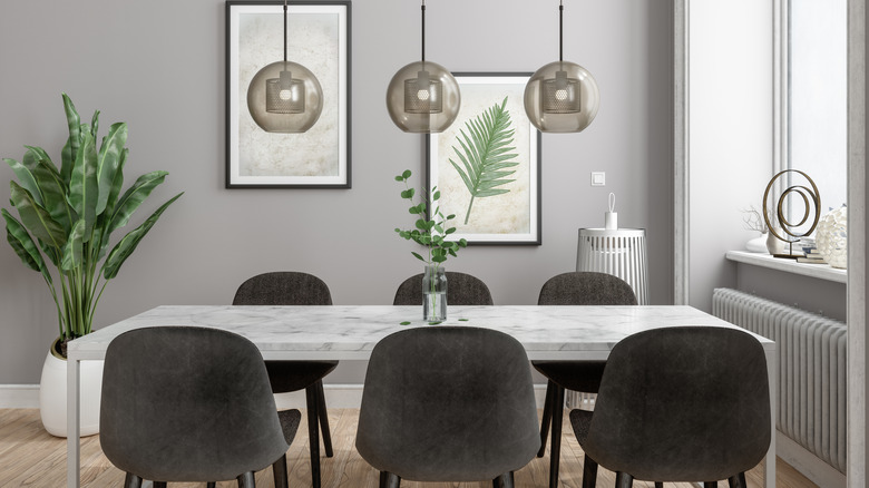
If white is out, gray is surely a good substitute, right? You can make neutrals work in a dining room, including gray and off-white shades, but they can feel a little dull in a room that's often a hub of activity. Cool gray shades, in particular, can feel unwelcoming or sterile and decrease the energy you feel when you enter the dining space. This includes gray paint colors that feature blue, green, or purple undertones.
If you want to stick with neutrals, be aware of the mistakes you're making when choosing a gray paint color. That includes not considering how natural light in your dining room will impact the hue. For example, natural light coming from northern exposure tends to highlight cooler undertones, so a cool gray wall color might look even cooler than you expect in a dining room with this type of light. Choosing a warmer gray color — one with yellow or brown undertones — can make your dining room feel cozier and more welcoming. This is where the popular greige color could come in handy. By mixing together gray and beige, the color keeps your walls neutral wall increasing the warmth.
Bright red can cause negative emotions
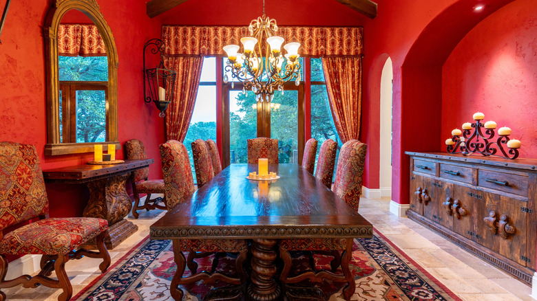
In color psychology, red creates energy, excitement, and passion. While that might sound like a great mix for a lively space like a dining room, red is also said to cause anger. That's not the emotion you're going to want for a room where family members gather. Red could also make your dining room too energetic, overwhelming, or aggressive, which isn't great if you're going for a more relaxed space where you can enjoy meals and conversations.
Red in your dining room might also make your home more challenging to sell. According to Fixr, their report indicates that red tops the list of colors to avoid if you're going to put your house on the market. However, if you still like the idea of having red walls in your dining room, move away from bright reds and choose something more muted instead. Deeper colors take out the harshness of the hue, leaving a warm look that feels inviting while amping up the energy of your dining room. Terracotta pulls in red hues while offering a lighter, paler look compared to bright red. If you want a richer look, opt for maroon to incorporate brown undertones or burgundy for a hint of purple.
Black can be too heavy
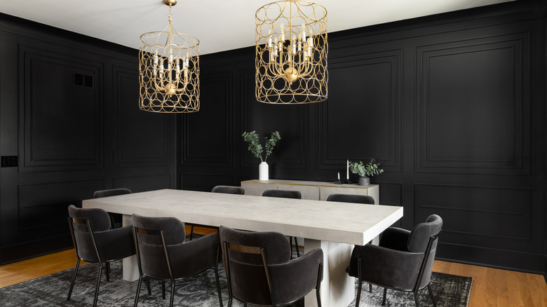
Black design elements often lean toward elegance and sophistication. But the dark, potentially overpowering color, can quickly close in on a dining room. And if your dining room is on the smaller side, going too dark can make the space feel enclosed. It creates drama, but it doesn't create an inviting atmosphere. Like many other potential dining room colors, black can be found with cooler or warmer undertones which can affect how it shows up in your room.
There are ways to incorporate black into your dining room without painting all of your walls the dark color. You might choose one accent wall or paint just the wainscoting black, while a lighter color is slathered on the rest of the wall for balance. That way, you can get the drama you crave without making the room too dark. Choosing black furniture, artwork, rugs, and other decor is another way to sprinkle dramatic tones into the space. If you want a truly unique look, consider painting your dining room ceiling black instead of the walls. Black is a trendy ceiling paint color that can add depth and lend visual height to the ceiling, which could make your dining room feel bigger. Or consider a different dark color to ramp up the drama. Charcoal gray gives you the rich elegance of black but with a softer look.