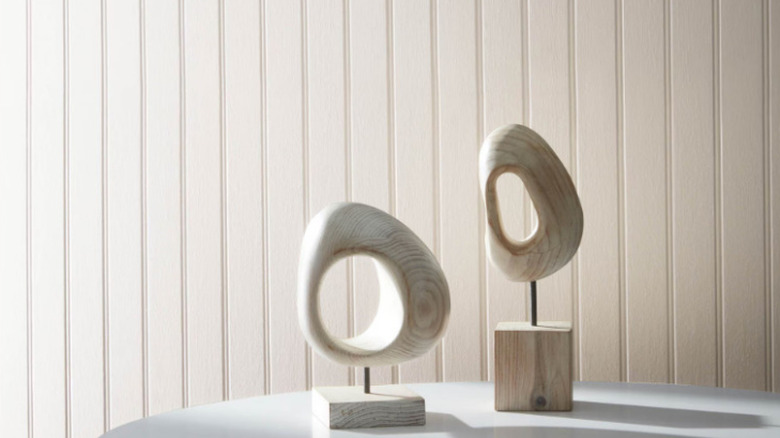
10 Warm-Toned Gray Paint Colors That Keep Home Design Neutral But Cozy
While the trendiest paint colors can feel punchy and striking, neutral tones will never go out of style. Warm gray is a timeless choice that can make your home's ambiance cozy and inviting while still looking sophisticated. According to paint experts at Benjamin Moore, "There is an undeniable sophistication to gray. Paired with almost any color, from scarlet to amethyst to sapphire, gray paint colors provide balance."
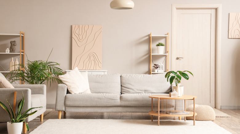
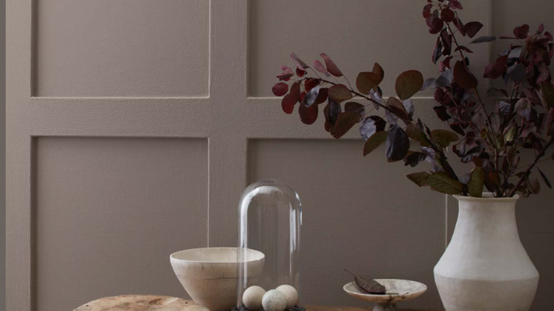
The beauty of a gray paint is it's understated enough to complement other accent colors without overwhelming the room. Choosing a warm gray instead of cooler tones will make your rooms feel more welcoming and refined. These tones blend beautifully with natural wood elements and can provide grounding contrast when paired with richer shades. Warm grays reflect beautifully in soft, natural light, and they won't look flat, which tends to happen with cooler tones. Here are 10 stunning warm gray paint colors that will keep your home's design neutral but enveloping.
Revere Pewter is a timeless bestseller
Revere Pewter is one of Benjamin Moore's bestselling colors. This uplifting shade can brighten your rooms without making the walls looked washed out. Revere Pewter is a part of Benjamin Moore's historical color collection, proving it can stand the test of time. It pairs beautifully with other effortless neutrals, like deep Chelsea Gray or crisp White Dove, and it's understated enough to be used throughout an entire house without being overpowering.
Agreeable Gray is versatile and welcoming
Agreeable Gray is another bestseller, and an expert pick from Sherwin Williams. The color's name is fitting because according to the paint brand, Agreeable Gray "is the perfect complement to just about anything. With a beige undertone, this gray exudes a subtle warmth." The color looks especially good when paired with rosy coral colors and serene shades of off-white. This shade can fit effortlessly into any room of the house and is ideal for pairing with a vibrant accent wall.
Warm Stone is earthy and refined
Sherwin Williams' Warm Stone is a deep gray tone reminiscent of nature. This sophisticated shade is a little bit darker, making it perfect for hiding ware in high-traffic rooms. This earthy and refined color exudes coziness, making it an especially comforting choice for bedrooms and living rooms. Warm Stone pairs harmoniously with other, lighter neutrals like Agreeable Gray and muted, earthy greens.
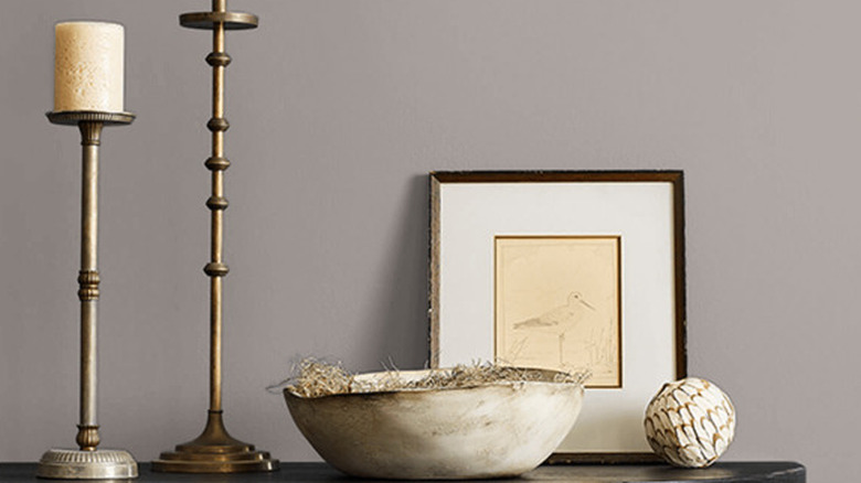
Elephant Gray brings a feminine touch
You won't want to avoid this elephant in the room. Elephant Gray's rich and rosy undertones can add a feminine touch to your home's design. Benjamin Moore explains, "Hints of violet and brown bring velvety richness to this medium gray." This color is a great lesson in how gray paint colors don't have to be dull and drab. The soft, blush undertones liven up this shade for a playful but serene hue. Elephant Gray complements deep, charcoal colors like Black Pepper or warm off-whites like Deserted Island.
Drift of Mist keeps things light and airy
Sherwin Williams' Drift of Mist is a prime example of how sometimes, less is more. This soft gray shade makes rooms feel light and airy and was even named Sherwin Williams' color of the month in February 2024. A major draw to Drift of Mist is how versatile the shade is. It coordinates well with warm browns and dark neutrals but is restrained enough to be used alongside pretty pastels and sumptuous jewel tones.
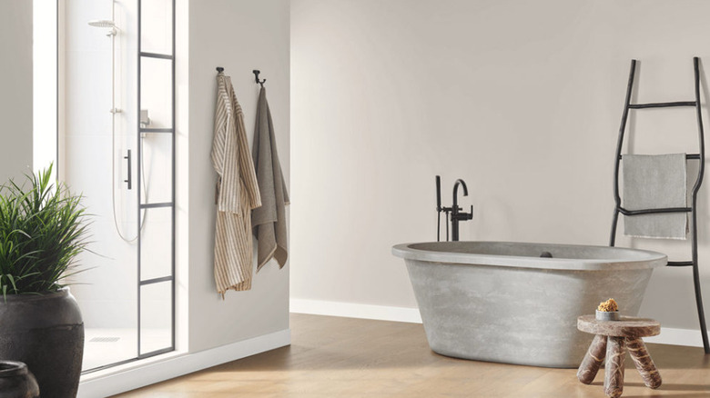
Polished Concrete is moody but inviting
Polished Concrete is a less popular neutral Sherwin Williams paint shade you shouldn't overlook. According to the company, "The red and violet undertones in this warm gray create a subtle but inviting glow. Perfect for making guests feel at home in your kitchen or gathering space." The welcoming, rich undertones set this underrated shade apart from duller grays with less depth. Polished Concrete pairs beautifully with lush purples, like Plum Dandy, and other lighter, softer neutral colors.
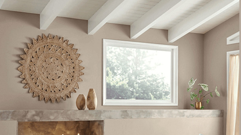
Nordic Gray is grounding
Nordic Gray from Benjamin Moore is a relaxing "greige" paint color perfect for a soothing home. This shade is so warm it almost feels like a soft brown, but the soothing gray undertone mellows it out for a refined effect. This shade is perfect for bringing a grounded, relaxed atmosphere to bedrooms or bathrooms. It complements earthy sage-green shades like Mountain Air or uplifting, delicate yellows like Greenmount Silk.
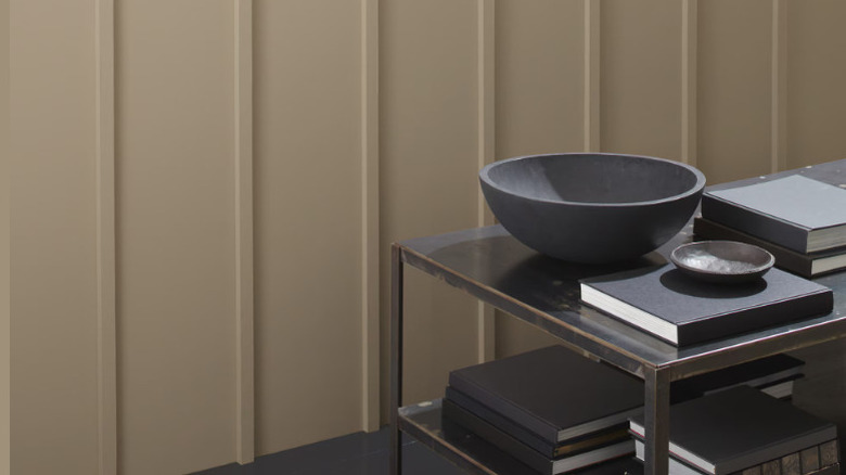
Perfect Greige is velvety and flawless
Perfect Greige from Sherwin Williams is another velvety tone that can effortlessly warm up a living space. This shade is a touch lighter than Nordic Gray but boasts red undertones similar to Polished Concrete. The result is a soft, flawless greige that earned it the moniker of "perfect." This creamy shade will fit right into a farmhouse kitchen and looks beautiful in soft, natural light. Match Perfect Greige to other paints with muted red tones, like Hushed Auburn or Pressed Flower from Sherwin Williams.
A la Mode is creamy and bright
Benjamin Moore's A la Mode shade is as decadent as its namesake. This velvety shade has gentle undertones of warm violet. The result is a bright but creamy gray that can light up your room. A la Mode has more depth than a stark or sterile white paint, and it exudes a complex warmth. This agreeable shade is compatible with a wide variety of colors, from muted greens to deep, rosy purples.
Coachman's Cape is exciting and mysterious
Last but certainly not least is Coachman's Cape from Benjamin Moore. This deep, rich neutral tells a story. "Like the swirl of a warm wool cloak at midnight — enveloping and mysterious — this color brings a sense of adventure," Benjamin Moore describes on its website. Coachman's Cape is a darker neutral that can add a dramatic flair to your home's design. This complex but elegant shade works beautifully alongside lighter grays and greens for effortless contrast.