The Trick To Picking The Perfect Paint Color Is Understanding How To Read A Paint Swatch
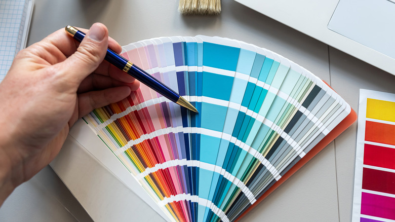
Picking the right paint color can be tricky, even if it isn't your first time. We've all come home with handfuls of paint swatches, creating a patchwork of chaos on our walls. However, paint swatches can actually confuse you more if you don't know how to properly read them. While you might know the design rule to always go for one shade lighter than you originally wanted, it's not that simple. Beyond the saturation of your paint color, there is one consideration you should not overlook — undertones. In fact, this is one common paint swatch testing method that everyone gets wrong.
You might be surprised to learn that paint swatches aren't actually a gradient of the same shade from light to dark. Although they are in the same family, the different variations can have completely different undertones on a single swatch. Undertones typically refer to a secondary color that has been mixed with the color of your choice. Meaning, you can have a shade of red that is warmer or cooler, depending on whether it has an added hint of yellow or a hint of blue. It may remain in the same color family, but it will always shift slightly towards another shade. Don't rely on the paint strip to show you a lighter or darker version of your original color choice.
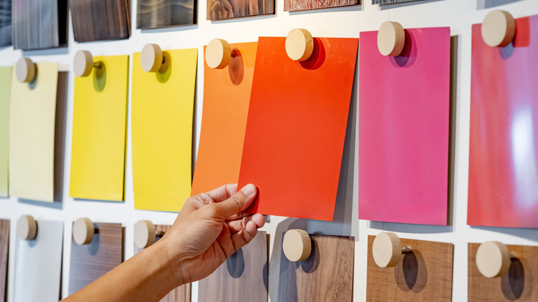
How to determine the right undertone for your space
Before deciding which undertone suits your interior, it's important to figure out how to read a paint swatch. If you're unsure which way your desired color leans, there is an easy test that'll help you determine the undertone of your paint color. You can also ask an expert at your local paint store to point out the most neutral, "true" version of your color and compare your swatch to the purest version of that shade. The true base color hex codes are as follows: red is #FF0000, green is #00FF00, blue is #0000FF, yellow is #FFFF00, and magenta is #FF00FF. If you are trying to choose a neutral shade, compare it to pure white.
If your goal is to create a cozy, welcoming atmosphere, a color with a warm undertone can help you achieve this feeling. Even if you choose the color blue, a warmer blue that leans purple will make your room appear less cold than a blue that veers toward green. You can also use the undertone to balance your space. If your home has lots of exposed wood or warm metals, a color with cool undertones can give it a more contemporary look. Don't forget this tip that'll make balancing warm and cool-toned paint a breeze.