The Bold New Twist On Quiet Luxury That's Taking Over Interiors
For those who enjoy the grandeur of plush fabrics lining jewel-tone velvet couches and connecting with guests over a pronounced sculptural coffee table, the loud luxury trend could be an appealing way to flaunt their home's expensive character. But for others, there's beauty in understated elegance and modest luxury, and they may opt for a quieter way of expressing it. Neutral and monochromatic color palettes, bespoke artisan furniture, and simple, minimalistic styling choices, for example, are the typical, modest ways of showing off a posh space. The problem with nailing the quiet luxury decor trend, though, is that the monotony of a beige color scheme paired with sleek, boxy furniture and overly clean lines can sometimes cause a space to look dull or sterile. One way to liven up subtle sophistication? Contrasting the space with bold, rich, moody hues.
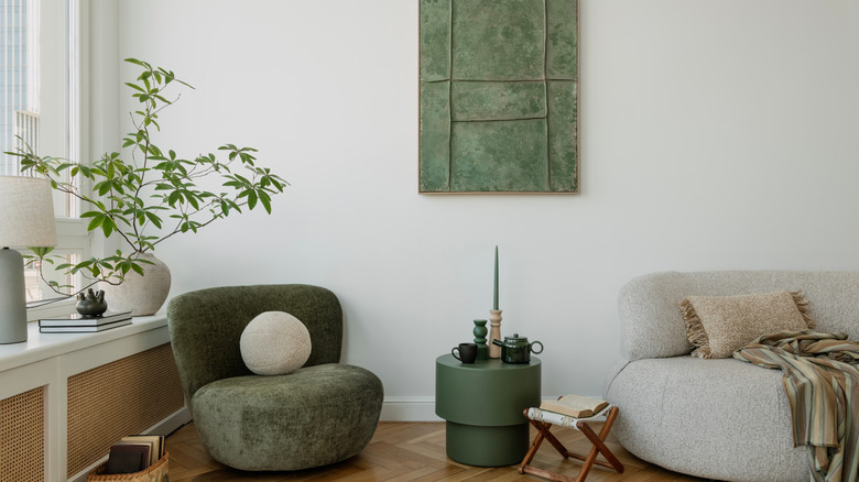
When it comes to coordinating interior styles tastefully, color is your best friend. The color palette you choose can brighten up your home, help your space feel bigger, or capture a specific mood in a room. Adding moody tones to an interior style like quiet luxury, which normally emphasizes natural, muted, often earthy tones, can instantly add visual appeal and make a space more intimate and cozy without compromising its elegance and expensive allure.
How to incorporate color into the quiet luxury trend
Like many spaces that fall at risk to dullness or monotony, mixing things up with bold, eccentric colors can be a subtle way to cheer up a space. To do this, you may think of using rich colors, like deep navy blue, velvety greens, or a deep, warm burnt sienna to capture moody elegance in your home without overpowering the space. Embellishing your walls with high contrast wallpaper not only adds depth, but it can emphasize the simpler, understated details, furniture, and finishes.
But you don't have to rely on ornate wallpaper or color to stun in your quiet luxury home. Even overscaled, bespoke furniture that has a pop of color that you match with an accent wall or shade throughout your home can still feel tame in a soft space while bolstering its character. A bold jade green craftsman coffee table and a coordinated chair, for instance, can be paired beautifully with a beige or earthy color palette. For an even more subtle approach, you may scale down on accent colors and only utilize small details that are more saturated. Cobalt blue throw pillows paired with a hanging light fixture, for example, can add an unexpected splash, but even small decor items, like wall art or coffee table books, can easily be swapped out to break up a neutral palette.