11 Best Painting Tips From HGTV Celebs Themselves
We may receive a commission on purchases made from links.
Through thousands of combined episodes on the network and decades of design and contracting experience, HGTV stars have made every painting mistake in the book. They've also tried every trick to see what's really worth it, and what's not. From selecting the right colors for each room of your house, understanding how light plays into the paint swatching process, and even the best techniques when it comes to actually painting, these stars know it all. And they aren't keeping it to themselves, either.
The best thing about these tidbits is that they're not just HGTV-star approved design trends, but they're timeless tips to make the entire process much easier for you. They're also quite practical and beginner-friendly. So, whether you're tackling a full home makeover or just refreshing a single room, these insider insights can help you avoid common pitfalls and get you results that you'll really love.
Taniya Nayak wants you to wait to paint
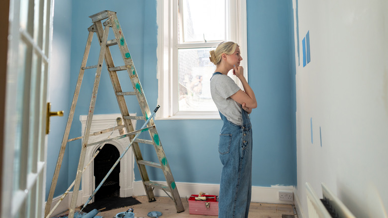
When selecting decor for your home, paint is easily the most customizable element. Even if you just want white walls, you can adjust the hue of the paint from a creamy, warm option all the way over to a stark, icy alternative. Because of this, Taniya Nayak of "Battle on the Beach" and "Build it Forward" suggests waiting to select your paint color until later in the decorating process. "If at all possible, postpone choosing your paint color until after you've selected artwork, area rugs, and draperies," she wrote for her website, Taniya Nayak Design. "It's much easier to select a color after you have these foundation elements in place versus trying to retrofit your furnishings to match a paint color."
Nayak emphasizes that picking the paint color last when designing a room has some key benefits. You won't have to worry about whether the great couch you found or the flooring material that's on sale will match the color you've already selected. To make the process easier (and often more budget-friendly), pick your paint after those more expensive buys. Plus, if you're struggling to settle on a color, having the rest of your room fleshed out may make things simpler. You can bring in photos of your couch and ask an employee to help you color match, or even bring a curtain panel to the store to see how things look together in person before committing.
David Bromstad recommends painting cabinets to add color and personality
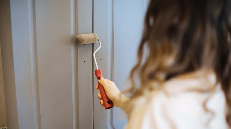
If you plan to paint your kitchen or bathroom, one of the first things you need to decide is exactly what you plan on painting. While most might settle for a fresh coat on the walls, David Bromstad, known lover of bright and bold colors, thinks that including cabinetry should always be a part of the conversation. "Personally, I love to add color to my kitchen by painting the cabinets," he told Apartment Therapy. "I prefer to keep my backsplash neutral and classic with some interesting shapes." So, instead of using tile or stone to do the heavy lifting, Bromstad recommends using paint, as it's less expensive and easier to change. "Painting your cabinets is such a powerful [form of] self-expression," he continued. "It's not gonna cost you an arm and a leg, and it's definitely going to make a huge impact."
Plus, if you know how to paint cabinets in just one day, transforming your kitchen, bathroom, or even laundry room is a quick DIY project that instantly adds more personality. Colorwise, the possibilities are endless. If you're interested in earthy tones, consider Farrow & Ball's Green Smoke, but if you like creamy neutrals, try Magnolia's Drawing Room, formulated specially for cabinetry.
Jenny Marrs loves neutral colors for sleeping spaces
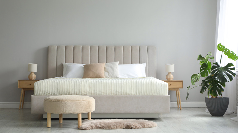
While research around color psychology is still ongoing, early results suggest that the colors we surround ourselves with can impact our moods. For example, white evokes feelings of calmness and stillness. This is the reason that most spas have relaxed, muted color palettes. This way, you are not energized by the colors around you, but rather calmed by them. The advice Jenny Marrs gives about the best bedroom colors follows a similar line of thought. "I really recommend avoiding loud paint colors and patterns in the bedroom because I want to promote a calming sensation the minute you walk into the room," she told Saavta. "I always recommend more neutral wall colors for the bedroom to help the space feel spacious and serene and leave all the fun, bright, and bold patterns for other parts of the home."
Neutrals can be any shade of white, gray, or beige. They function well as a base to build your design off of as well, because they complement most other colors and fit in with most styles, like classic farmhouse and mid-century modern decor. Popular colors to choose from include Benjamin Moore's Pashmina and Sherwin Williams' Agreeable Gray. Both hues are very earthy with warm undertones, but are not dark enough to box things in. This way, your sleeping space feels cozy and expansive, just as Marrs recommended.
Leanne Ford recommends white for your entryway
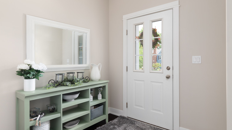
First impressions count, so Leanne Ford recommends choosing white paint for a light, bright entry into your home. "It feels so heavenly to walk into a light box. Everything and everyone looks good," she told Homes & Gardens. Ford is famous for her extensive use of white in her personal designs, as well as her knack for finding the perfect shade. She's opted for cooler hues that are sophisticated (but never sterile) as well as warm, creamy whites that are as cozy as fresh laundry. This means that a white entryway is customizable to a wide range of aesthetics. More traditional spaces can lean into warmer options while airier ones with more modern vibes can look for crisper shades.
Luckily, you don't have to master discovering these differences on your own, as Ford has plenty of pointers for finding your perfect match. Her go-to white is Shoji White from Sherwin-Williams. "It's a warmer, more natural-feeling white that is still clean and bright. It has a kind of ceramic feel to the color, and I love how that adds depth to any space that it is used in," she wrote for her blog. If you want something brighter, she recommends Behr's Ultra Pure White. "You can get this one right off the shelf and paint away," she continued. "It's the perfect white for a modern space, no tint, and it works well in high gloss and/or flat. I love it."
Lyndsay Lamb and Erin Napier always consider undertones
An undertone is a faint color that shows up underneath the main shade. It can change how the color looks depending on the lighting or what colors it's next to. For example, a gray paint might have blue, green, or purple undertones, which affect whether it feels cool or warm in a space. Many HGTV stars, including both Lyndsay Lamb and Erin Napier, recommend understanding the undertones of any paint color that you pick. "Most grays have a blue undertone that can tend to make gray feel very cool, but Gray Owl is unique as it has green undertones," Lamb shared on Lamb & Co. about Benjamin Moore's Gray Owl. "The green undertone does a great job of warming the color while letting it remain cool. Truly making it a neutral hue." Here, the shade's undertone makes all the difference between the color feeling energizing or relaxing.
Yet this isn't the only thing that undertones can do. For example, when Erin Napier wants to include a color that might be polarizing to some, she relies on undertones to make it more universally appealing. "If you're going to paint with pink, choose a dusty one with a yellow undertone that leans peach like Cape Sands by Valspar Paint," she shared on Instagram. "It reads as a neutral in natural light, never babyish or bubble gummy." If ever unsure about a color's undertones, they should be listed alongside the shade on the manufacturer's website.
Erin Napier never skips swatching on exterior projects
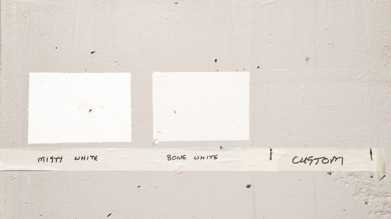
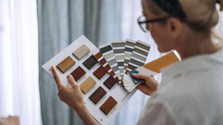
Once you know the general color and finish of the paint you want, it's time to start swatching! You can begin by bringing a few paint chips home with you to get a general idea of how the color looks in your space. From there, you can purchase small sizes (or sometimes get free samples) of the final contenders. While most might consider this process a no-brainer if repainting their living room, Erin Napier warns that it might not be top of mind when doing outdoor projects. "Paint tip: if you're painting an exterior, never skip swatching!" she shared on Instagram.
The reason swatching is especially important outdoors is that exterior walls are exposed to dramatically different lighting conditions throughout the day. Plus, nearby surfaces can affect how color reads in unexpected ways. A smart tip that builds on Napier's advice: Don't just swatch in one spot. Paint samples on multiple walls, especially those that get different types of light. You'll also want to pay attention to how the color interacts with its surroundings, too. For example, when painting your porch, you might notice that the wall above the gray sidewalk looks markedly different than the one nestled against the greenery of the flowerbed. If you swatch both of these spots, you won't run into any surprises later on.
The Property Brothers recommend matte paint if you have imperfect walls
Once you've selected your paint color, you also need to narrow down the kind of finish you want. Choosing the right finish for your house can be tricky, as there's no one-size-fits-all solution. However, if the walls you plan to paint have a few imperfections, the Property Brothers recommend you choose matte paint. "If you're doing a renovation, you really should do a matte finish," Jonathan Scott told House Beautiful. "Gloss or even semi-gloss shows every imperfection." Matte paint does a good job of hiding marks, scuffs, or even smaller nail holes because it has so much pigment in it. Drew Scott added that unless your drywall is in perfect condition, choosing this finish type is "more forgiving and more inviting."
Yet covering imperfections isn't the only benefit of choosing a matte paint. Depending on the amount of time you have available for a project, it can also save you plenty of prep time, too. That is, if you don't want to spend hours sanding down woodwork or filling in dents to prepare a surface for a glossier paint option, choosing matte can help you sidestep all this hassle. Plus, it gives you that soft chalky finish that's both modern and welcoming. Gone are the days when you have to opt for a higher sheen in kitchens and bathrooms. Now, paint makers are formulating matte finishes to also be washable and able to stand up to high-traffic spaces.
Joanna Gaines uses a grocery bag and a rubber band to keep brushes wet
When you're using a paintbrush, it can be a hassle to keep it fresh and ready to go during your project. This is especially true if you can't finish it all in one session. Luckily, Joanna Gaines has a unique hack to help with this problem. "Here's a simple tip that'll keep your brush soft and supple, so you don't have to clean everything up," she shared on YouTube. "Simply get a grocery bag, put your brush in there with the paint on it, and then just make sure you get all the air out."
She demonstrated this by twisting the bag in on itself a few times and then wrapping it around the base of the paint brush. From there, she used a rubber band and twisted it over the bag and brush, just like you might use a hair scrunchie on a bun. The great thing is that this hack lasts a lot longer than you might think. "You can keep it in this plastic bag for several days, so when you're ready to get back to your project, just use the same brush you started with," she continued. Gaines also recommends a few key paintbrushes, including a 3-inch flat brush like this Double Thick Chip Paint Brush for larger projects.
Jeremiah Brent emphasizes the importance of choosing paint colors based on the room's natural light
Once you have an idea of the paint color you'd like, as well as its finish and how it blends in with the colors around it, there is one final thing to consider. When you place your swatches to see what looks best, be sure to revisit them multiple times throughout the day to make a fully informed decision. "People often choose their paint color without considering the lighting of their actual space," Jeremiah Brent told Homes & Gardens. "What you see in a store with fluorescent lighting is very different from the natural light that will change with every hour in your home."
For this reason, test your interior paint swatches in at least three types of natural light: morning, midday, and late afternoon. If it helps you remember what you thought about each shade during each test, keep a note on your phone with a photo of each stage and a quick blurb underneath, including pros and cons or other thoughts for later. You should also take a photo with the artificial light that's likely to be present in the finished room, as per Brent's suggestion. This way, you'll know what to expect with the finished product.
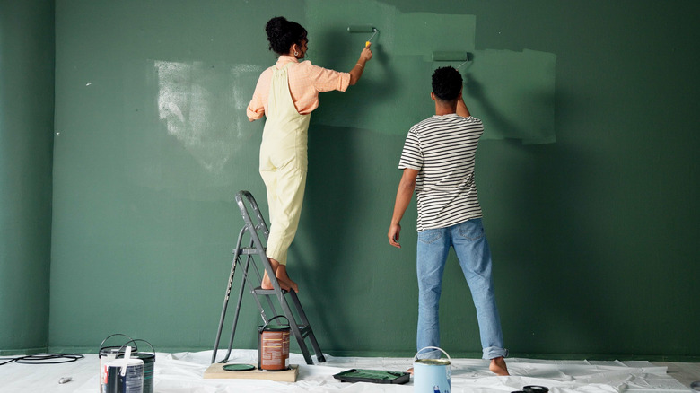
Vern Yip recommends painting in a W formation
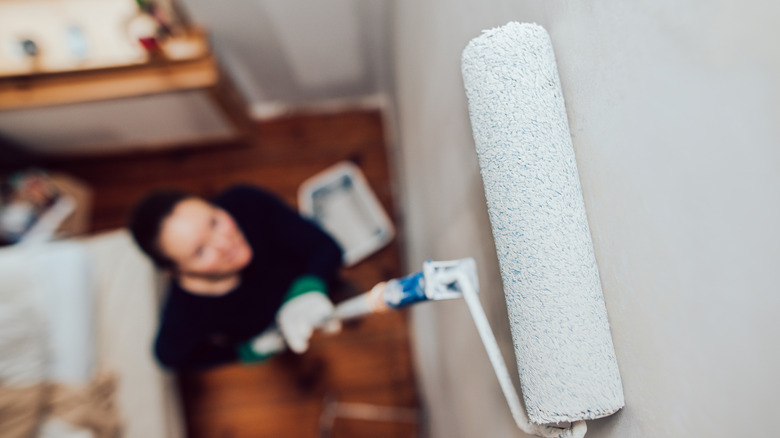
When you're ready to begin painting, the right technique can make all the difference in how good the final product looks. In an appearance on Live with Kelly and Mark, Vern Yip demonstrated the best way to make interior walls for a professional look. "Make a 'w.' Not up and down, or side to side," Yip shared with the audience. "Make a 'w' because that keeps it from streaking." You can then continue to paint over the large "w" you have created in small overlaps until the entire wall is covered. This gives the wall a polished look and applies the paint evenly.
For even better results, Yip also recommends choosing the correct nap for your roller, depending on the texture of your wall. The nap is the thickness and texture of the roller. It corresponds with the texture of the wall. For example, a smooth nap like the Bates-Paint Roller Covers paints quite evenly, as it doesn't need to reach into any dents or scratches. Yet if you are painting on texture, or a wall with lots of imperfections, try the Wagner Spraytech Smart Flow Roller, as it has a fluffier body and can get paint into more spots, including uneven surfaces.
Bobby Berk recommends using a paint pen for quick touch ups
Once your walls are primed, painted, and finished, you might be devastated to discover a pen mark, scuff, or other imperfection. Getting out a large brush for such a small project can be annoying, but luckily Bobby Berk has a great hack to make things easier. "My go-to hack for paint touch-ups," he posted on TikTok. "Just grab a paint pen. Fill up the tube with the included syringe. Pop the top on and touch up in seconds!" He showed how quick and easy it is to correct tiny mistakes without getting all of your painting supplies out.
To implement this tip, grab these Fillable Touch Up Paint Pens and use the paint you use on your walls in them. To avoid having to buy more paint for these situations, consider keeping your leftover paint, even if it's just a little bit, labeled and stored in a utility closet or basement if it's climate-controlled. This is because if paint freezes, or gets too hot over the years (as it might in attics or garages), it will likely become unusable.