Nate Berkus Has A Surprising Take On White Ceilings (And Alternatives He Loves Instead)

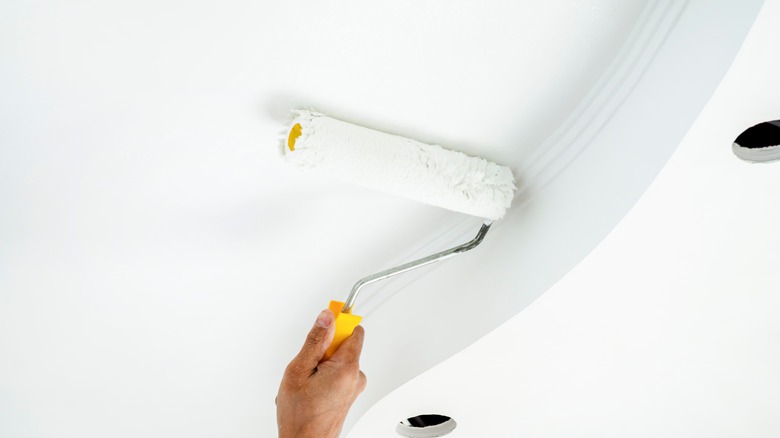
Some design elements have always been staples, like stone fireplaces and wooden floors, but one that's remained a constant through every decade is white ceilings. While this choice has almost become second nature in home design, sometimes a fresh perspective can reveal more possibilities for your ceiling space. For instance, HGTV star Nate Berkus is one interior designer who isn't afraid to try something new when it comes to ceiling paint. He recently took to social media to bust the myth that white ceilings are a necessary choice, noting that some of his favorite designs use unique ceiling color choices like pale pink and other subtle shades.
Berkus is often drawn to those special elements of personality in interiors, but he's not fully against white ceilings — he often encourages sticking to this classic choice in certain cases. However, with so many eye-catching ways to decorate your ceilings, there's no need to stick to the basics with white paint. Berkus lists plenty of pale paints as his favorite alternatives, offering a great way to experiment with painting your "fifth wall" in a softer version of your wall color. Whether you're opting for a specific neutral, trendy pink paint, or a subtle contrast to your walls, it may be worth bringing some stylish flair overhead.
Berkus' take on white ceilings
In a recent video he shared to social media, Nate Berkus responded to the question of whether your ceilings should always be white, saying (via Instagram) "Some of my favorite historic interiors actually have painted ceilings. And whenever I notice that — a pale pink ceiling, a pale gray ceiling, a pale green ceiling — it makes me really happy." While Berkus admires these stylish paint choices, his own designs regularly feature white ceilings. In homes with open floor plans, he's emphasized that you should keep ceilings white, as bold colors can often be tricky in these kinds of spaces.
Berkus has opted against white ceilings in the past, like the time he spruced up a basic ceiling for something more unique with bamboo layering. However, he tends to make these untraditional ceiling choices when working in smaller spaces. In Season 1, Episode 3 of "The Nate and Jeremiah Home Project," Berkus joked that they may paint everything white in their own home, but did choose moodier colors for the ceiling in their client's Victorian home to emphasize the historic architectural features around the walls. Pale gray, one of the alternatives Berkus enjoys, is often recommended for this purpose as it pairs beautifully with white molding and trim, or to highlight details like shiplap and vaulted ceilings. Like many of his design choices, the question of whether or not you should stick to classic white ceilings will depend on the unique character and layout of the home.
Light paint shades to match your walls
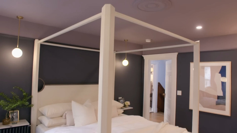
The pale shades Nate Berkus mentioned as some of his favorite substitutes for white ceilings can work great within one of the latest trends — painting your ceiling with a lighter version of the color on your walls. He took this approach in the primary bedroom of the Victorian home he designed with partner Jeremiah Brent, opting for deep, moody purple walls, and a softer tone of purple for the ceiling. This approach can be a wonderful alternative to color drenching, as it uses one cohesive color for walls and ceilings, but the lighter shade up above adds a stylish sense of dimension.
To nail this look, you can even create your lighter ceiling shade with a mixture of 80% white paint and 20% the color of your wall paint — it's a simple way to keep the hues harmonious. This trend is especially effective in smaller rooms. By using a lighter tone above the walls, it creates a visual effect that can make your space feel more expansive. This style can also suit a variety of palettes, from bold and vibrant to the classic neutrals Berkus tends to favor in many of his designs. He listed pale green as one of the colors he loves to see on ceilings, which is a great choice for this trend, especially if you're looking for a balance between natural, earthy tones and a hint of vibrancy.
Pale pink is a stylish choice for ceilings
When discussing the non-traditional paint colors he loves to use overhead, the first choice that came to Nate Berkus' mind was pale pink. Designers have noted that these subtle shades of pink offer a sense of sophistication and history, making any room feel warm and romantic. Berkus has a known fondness for historical homes, many of which from the Victorian and mid-century eras embrace this rosy hue. Pale pink specifically works well in home design as a neutral base, providing an earthy warmth that's chic and arguably more interesting than typical beiges or whites.
Cold neutrals — including some of the most popular shades of white used on ceilings — are the once-trendy paint colors that will make your home look dated in 2025. Pale pink, on the other hand, instantly creates a more personal and cozy atmosphere. Best yet, when swathed across ceilings, these warm pink tones bring the fifth wall closer to the ground for an intimate, cocooning effect that you can't get with stark white paint.