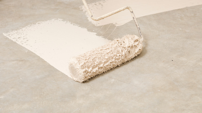
Avoid The White Paint Mistake That Ruins Low-Light Rooms

Choosing white paint for your walls may seem like a simple task, but with so many variations of white to choose from, it often turns into a delicate art to find the perfect shade for your home. There are plenty of tips to help you pick the right white paint for your space, but it's also important to pay attention to certain details that can make or break the look. Professional interior designers are no stranger to making this choice, and those who have years of experience sifting through white paint swatches have discovered some key factors and mistakes along the way. One thing designers often advise against in low-light rooms is choosing brilliant white paints, as they can come across as too cool-toned in these atmospheres, disrupting the overall look of the space.
Brilliant whites are meant to be the purest form of white you can get, often without any strong pigmentation or undertones — a true, neutral white. It seems like a safe bet for those who don't want their room to read too cold or too warm, but the way this shade reflects in different lighting can make it a much more complicated color. If your stack of paint samples for a low-lit room contains a shade of brilliant white, you may want to rethink your decision, and consider some more flattering hues to complement your space.
Brilliant white can make low-lit rooms look cold
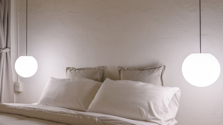
Cold neutrals are the once-trendy paint colors that will make your home look dated in 2025, which means those white paints with cooler undertones may not be the best choice for your walls. While these paints may have been more popular during the heyday of stark minimalism, home design trends are now more in favor of warm, cozy interiors. In accordance with the current styles, you might want to stay away from brilliant white walls in north-facing rooms that lack natural light, so as to not risk the color coming off as cold.
Pure, brilliant whites that don't contain any pigment tend to work best in rooms with natural light, as they will reflect this light throughout a space — reading as warm and natural among the daylight and typically cool among artificial light. Lighting has come a long way since the days of those warm and cozy incandescent bulbs, with innovations like fluorescent and LED lights that have made cool-toned light much more common. Unless you're positive that your bulbs are warm-toned, you should avoid brilliant white paint in spaces meant for comfort and relaxation.
Choosing white paint colors for low-light rooms
While it's true that brilliant white is meant to be a pure, non-pigmented shade of white, many formulas on the market under this name do possess subtle tints of warm or cool tones. It's common for some variations to have a gray or blue undertone that emphasizes its risk of looking cold in low-light, so it may be best to avoid this shade as a whole. Instead, some designers recommend shades like Benjamin Moore's "Swiss Coffee" for its warm tones that pair well with low-lit spaces, and look even better among dark wood furniture. A warm white is the trendy shade you'll want to incorporate into your home, with some of the most popular choices being Sherwin-Williams' "Alabaster" for kitchens, or Benjamin Moore's "Linen White" for living rooms.
You may think that a bright white is the way to go in order to brighten up dark spaces, but because these colors are highly reflective, they may make your space look gloomier in certain corners. A better choice may be to opt for off-whites or creamy whites that offer more depth with modest yellow or orange undertones. If you're not fully committed to white paint and are open to a warm, light neutral, a cozy beige can be a good choice for low-lit rooms that are meant to feel comforting, like bedrooms or cozy nooks.