Mistakes You're Making When Decorating With A Muted Color Palette

The colors in our homes set the mood and influence our emotions. A muted color palette contains hues that are less saturated versions of brighter colors. These shades are achieved by adding white, black, or gray to more vibrant colors. Muted shades are popular because they infuse the space with a relaxed, calm feeling and timeless elegance. Muted hues can also be some of the best paint colors to mask wear and tear in your home. While these shades work well with homes in many architectural and design styles, there are some mistakes to avoid when using a muted color palette, such as using hues that are too similar and lack contrast. You can fix these problems with more variation between shades and adding accent colors.
A muted color palette should not be confused with neutrals. Examples of neutrals include white, beige, gray, ivory, taupe, and black. On the other hand, muted colors are desaturated versions of other colors. Some examples of muted colors include sage green, creamy coral, dusty blue, terracotta, and olive green.
Avoid too much of the same hue
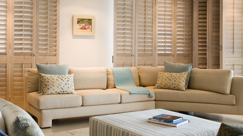
The shades you choose for your color palette can vary, depending on the look you are hoping to achieve, the style of your home, and surrounding environment. A common mistake is pairing too many similar muted colors. Minor variations in hues are easy to detect when working with brighter shades. For example, a bright cherry red beside a punchy oxblood. However, when you are using muted colors, slight differences in shades can blend together and look the same or even clash — soft salmon and bubblegum have too much in common.
A room with muted colors and no contrast can end up looking flat and lifeless. For example, using too much light blue alongside creamy beiges, or soft grays won't introduce enough contrast and can make the space feel dull. You can create contrast and add visual interest by using more variations in shades, bringing in more texture to the space, or including a few pops of accent colors.
Regardless of your home's interior design style, there are certain colors that should always be avoided when decorating in muted color palettes. While it's good to have a contrasting accent color, stay away from bright, highly saturated hues, neon, primary colors, jet black, and stark white, which can overwhelm the muted palette.
Mix muted colors, incorporate texture, and add accents
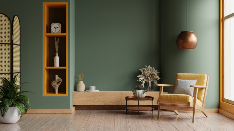
The first step to creating a muted color palette that works is to take inspiration from your surroundings. Considering the architectural style of your home, the surrounding landscape, and the room where you want to use muted colors can help you select the right shades for paint, furniture, and decor. Muted colors may suit some rooms better than others. For example, soft green is a popular muted color, and the areas where pros recommend bringing in trendy muted green paint tones include kitchens, mudrooms, and home libraries. When in doubt, the calm, soothing feel of most muted colors makes them a perfect choice for bedrooms. Property Brothers' Jonathan Scott's color palette for a soothing bedroom design includes muted shades like sage and pale mustard.
Once you have an idea about the colors you want to use, you can get the right balance by following the 60-30-10 rule in interior design. According to this concept, 60 percent of the color in the space should be your main color and 30 percent should be a secondary shade and texture. The last 10 percent should be an accent color that stands out from the rest of the room.