HGTV's David Bromstad Has A Simple Curtain Tip To Give Any Room A Dramatic Look

Is your home lacking drama? You can use your curtains to give any room a more dramatic look by creating a sense of contrast, according to HGTV's David Bromstad. The contrast can come from a couple of different techniques, though primarily you'll be dealing with curtains that do not match your wall colors, and playing with lights and darks or different textures. Depending on what you're aiming for as a decorator, your curtain choice will ideally augment other features, like a focal wall or design motif, that you're trying to emphasize in the room. Each of these decorating tricks can be used on their own or in conjunction with another technique.
Let's get started with the contrasts by discussing how they're created by placing lights and darks next to each other. In this case, it can be light curtains against a dark wall or dark curtains against a light wall. Or if you really want to make a statement, try adopting a combination thereof. If you decide on the last option, you'll create a more nuanced look within the dramatic framework of the design. Here's how the combination may play out. Say the room sports a matte black focal wall with a big window. While hanging white curtains on the window would create contrast, your display will have more visual interest if you opt for black-and-white patterned curtains. This would be a logical decor choice if you have a bold pattern drenching design going on in the space. The black and white curtains, particularly if they featured more white than black, would still provide contrast but also a bit more pizzazz than just plain white curtains alone would.
Bringing color contrast to the space
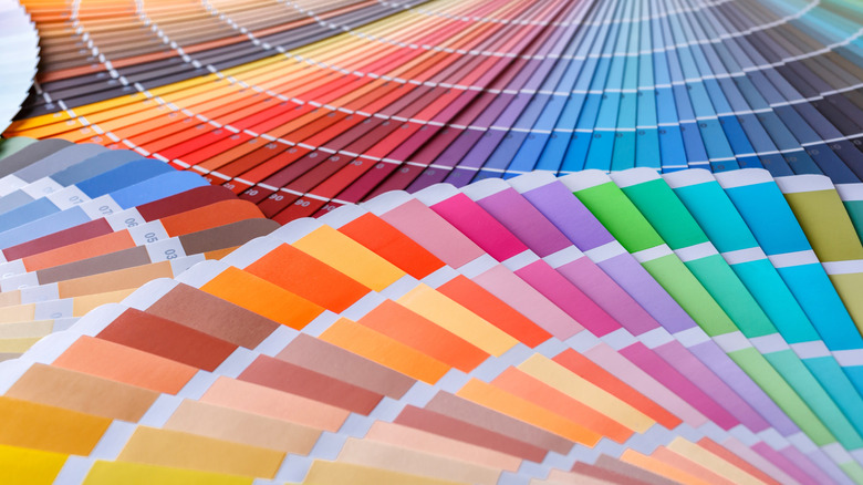
Anyone who has ever been to art or design school comes into contact with the color wheel sooner or later. For those not in the know, that's the wheel of colors that are divided by pie-shaped pieces of assorted hues — red next to orange, orange next to yellow, yellow next to green, and so on. Essentially, the color wheel provides you with a guide. It helps you choose colors that look good together, whether you're using the information to create a beautiful painting or to set up a dramatic curtain display.
The closer the colors are to each other – analogous colors – the less contrast there is. Less contrast equals less drama. These would be shades of red next to shades of orange, for example. On the other hand, opposites on the color wheel, like purple and yellow, automatically push the room's color scheme in a more dramatic direction.
With regards to your curtains, the same light/ dark contrast rule still applies, but you'll also be adding color to it. In this case, you may substitute the black walls for a dark, navy blue and then adorn them with orange curtains since orange is blue's complement, or opposite, on the color wheel. The option remains for other design choices, like pattern or stripe drenching. You can also play things down a bit by opting for something like orange curtains with one large dark stripe at the hem, a variation on a theme that David Bromstad has embraced as well.
Contrasting textures for the win

Putting disparate textures next to each other counts as the last way that you can use your curtains to create more drama in a room, even if you don't opt for contrasting colors. According to celeb designer David Bromstad, there's a reason why this works. Basically, even if you've hung curtains that match your wall's paint, the texture of the curtains creates a nice architectural contrast to the wall, thanks to the different materials being placed side by side.
For lovers of color, it can be easy to overlook the role that contrasting texture plays in space design. It's only in its absence that you begin to notice how dull or flat the design looks. The eye needs something to grab onto, so to speak, as it roams about the room. Different textures add life to the space and give the eye something to hang onto. And given that most curtains have some texture anyway, they are a logical place to start when it comes time to add more texture to the space.
You can turn up the volume on this concept by choosing curtains with obvious textural elements, like velvet, and hang them up next to a wall that's painted with glossy paint. The drama is increased even further if you decorate with complementary colors or the light/ dark contrast. For example, just imagine how dramatic a set of black wool curtains would look hanging next to a wall coated with a white silky gloss paint or even light-colored tiles. Your eyes may never want to look away.