13 Dreamy Benjamin Moore Paint Colors That Are Perfect For A Calming Bedroom
Nothing beats coming home after a long day and being welcomed into a sanctuary of your own, a serene and inviting bedroom. A relaxing bedroom can help put your mind at ease and serve as a welcomed respite from the occasional chaos that accompanies everyday life and its responsibilities. One of the best ways to encourage a tranquil ambiance in your bedroom is by being intentional with your color schemes, and opting for a paint color that's calming. Delicate shades of blue, muted earth tones, and velvety neutrals can all inspire feelings of calm and put you in the right headspace to unwind after a long day.
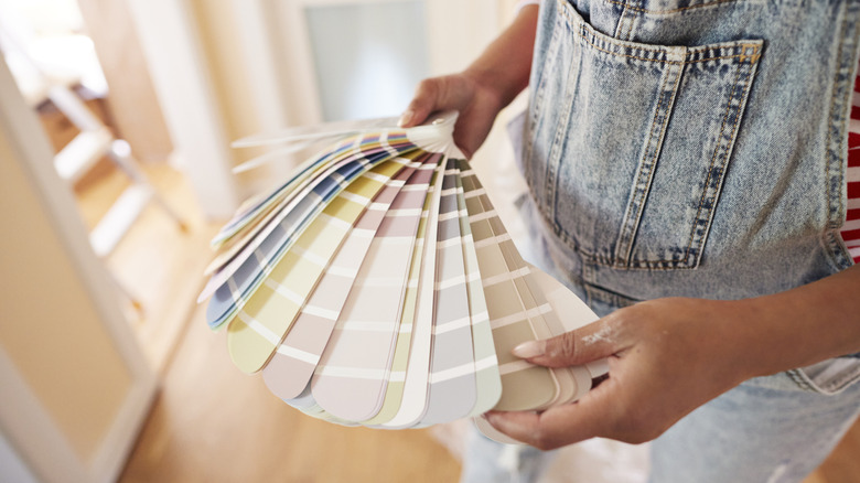
Trusted paint companies like Benjamin Moore specialize in offering endless hues of high-quality paint that can fit effortlessly into a wide range of color palettes. Some of the brand's most popular paint colors are laid back, calming hues that won't distract or overwhelm the space. From dreamy beach-inspired paint colors that evoke visions of the seaside to minimalist neutral paint colors for a relaxing home, Benjamin Moore has plenty of options to help revamp your bedroom into a peaceful haven where you can rest and recharge. Here are some of our favorite Benjamin Moore paint colors that are perfect for a calming bedroom, what kind of tones they can set when used in your interior designs, and which colors to pair them with for a perfectly complementary color scheme.
Yarmouth Blue
Benjamin Moore's Yamouth Blue is delicate and soft, with a timeless appeal, which is why you can find it in the brand's Historical Collection of paint shades. This breezy blue shade is adaptable and looks chic in a wide range of lighting. In bright, natural light, the subtle blue hue gives off the same impression of a neutral shade, and when the sun goes down, it has more depth and intrigue. This shade is elegant without being fussy and can bring an air of relaxation to a bedroom's ambiance.
Gray Cashmere
Gray Cashmere is another relaxing and neutral paint shade that boasts the perfect blend of green and gray undertones. Gray cashmere can serve as the perfectly uplifting base color and is versatile enough to pair with a wide range of color palettes. Dark shades of gray and rich, jewel-toned greens can complement Gray Cashmere, as well as muted yellows and deep taupe. In natural lighting, the shade of gray has warm undertones that are welcoming and cozy, and as the sun sets, the paint appears more neutral but still crisp.
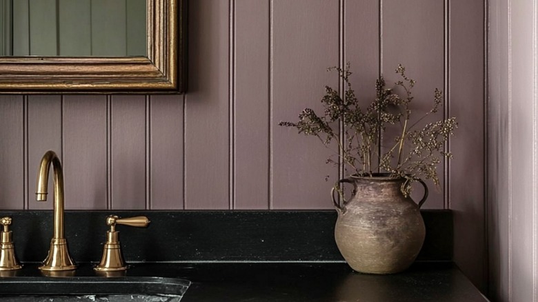
Smoked Oyster
Smoked Oyster is also a popular calming paint color from Benjamin Moore. This velvety shade of taupe is indulgent and slightly moody. According to Benjamin Moore's website, "With its rich brown, violet and gray undertones, this surprisingly versatile taupe adds unique character to a space." Smoked Oyster can be paired with other warm taupes and cool, pale grays for a color scheme that puts your mind at ease but still carries a bit of charm. When paired with other dark browns and deep grays, it can have a very grounding effect.
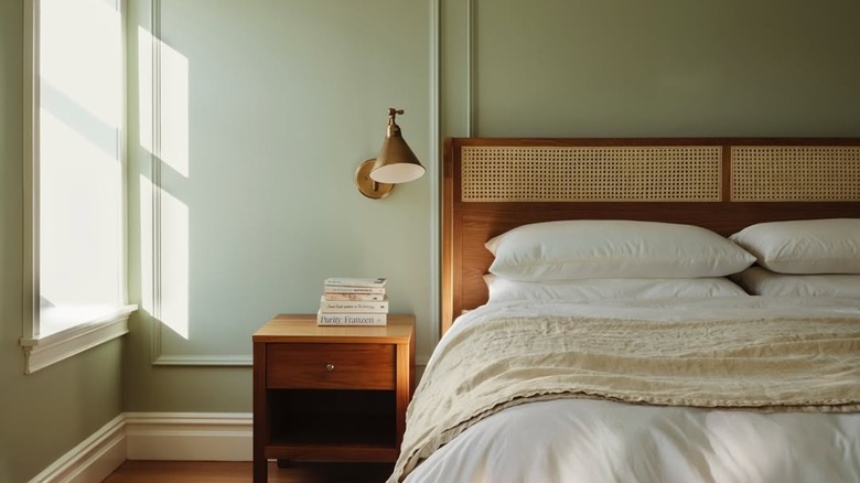
Manchester Tan
It's no surprise that Manchester Tan is one of Benjamin Moore's top selling paint colors. This shade of beige is perfectly uplifting, with nicely balanced undertones that give the warm neutral striking but subtle appeal. You can pair this shade from their historical collection with clean whites for a more sophisticated, refined look, but it is also neutral enough to complement bold accent colors with effortless harmony. In natural sunlight, it looks clean and airy, and in dimmer lighting, the warmth shines through, creating a cozy, relaxing ambiance.
Cinnamon Slate
Cinnamon Slate is Benjamin Moore's 2025 color of the year and is an ideal match for serene bedrooms that are soothing but bold. This muted purple with rich brown undertones is full of character and charm. Cinnamon Slate works exceptionally well with other muted purple shades, like lilac or sultry mahogany. You can also pair it with creamy neutrals that complement the warm plum hue by striking an uplifting balance. Cinnamon Slate is versatile, and depending on the lighting, it can look like a rosy blush hue or a decadent brown.
Hamilton Blue
Hamilton Blue is another charming hue from Benjamin Moore's historical collection. This muted blue with complex, gray undertones is relaxing by nature, but is light and airy enough that it won't weigh down the room's atmosphere. Hamilton Blue is soothing, but still comforting and inviting, with a touch of timelessness. The shade pairs well with creamy whites and warm grays for an elegant effect. The color is subtle but still saturated enough to make a statement in your bedroom, where it's ready to welcome you home after a long day.
Chimichurri
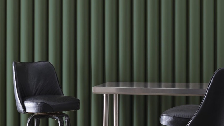
Green is another great color option for promoting calmness in the bedroom, since it can be reminiscent of nature's most peaceful landscapes. Chimichurri by Benjamin Moore is a great candidate for a bedroom paint color that inspires feelings of peace and serenity. Interior designers and decorators agree with this sentiment, which is why you can find the deep, muted shade of olive green used in many high end bedroom designs. In ambient lighting, Chimichurri is a more reserved shade omits almost a subtle glow, but in natural daylight, the paint's warm undertones shine through for a cozy atmosphere.
Rocky Coast
Rocky Coast by Benjamin Moore strikes the perfect balance between gray and pale blue with a certain air of effortlessness. It's hard not to feel calm around this color that Benjamin Moore describes as "a rich gray reminiscent of wave-ravaged rocks along a stormy coastline." Rocky Coast pairs beautifully with warm neutrals that add just the perfect amount of contrast to the paint color's cool undertones. You can match Rocky Coast with warmer grays or creamy taupe to make your space more snug, or other cool blues for a more refined and cohesive aesthetic.
Black Beauty
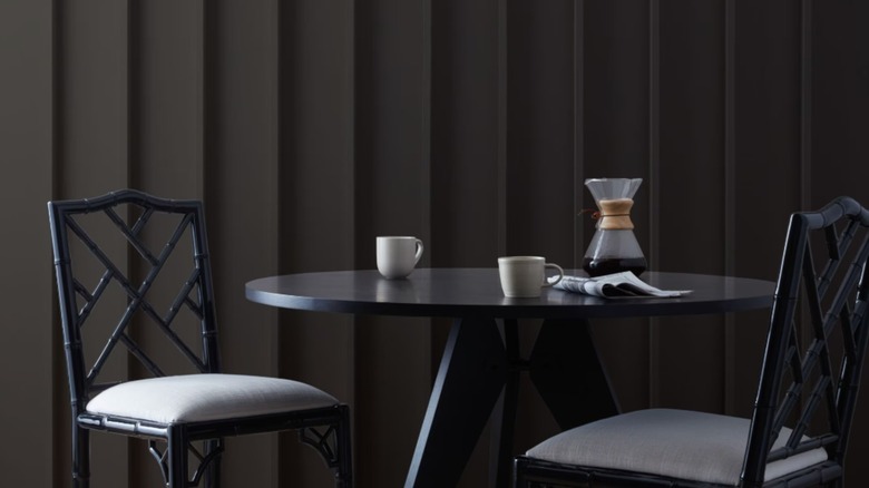
Some may assume that black paint is too moody or dramatic for the bedroom, but if you choose the right shade, it can actually be very grounding and elegant, lulling you into a deep sleep with it's deep hues. Black Beauty from Benjamin Moore has warm undertones that make the striking color more welcoming and cozy. During the day, black beauty's warmth is more noticeable, and the walls appear to be a velvety brown hue, but as the sun sets the paint's darker nature takes over, and becomes reminiscent of the night sky, promoting feelings of restfulness.
Hale Navy
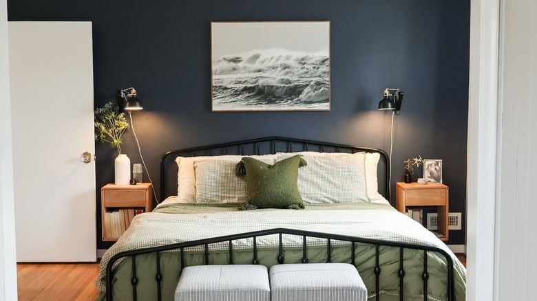
There's a reason that Benjamin Moore's Hale Navy from the historical collection is one of the brand's best selling colors. Hale Navy is a subtle, versatile shade that can be used in any room of the house, but it can be especially fitting in bedrooms where the blue hue with deep gray undertones can evoke a sense of tranquility, like the seas that the shade was inspired by. It can used beautifully in tandem with other cool neutrals like soft grays and whites, or with warm tans to create elegant contrast.
Grecian Green
Grecian Green is timeless and uplifting, with soft and muted characteristics that can put your mind right at ease. This shade from Benjamin Moore's classic colors collection is a gentle green with warm undertones that will make you feel right at home when used on your bedroom walls. You can pair it with complementary, cool neutrals like off-whites, robin egg blues, or even use it with more striking dark grays for a more eye-catching result. The warm undertones of Grecian Green will shine through regardless of the time of day, making bedrooms feel cozy around the clock.
Glacier White
Benjamin Moore's Glacier White is a classic neutral with a hint of subtle cream undertones to warm up the space. The crisp and understated hue is unfussy, airy, and not at all distracting, so you can keep your mind at ease when relaxing in your bedroom with Glacier White walls. It is slightly warmer than stark shades of pure white, which can feel a bit sterile or unwelcoming. Another alluring quality to Glacier White is that it's endlessly versatile and can complement just about any color palette, and serves as an elegant backdrop.
Old Prairie
Old Prairie is another off white paint color from Benjamin Moore that can encourage zen vibes in your place of rest. Barely there green and gray undertones add intrigue and complexity to this otherwise classic neutral, and it won't come off as boring or uninspired when used in your interior designs. Old Prairie complements muted shades of green, blues, and grays, and is reserved enough to be styled with bolder colors that stand out as elegant accents. In natural light, the green undertones can warm up your space, but in ambient lighting, the cool gray undertones are soothing.