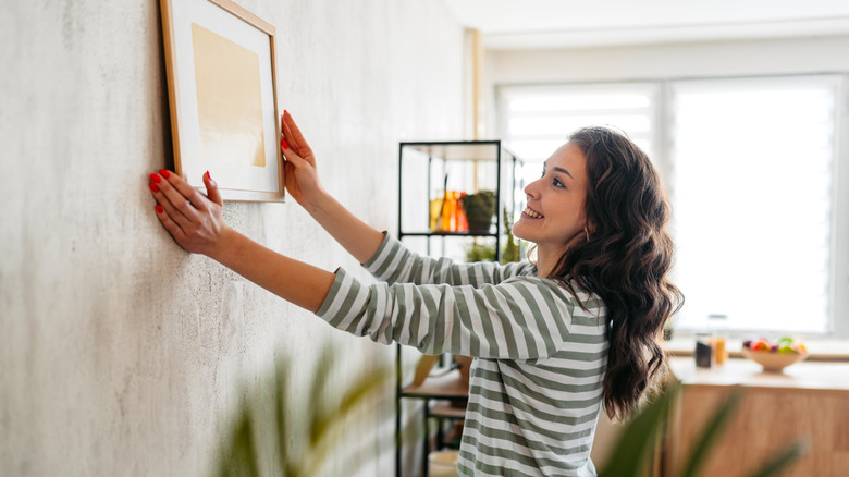
The Underrated (Yet Most Important) Thing To Consider When Designing A Gallery Wall
We may receive a commission on purchases made from links.
When it comes to designing your home gallery wall, there are so many tips and tricks to getting it right that it can feel overwhelming. While advice is flying thick and fast, there is one angle to consider that will help you create the perfect gallery wall and it is this: pay attention to the color palette of the pieces you're putting up. To create a cohesive gallery wall that feels effortless and impactful, aim for art that's part of the same color family.
Without getting technical, you'll know if your pieces are part of the same color family because they look like they're related. You know those family photos where you can see similar traits showing up in Uncle Joe, Aunt Sadie, Grandma, and the cousins? Your works will hang together and feel similar, whether you pick on two or three shades that are echoed in each piece or lean into similar hues and tones.
While this may feel limiting at first, the end result will be absolutely stunning. One of the big misconceptions you may have about DIY gallery walls is that sticking to a color family equals a boring display. There's nothing stopping you from varying the type of art you include. Throw in a wall-mounted sculpture or fabulous mixed media piece for added interest. Vary the texture of frames and the subject matter of your pieces. Once you're done, light it with a few Craftersmark Dimmable Cordless Picture Lights to show off your carefully curated collection.
Color family ideas to consider for your gallery wall design
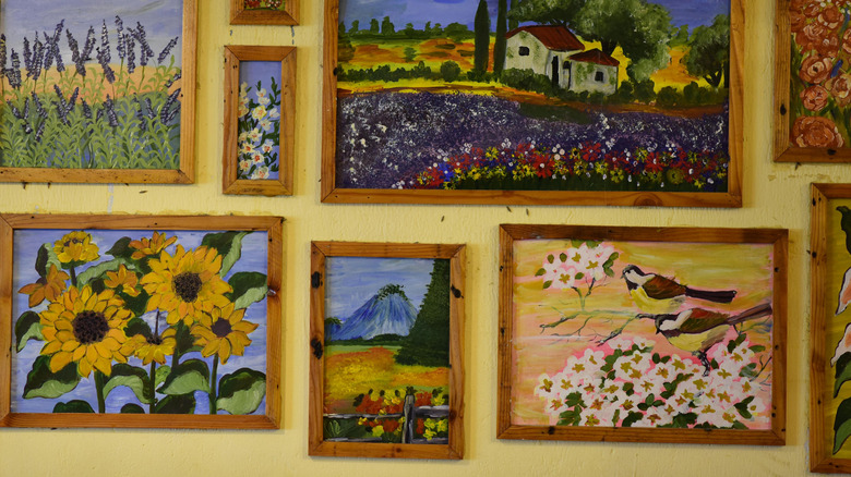
An easy guide to creating a color family is aiming to repeat each color or tone two or three times on the same gallery wall. This repetition creates connections across the pieces and helps them hang together. Choosing pieces with a similiar intensity or saturation, goes a long way to creating a cohesive gallery display. Opt for muted colors for a softer overall effect, or highly saturated bright colors for something with bold appeal.
Whether you are modernizing an outdated large gallery wall or designing a new display from scratch, the color palette you choose will have a direct impact on the mood of the room and how people feel in the space. Keep that in mind when you're deciding on the overall color theme of your gallery wall. Bright colors are cheerful and create a sense of fun. Warmer tones feel welcoming and put people at ease, while cooler tones are often refreshing and calming. Neutrals create a sense of balance, harmony, and relaxation.
You can also base your color family on the design aesthetic of the room you're working in. For an air of sophisticated glamour, you may want to collect pieces with a darker, vintage feel, complete with the glimmering of antique gold frames. In contrast, a breezy coastal living room will benefit from blues, whites, and sandy beige accents. Or, opt for bright primary color artwork for a cheerful room that feels light-hearted and fun.