11 Wall Color Palettes To Give Your Home A Warm Retro Vibe
Retro interiors have been all the rage for a while now, with mid-century modern decor being one of the most popular styles emulated by designers and dwellers alike. Of all the concepts that help define mid-century style, one of the most prominent is the use of color. Mid-century color palettes often include neutrals and earth tones, with splashes of brighter colors, including furniture, linens, floors, and wall colors. We've collected a few color palettes to help you evoke a warm retro vibe when choosing paint colors for rooms.
While the term "mid-century" technically refers to the decades from the 1930s through the 1970s, its most common visual references tend to be 1950s and 1960s. The popular colors often seen in stylish interiors from this era include warm, earthy tones inspired by nature — even appliances got a splash of saturation with memorable colors like "Harvest Gold," "Avocado Green," or "Coppertone." Wood furniture was also popular at the time (think Danish modern style, with tables, shelves, and lighting fixtures made of teak), and a subdued neutral palette accented by warm wood tones exemplified the mid-century look.
But mid-century style also features the bold use of color: unexpected contrasts, striking bright hues, and bright, graphic design elements. Because wall colors are the backdrop for interiors, most people feel it's smart to choose neutral shades and save the brighter colors for accents or furnishings. But a mid-century approach to color goes well beyond boring white, gray, and beige walls. The mid-century modern concept of "neutral" is found in more eye-catching hues of the natural world, including olive green, terra cotta, cherry red, plum, ochre, and contrasting vibrant, bright colors like turquoise, pink, orange, and lavender.
Butter yellow and deep orange
Pale butter yellow is a color commonly used for kitchens, but it's a good warm neutral for any room. Paired with a vibrant orange, it evokes a lively mid-century vibe, a rich color setting perfect for social gatherings and cozy, comfortable evenings. Try vivid "Tangerine Melt" or soft "Peach Sorbet" from Benjamin Moore, or Behr's sunny "Vintage Orange." Touches of pale blue, olive green, teal, or turquoise are good contrasting accents for this palette, while adding reds or greens can turn this warm combo into a pleasing analogous color scheme in your home.
Pale apricot and spring green
In a room with few windows, melding pale but warm neutral tones together keeps things light and airy, creating a pleasing ambience. Pale apricot is a warm tone that works well with a light spring green for a natural, cheery look. Try Behr's "Warm Apricot" for a touch of warm peach, or East Bay's "Apricot Beige" for a slightly more neutral tint. "Citron Cocktail" by Benjamin Moore is a delicious spring green with a touch of brightness, while "Veranda View" is softer and more muted.
Olive green, cherry red, and pale blue
Red and green are opposites on the color wheel, so when used side by side in decor, this combination can sometimes look garish or overpowering. Other color wheel opposites like blue and orange are more commonly seen in decor, but still tricky. However, muted warm greens like olive or avocado (mid-century classics) pair well with vibrant reds, balancing the earthy and bright tones. Add a touch of neutral pale blue and you have a color palette that is both versatile and pleasing to the eye.
Pink and chartreuse
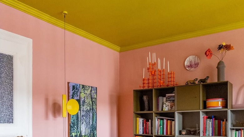
Pink is a classic mid-century color. The 1957 film "Funny Face" starring Audrey Hepburn featured the lively song "Think Pink." This slogan became a popular cultural presence that still resonates, from Italian fashion to women's health campaigns. Often chosen for children's rooms, pink's versatility can actually be a great choice for almost any room. A warm pale pink (like Farrow & Ball's "Nancy's Blushes" or "Pink Ground") is a fresh, cheery look for the living room. For a charming retro look, try pairing it with a bold chartreuse (like Little Greene's "Pale Lime"), another mid-century fave.
Deep plum and peach
When using deep colors like plum, brown, or forest green on walls, consider a paint finish with a bit of sheen to it (like eggshell or satin), to reflect light, as these colors tend to give the room a dark look. Pairing dark colors with lighter ones also imparts a sense of light. Mid-century palettes emphasize earth tones: a plum with brown tones (like Farrow & Ball's "Brinjal" or Little Greene's "Adventurer") paired with a warm shade of peach (like Benjamin Moore's "Sanibel Peach") is a nature-infused palette that is relaxing and inviting.
Sage green and cream
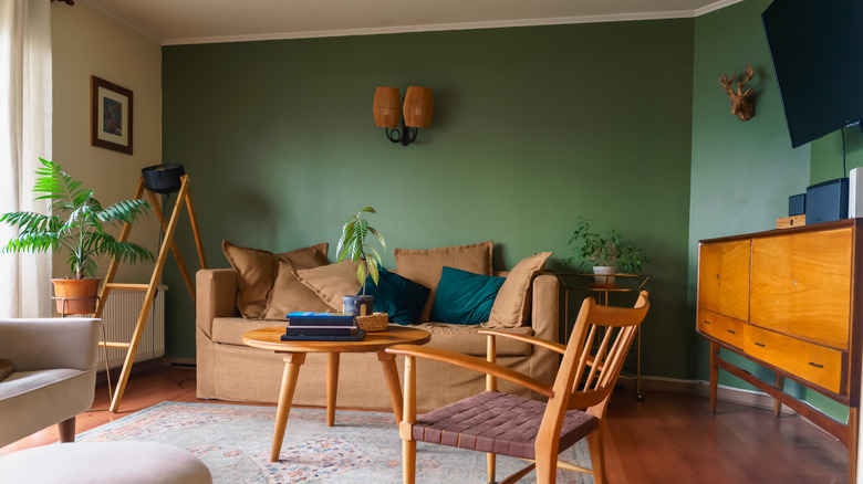
The emphasis on natural wood in mid-century interior design forms an essential part of the color palette. Hardwoods with warm tones like teak, oak, and walnut were often used, and they pair beautifully with neutral green shades. Their reddish tones are complementary opposites to green without seeming harsh or garish like bright reds. Choose a warm cream for trim, accent walls, or ceilings (like Benjamin Moore's "Cameo White" or "Acadia White"), and pair it with a medium green (like Benjamin Moore's "Palace Green" or Farrow & Ball's "Calke Green") that balances warm and cool tones.
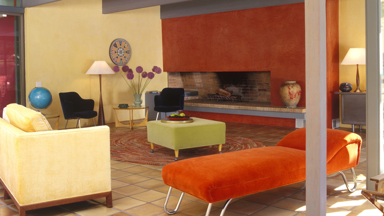
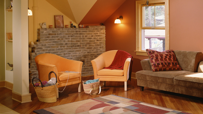
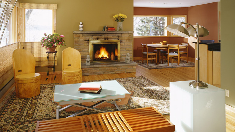
Harvest gold and white
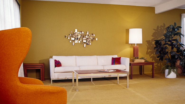
Adding crisp, cool white trim to rich, earthy wall colors can help keep them from looking too dull or muddy — a potential problem with brown-toned neutrals and other warm shades. Harvest gold is a ubiquitous color in mid-century decor, used for walls, furniture, appliances, linens, and rugs. This vintage room's white sofa, drapes, and lamp shade further offset the gold walls and carpet, with deep orange accents for a splash of bold color. To achieve this vibe, try gold shades like "Brittlebush" or "Sunflower" by Sherwin Williams or Farrow & Ball's "Sudbury Yellow" or "Duster."
Tomato red and creamy yellow
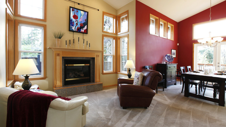
An accent wall is often applied to just one of the walls in a room and painted in a contrasting color. But if your room has many nooks or angles, you may decide to paint several accent walls. Warm color palettes create an expansive, welcoming vibe, and one great retro combo is pale butter yellow with rich tomato red. The key to making this work is choosing a red that's not too bright, and opting for a soft paint finish (eggshell is perfect).
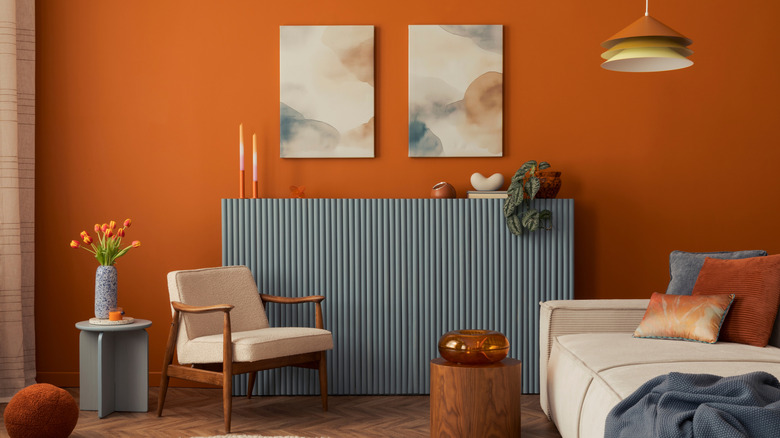
Terra cotta and tangerine
Terra cotta is named for the natural reddish-brown clay used to make planter pots, as well as roof tiles and decorative clay pieces. It's a warm neutral that works well with many other colors, from bright yellows to deep blues. This room pairs terra cotta walls with soft tangerine accent walls and chairs. The brown bricks and furniture add more muted earth tones for a cozy palette perfect for a relaxing guest room, den, or study. Try Benjamin Moore's "Hale Orange" or "Red Point Sand" to get this cozy retro look.
Pumpkin and khaki
Orange hues are surprisingly versatile in neutral color palettes. A warm pumpkin in a satin or eggshell finish (the best paint finishes for medium, warm neutrals) stands out boldly next to a neutral khaki wall. Adding some contrasting blue accents tie this lively look together. For the khaki wall, try a basic neutral tan with a touch of olive green like "Yorkshire Tan" or "Seville Tan" from Benjamin Moore. For a great pumpkin shade, try one of these vibrant, golden orange hues: "Harvest Moon" or "Orange Appeal" by Benjamin Moore or Farrow & Ball's "Dutch Orange."
Pink and pale aqua
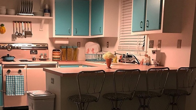
Pink and aqua has a quintessential mid-century feeling when paired together. The subtle opposition of the red and green-toned colors looks fresh and lively when done in pastels, making a fun, eye-catching palette for the kitchen, bathroom, or a three-season porch. To make this combination work, choose a soft, warm shade of pink with a touch of peach or coral, like "Authentic Pink" or "Pink Powderpuff." Pair it with a medium pale aqua like "Maritime Blue" or "Biscayne Shore", all paint colors by Benjamin Moore.
Ochre and rust
Ochre is one of those colors that's hard to describe, but perhaps familiar to artists who use oil paints. It's a subtle, earthy tan shade with hints of green and gold. It's similar to mid-century classic "Harvest Gold," but deeper and more subdued. Benjamin Moore has a number of gorgeous ochre tints to try, including "Coffeehouse Ochre," "Antique Bronze,' and "Ochre." It's a great neutral for an earthy palette, and pairs well with warm woods and rich paint shades like cozy rust orange.