What Is An Analogous Color Scheme And How To Use It In Your Home
Are you a "formula" person who likes to follow a clear set of instructions in return for a predetermined outcome? In decorating, plenty of guidelines lead to a comfortable and gorgeous space. For example, the ratio of coffee table to sofa length should not exceed two-thirds, there should be a focal point in every room, and various furniture silhouettes should be combined for interest (via House Beautiful). Additionally, a proper order exists for the design process. "Start with the carpet before you develop a palette of materials for any room," notes designer Jeffry Weisman in Lonny. And always measure and implement a mock-up of the layout, advises Abbe Fenimore, founder of Studio Ten 25. "Before buying anything, measure your space and make a plan."
The color wheel offers another reliable route for mapping a design scheme. According to 99designs, color theory comprises the study of how hues are visually perceived, how they relate to their given environment and one another, and their psychological consequence. The color wheel is an indispensable tool because of its standard positioning of the hues; the visual aid helps us understand how to activate and take advantage of inherent color characteristics, and further, how to mix them for a desired effect. Rest assured, an analogous combination is an easy one — to live with and get right — even if your approach is less than methodical. The pleasing adjacent hues create a story as much as a system and offer inspiration as well as instruction. We share more about using them in your spaces at home.
What is an analogous color combination?

Time-tested color juxtapositions inform the palettes for projects by marketers and designers alike. The success of a product relies primarily on its visual branding. According to 99designs, it takes just 90 seconds to discern how we feel about it and our preference is 90% color based. A complementary grouping (opposites on the wheel) emphasizes individual hues for high energy, whereas analogous (neighboring) colors have an effortless rapport and promote tranquility; monochromatic schemes (tints and shades of one hue) are the most serene.
Per Color Psychology, analogous groupings generally include three hues that have a foundation in common, making them particularly harmonious (for instance red, red-orange, and orange all contain red). They appear frequently together in nature. Imagine the variegations of a flower petal or leaf, and on a grander scale, the layers of a land or seascape. It's within the tonal shifts and adjacencies that visual richness can be found. From sand to dune grass to green-blue waves, or a plum blushing to purple and then magenta, these represent colors that exist in delicious proximity.
While each one is beautiful in some way, color is personal, visceral, and incredibly effective at setting a mood. Therefore, it's important that your preferences and the room's intended function drive color selections. Clear hues are bright and fun; they create a different impression when grayed or tinted. The washed pink, lilac, and violet shades above, for example, are softer than vibrant red, fuchsia, and grape and are perfect for a restful bedroom.
How to use analogous colors in design
Per My Domaine, analogous color combinations and their ability to create a pleasing, cohesive design are undervalued. Design blogger Tracey Hairston told the outlet, "I love how calming and serene [analogous colors] can make a space." For the most tranquil room, opt for cool shades such as those in the blue, green, and purple families. If the aim is more vitality, choose warm colors like red, rust, tangerine, ochre yellow, and hot pink. Any downside with an analogous range exists in its low contrast, yet two palettes employ mixed temperatures to the effect of a bit more kick: yellow/yellow-green/green and red/red-purple/purple.
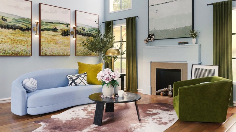
Color Psychology says that there are ample differences between the hues in this scheme. In that vein, contrast can be created by varying the saturation (clarity of color) and value scale within the design while maintaining adherence to the color story — a heathered hue combined with brights or a tinted pastel played against deep shades, for example. According to Hairston, to further increase the vibrancy and interest in a space, a complementary accent color can be minimally introduced. Take note of the blue-green in the artwork above; it's the only hint of cool color in the room and breathes air into the close palette. Art, flowers and greenery, and patterned textiles and carpets can all be employed in this way. However, the farther colors are apart in saturation and value, the greater the contrast; this lends visual busyness, which can make spaces appear smaller.
Getting the right mix
To create balanced interiors with an analogous color palette, pick a hue as the dominant (per Color Psychology, it's often the one in the middle) and allow the remaining two to act as supporting shades. Yet, that dominant hue shouldn't completely take over. "I think the biggest mistake [people make] is [using] too much of the same color," Tracey Hairston notes in My Domaine. Follow the 60-30-10 rule to help ensure a successful distribution. In this case, the outlet explains that 60% of the space is the main color, 30% incorporates the secondary hue, and the last 10% is the third color in the combination.
Designer Kristen Peña favors a lighter hand with color, suggesting it can be easier and more forgiving to decorate with subdued versions of neighboring hues. But if you're partial to saturated tones, they can be sparsely interspersed in a neutral ground: "Also using the analogous colors as the accent colors in an otherwise more neutral palette can be a great way to design a space that is not overwhelming with color," she offered in Elle Decor.
Finally, consider an analogous scheme outside of a vacuum; myriad factors impact how a hue and its environment are regarded. The temperature of the incoming light, tones in flooring and wood furniture, and the value degree of the wall paint beyond and in tandem with the color palette will affect the impression of the space.