How To Make A Mismatched Kitchen Look Like A Purposeful Design Choice
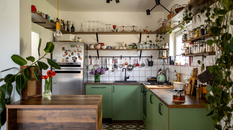
A mismatched kitchen often arises out of necessity: cabinetry sourced second-hand, appliances that were slowly upgraded over time, or furniture collected across entirely separate eras. While this type of space may feel disjointed at first, it can also convey a layered, intentional aesthetic when approached thoughtfully. The key is to identify unifying elements that can be found throughout the space to create a sense of cohesion that doesn't get in the way of personality. These can be as simple as repeating materials, color accents, or consistent hardware. For instance, bronze or black drawer pulls across different cabinet styles can create a unified visual trend, while a consistent countertop material anchors dissimilar pieces. Color is another powerful tool; even when shades differ, keeping the palette within a singular family ensures harmony throughout a kitchen space. The goal is not uniformity, but rather a curated rhythm that guides the eye between each unique piece in your collection, making differences feel deliberate versus accidental.
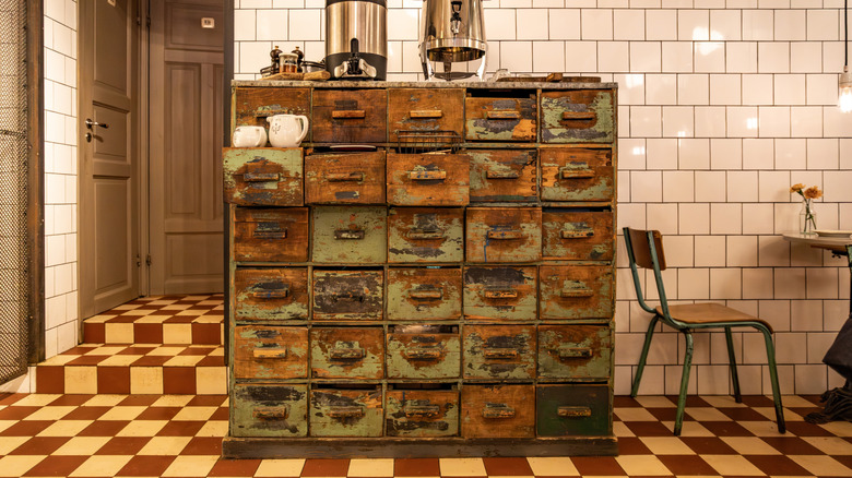
Textures and finishes further contribute to this muted sense of cohesion. Pairing matte and glossy surfaces, or mixing metals in your home decor, introduces subtle contrast. Equally important is scale and proportion: large contrasting elements like a repurposed credenza that now serves as a kitchen island or oversized light fixtures can pull focus away from smaller differences and offer the space a sense of structure. Thoughtful repetition — whether through open shelving accessories, artwork, or decorative elements — reinforces a sense of design intention. Ultimately, a mismatched kitchen works best when every element, from cabinetry to kitchen counter clutter, exists within a cohesive visual plan.
Styling strategies to successfully blend cohesion and contrast
Once the foundational elements are in place, consider the role of accessories and decor in reinforcing specific themes throughout the space. Coordinated bar stools, pendant lighting, or countertop accents echo the room's color scheme or finishes, bridging differences between cabinetry or appliances. Strategic repetition of color, shape, or material throughout the kitchen can create visual continuity. For example, a bold cabinet color can be repeated subtly in ceramics, textiles, or small appliances, ensuring the contrast feels purposeful. Even smaller details can make a world of difference, like matching cutting boards or utensil holders with a wood tone that stands out within the space. Attention to these details ensures that the room's unique components create a cohesive image that the eye can follow, rather than competing for attention.
With that being said, you don't need to shy away from intentional contrast either. When used deliberately, it can elevate a mismatched kitchen to become a statement space. Pairing modern, streamlined elements with rustic or vintage features adds depth and interest, while maintaining a consistent palette ensures the overall look remains intentional. Textural layering — like hanging a rug on the wall as artwork or pairing raw wood with a deep black countertop – adds dimension without cluttering up the space. Maintaining clean surfaces and minimizing unnecessary visual distractions prevents the space from feeling chaotic. It's also entirely possible to experiment with your unique pieces. This style is all about figuring out what works, and what's simply too contrasting, so experiment with your pieces until it clicks.