The Dated Countertop Trend That's Getting Left Behind For A Good Reason
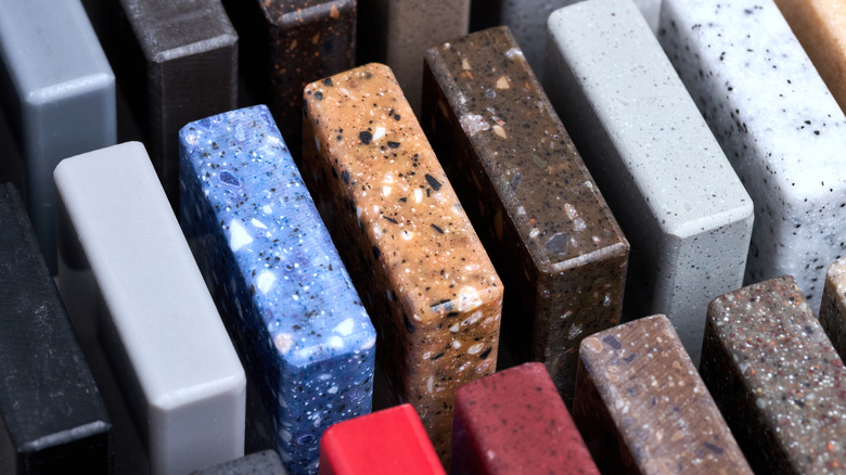
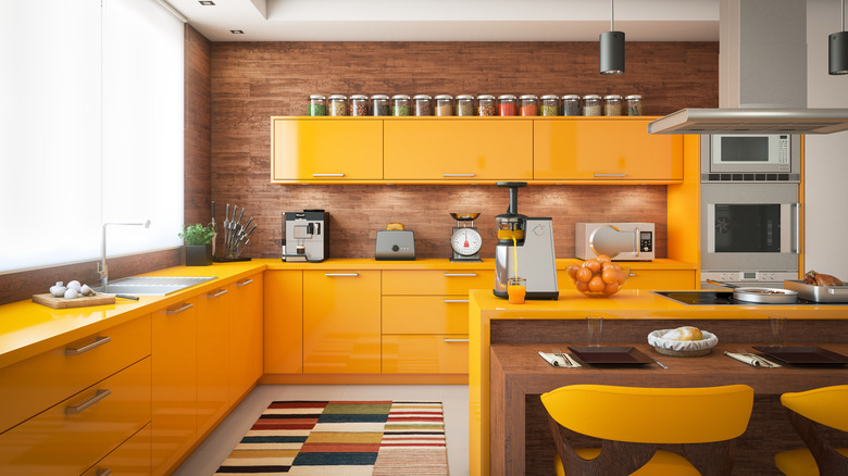
Choosing the right countertop color for your kitchen can be one of the most important decisions you make in the space. Not only will counters stay with you for years (possibly decades), but they will greatly inform your kitchen design, possibly enduring many decor scheme changes and waxing and waning trends over time. While one great way to bring in a dramatic and bold look has been choosing colorful countertops, these pigment-saturated materials may be on their way out in favor of more earthy and nature-inspired shades.
Homeowners are choosing a new range of more subdued shades in lieu of bright colors, largely to avoid the limitations and outdated kitchen trends of more intense hues. Today's designers are moving toward natural shades like beige, clay, taupe, and warmer grays, avoiding louder options like cobalt blue, fire engine red, and neon green. The result is a kitchen that will always be adaptable and in style rather than limited by the dominating trends at the time of installation.
Colorful countertops hit peak popularity in the mid-20th century, when the rise in the use of Formica as a counter surface brought the popularity of a huge range of color possibilities like bright primary shades and more delicate pastels. Colorful countertops were especially popular in the colorful kitchens of the 1950s-1970s, when they gave way to more neutral shades of Formica, like gray and cream. The switch to stone counters in granite, marble, and quartz around the turn of the millennium eventually made Formica less fashionable and dated. While you can still find vibrantly colored natural stone, the vivid range of hues that Formica provides is much less sought-after and in demand.
Why you might want to avoid color-saturated counters
Since your kitchen counters will be with you for years and require significant investment to install or change, brightly colored counters offer less flexibility over time. You may find yourself struggling when seeking to shake up your decor since only so many things work with bold and saturated colors. Neutrals and nature-inspired colors give you a larger range of possibilities, lending themselves to a wider variety of designs. Colorful countertops also often accompany a more modern and contemporary look, which makes it harder to achieve a vintage, rustic, or farmhouse aesthetic.
Because colorful counters go in and out as a trend, they can also look dated, especially if you choose a very "now" color that many people will eventually get tired of and look to replace. Brightly hued counters can also work against you when it comes to reselling, since many buyers prefer neutrals, and not everyone is on board with that much color. Because neutrals and more subdued shades have greater longevity in the trend cycle, they will still look fresh a decade or more from now.
What to do instead
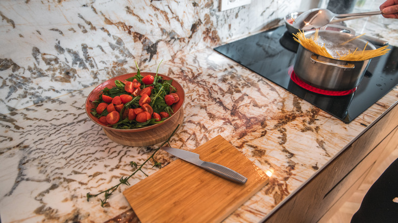
Instead of choosing bright and colorful countertops, opt for more classic shades of stone in neutrals like beige or warm gray, which provide a beautiful foundation when combined with natural wood cabinets and accents. If using color, newer trends point toward soft pastels, warmer earth tones like terracotta or burnt orange, as well as more subdued shades of blue or green like sage, slate, or aqua. Many are also opting for pastel shades like softer or duskier pink or blue, instead of primary colors. Many designers predict a return to homeowners embracing color, but with natural materials rather than manufactured. Alexandra Peck of Alexandra Peck Design tells The Spruce, "I think we're going to see beautiful marbles, quartzites, and soapstones with a variety of colors and interesting vein patterns."
If you love bold countertop color trends but want to avoid the pitfalls of overly saturated counters, choose one that offers an unexpected take on more neutral shades, like the textured surfaces of leathered stone or honed quartzite. Or add novelty with bolder patterns like dramatically veined statement marble, richly stratified stone, terrazzo, or embedded glass fragments. Charlie Kongkaeow of Kitchen Solvers of Grayslake tells Chowhound, however, that "Bright-colored concrete, heavily veined marble, or ultra-bold quartzite patterns might seem like a luxury upgrade but can be too personal and polarizing for resale."


