The Kitchen Color Combinations That Joanna Gaines Can't Get Enough Of

Joanna Gaines has been inspiring professional and amateur designers alike for the last decade with her aesthetic. She single-handedly launched the modern farmhouse trend in the mid-2010s, and has since evolved the look to a moodier, more vintage look that combines period pieces with modern touches. (You can thank her redesign of the Castle and the Lakehouse for that.) But whether you're still loving shiplap or have embraced her modern Victorian ideas, chances are you still look to the iconic Magnolia designer to see what she would do during a remodel. And one area where she especially reigns supreme is in kitchens. Gaines has a knack for creating memorable, welcoming kitchens that are as well-designed as they are functional. Because of this, we rounded up all of the kitchen color combinations she can't get enough of, helping you choose the foundation of your own kitchen.
Whether it's a classic black and white color scheme to match her farmhouse aesthetic or something a little more whimsical like blue and white, there is something for everyone. See her recommendations below, along with which paint colors to use to mimic her designs. You'll have a Magnolia-approved kitchen in no time.
White uppers with dark lowers for smaller spaces
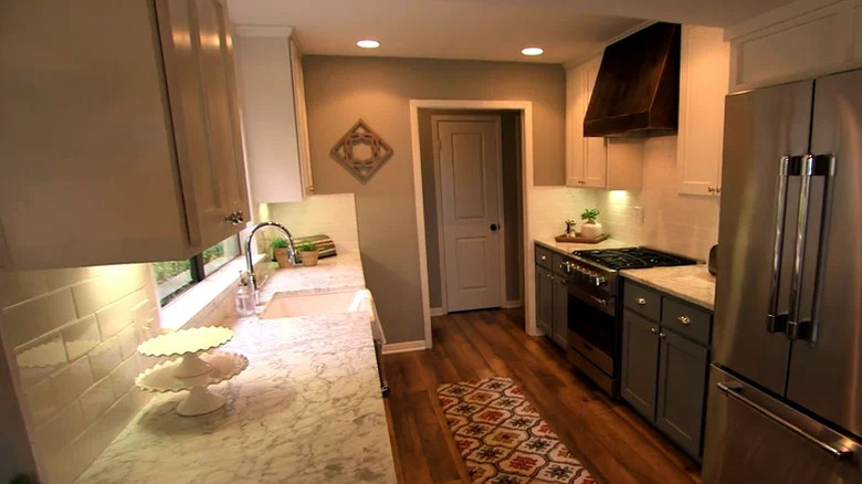
A dark and light color scheme is one of the staples of modern farmhouse design, so it's no surprise that Gaines champions the color combination for kitchens. To keep things airy and bright, she recommends painting the cabinets white. "For high-traffic areas like kitchens and living rooms — and almost any space – I like to keep things simple and use a creamy, neutral white like Shiplap," she told Country Living. "[These colors] create a bright, clean space and offer a versatile backdrop for décor." However, if you have a small kitchen like a galley, she recommends painting the lowers something different. To make your small kitchen feel bigger, she suggests painting the bottom cabinets a darker hue, like navy or charcoal, and the top cabinets, backsplash, and wall an airy white. This gives the "illusion that the space is a lot larger than it really is," she told HGTV.
Luckily, if you want to recreate this color scheme in your own kitchen, you can use Gaines-approved paint colors to hit the exact right tones. That's because the designer made a paint collection with KILZ called Magnolia Home Paint, all carefully crafted by her. For off-white, try something like the aforementioned Shiplap, or Silos White, which is a white with beige undertones. You can also paint your cabinets Panna Cotta, which has an even creamier beige base. As for dark colors, try something like Aspen Stone if you're looking for a chalky black that will make a statement but won't overwhelm the space. You can also try Times Past if you have been gravitating towards dark gray shades, or Moments if you want a dark, chocolate brown color.
Mossy, earthy greens with off-white
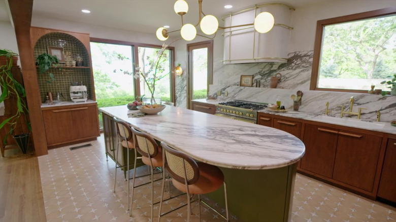
In an effort to bring the outside in, the design world has been attracted to nature-inspired colors for the last several years. Whether it's the rise of the biophilic design trend or a throwback to moody '70s color palettes, people are using earthier color palettes to create cozier kitchens.
Gaines is no exception. She loves mossy, earthy greens on kitchen cabinets for an unexpected pop of color. "At the moment, I'm really drawn to fresh botanical shades, like Magnolia Green," she told Country Living. "I think it would be [a] fun choice for kitchen cabinets, or anywhere that needs a touch of nature." Not only does her Magnolia Home Paint collection have a range of greens, but she also painted the Lakehouse's kitchen island a mossy green. When it comes to which color to pair with the nature-inspired hue, she recommends a simple off-white. "I love the contrast of a sophisticated green paired with an off-white. These colors work together to give [a] kitchen depth and visual interest without it feeling overwhelming," she told KILZ.
While Gaines says this nature-inspired color is perfect for kitchen cabinets, you might not be open to repainting all of your kitchen cabinets. If that's the case, try painting your walls the mossy green instead. This will especially be Gaines-approved if you have off-white cabinets to begin with. While she mentioned Magnolia Green, which is a chalky green, she has tons of other options in her collections to choose from. For instance, Celery Seeds is a classic avocado green, perfect for a midcentury modern or '70s-inspired kitchen. If you want something mossy but closer to a neutral, then Luxe might be the right pick. It's a deep gray with green undertones, creating an earthy hue that still plays it safe.
Dark, almost black-green colors with off-white hues
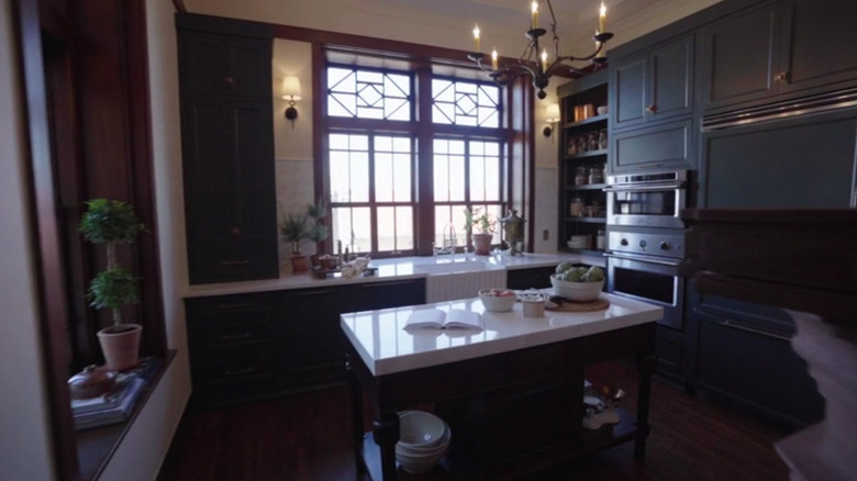
An earthy green isn't the only shade that Gaines has embraced in recent years. Since taking on the redesign of a castle, she's also gravitated towards black-green hues, often pairing them with soft, off-white tones that border on putty. For instance, she used Cottage Grove for the butler pantry in the restoration, which is a dark navy infused with moody green undertones. "A rich blend of navy and green, this color can take on either tone in different light, which makes it both dramatic and cozy all at once," she shared in the product description. To balance the depth of the color, she painted the walls in Castle Cream, a soft white with subtle yellow undertones that helps brighten the space. Both are part of her Castle Collection.
But the historic restoration isn't the only place the designer used the dark green and off-white color combo. She also used it in her own kitchen and butler's pantry. For the latter, she painted everything from the cabinets to the walls to the ceiling in the dark color, creating a color-drenched effect. If you want to try this color combo but Cottage Grove is too dark for you, there are a few more greens to choose from in the collection. Specifically, there is Step Stool Green, which is a dark olive green, as well as Estate, which is a dark sage with heavy gray undertones.
Blue and white
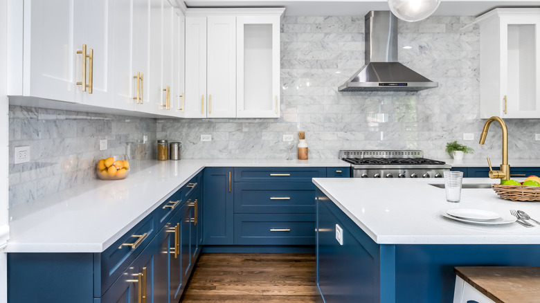
While Gaines doesn't usually dip a toe into blue color schemes, she makes an exception for clients with a playful, bold style. If you're looking to add a little personality to your modern farmhouse design, a blue and white palette might be the perfect fit. For example, when flipping a kitchen in Season 3, Episode 13 of "Fixer Upper," Gaines did just that. She shared on the Magnolia blog: "To match this couple's fun style, I decided on something a little unexpected in their kitchen by doing a fun blue for the lower cabinets and white upper cabinets ... The raw wood venthood warmed up the space and the clear glass pendant lights over the island brought a modern feel to the kitchen." A simple all-white and gray kitchen wouldn't have suited their tastes, but blue and white added just the right touch of character and charm. And luckily, blue continues to be one of the most popular choices for kitchens.
Luckily, Magnolia Home Paint has tons of different blues to choose from, which makes picking a Gaines-approved shade easy. Specifically, she has 13 different options, but Signature, Sir Drake, and Winter Solstice are standouts. Signature is a dark denim blue, which would be great for lower cabinets, especially if you're planning to make the uppers off-white. If you prefer something a little grayer, then Sir Drake is a great pick. It's a light gray mixed with a blue-green base. For those looking for more of a French blue, consider Winter Solstice, which is an icier bluish-gray.
Black and white
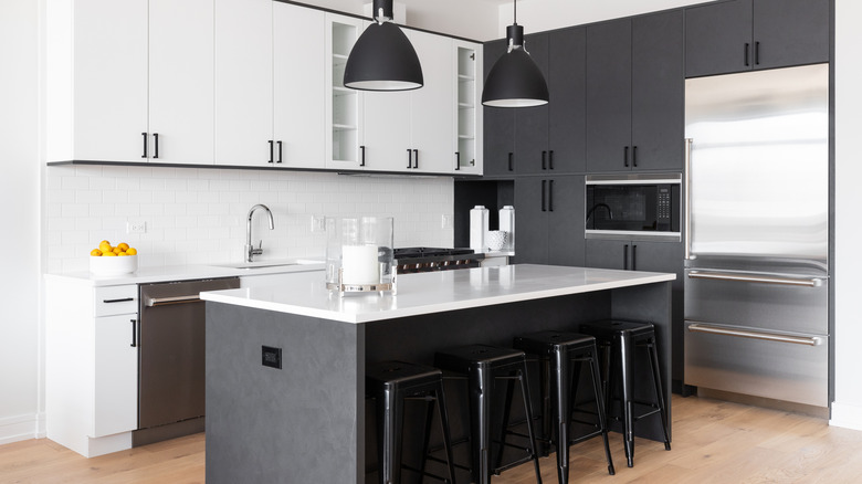
A black and white color combo might feel bold or stark to some, but if you have a bright kitchen with lots of natural light, then Gaines thinks it makes for a great modern farmhouse color palette. It's the pairing she herself used when designing their bed and breakfast, called the Magnolia House. Decorated in 2016, Gaines was deep into her iconic farmhouse look, so the kitchen's color scheme reflected that. In fact, the look of the kitchen was specifically designed to look like Gaines' own home. "The design inspiration for this house was taken from my own home. I wanted it to feel like our farmhouse so when guests stay here, they feel especially welcome," she shared on the Magnolia blog. Her kitchen at that time had a black and white color scheme, with white cabinets and shiplap walls, dark gray concrete countertops, and black industrial open shelving. However, she decided to take that look one step further in the B&B. "Since the space felt wide open and light, I thought we could incorporate a classic black paint on the lower cabinets," she explained on the blog. She paired it with open shelving uppers and white shiplap walls.
If you have a similarly sunny kitchen, there are plenty of Gaines-approved black shades you can choose from for your lowers. In fact, Magnolia Home Paint Collection has 29 shades of black and gray to choose from, allowing you to select a hue you're most comfortable with. If you want to mimic the Magnolia House's aesthetic, try going for a dark black. Blackboard is a chalky black with subtle blue undertones, creating a softer look than stark black paint. Fine Black has a slight gray cast, whereas Arches is closer to a slate gray.
Wood cabinets with white
While Gaines loves a painted cabinet, she also creates her fair share of kitchens with wooden cabinetry. In those cases, she likes pairing the wooden hues with crisp whites. This creates a modern background for the wood, making it feel contemporary rather than dated or visually heavy. Instead, the white backdrop helps create a clean aesthetic. "Since I decided to go with a white oak cabinet in here, we painted the ceiling shiplap white, so the shades of wood wouldn't compete with one another," she shared on the Magnolia blog about the flip in Season 3, Episode 16. More recently, she used this same color combination when designing the Gristmill, the set of her cooking show, which featured white oak cabinetry and whitewashed stone walls.
When choosing a white shade to go with your wooden cabinets, choose one with yellow undertones to make the space feel soft and welcoming. The previously mentioned Shiplap shade reads as creamy, creating a pleasant background. One Horn White is similarly warm, but has more of a beige undertone, which would pair great with white oak shades.