16 Decor Mistakes To Avoid If You Don't Want A Cheap Or Tacky Looking Home
The beauty of having your own space is that you can decorate it however you desire. The little knick-knacks that caught your attention on a trip abroad or the replicas of pretty floor lamps you once saw in a television show could all share the same space. However, if you're trying to follow home trends and want to impress guests or buyers walking through your property, there are a few common décor mistakes you can't afford to make.
To know which décor tactics make your home look not-so-hot, we exclusively interviewed four experts with years of experience under their belt. Anything that's generic, was trendy decades ago, isn't made well, or is an outlier in your surroundings should probably go. Inspirational signage, directional signs, copied art prints, and self-adhesive products are some such examples, according to our experts. There's plenty more that could cheapen your home, as you'll discover shortly.
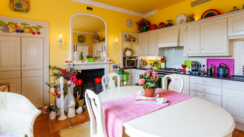
Mass-producds inspirational letters and phrases have lost their charm
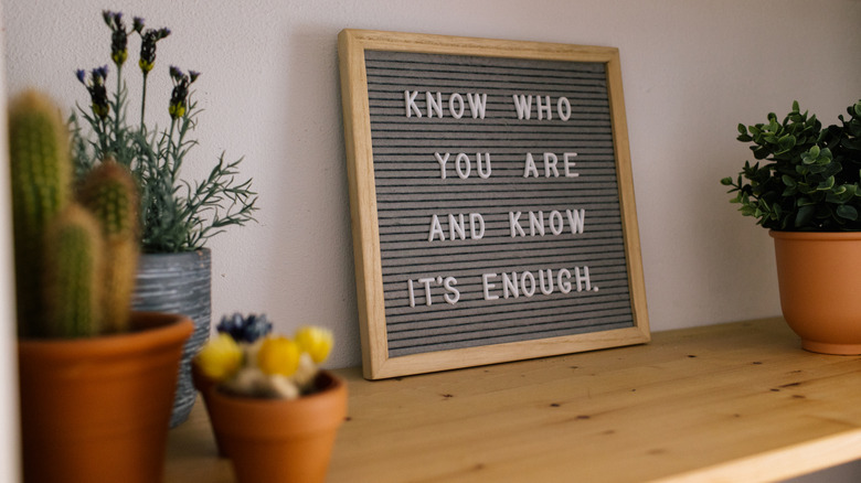
Signs and decals displaying inspirational quotes and phrases gained popularity in the aftermath of the 2008 recession, when homeowners sought hope and an economical way to decorate their homes. But according to Matthias Silverton, interior design consultant and curtain design specialist at The Snug Company, it's time you retire these signs. In his exclusive interview with House Digest, he says, "Mass-produced phrases like 'Live, Laugh, Love' and 'Home Sweet Home' have lost a lot of their initial meaning and appeal; they've gone from a charming sentiment into a design cliché that makes a room feel generic and tacky."
Silverton feels that their massive production has divorced these word signs from individuality and inspiration. "They've gone from being a reflection of a homeowner's personal beliefs to a convenient, mass-market shortcut for decorating, stripping a room of its character, and distracting visitors from the more subtle design choices in a room," he shares. Instead, use décor pieces that feel more intentional and spell character, sans spellings. Artisanal-made metal wall art like these steel pine tree signs by InfinityMetalsUS or a gallery of sentimental family photos can make splendid replacements.
In-home direction signs also don't feel stylish, especially if they're from a big box store
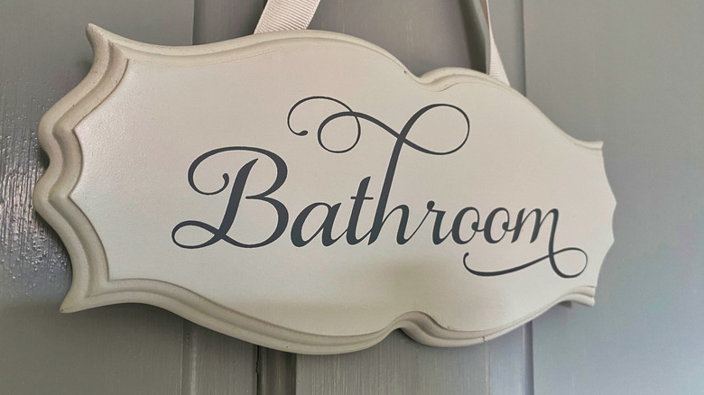
Coming in hot on the heels of the inspirational quotes are the 'direction' signs, meant to prevent you from getting lost in ... your own home. Or, to constantly remind you of the house's theme. Remember that TikTok trend where Gen Z went around their lake houses reeling off every sign? However, James Pearse Connelly, Emmy Award–winning designer and visionary founder of Studio Connelly, feels that these industrial signs don't look stylish and are dating your home. Opening up in his exclusive interview with House Digest, he says, "Yes, we are aware that the 'laundry room' is located here. Let's save signage for Las Vegas and ditch it in your home."
So, look for unique pieces that evoke character and celebrate history and craftsmanship. "Find a unique piece from a vintage store or make a DIY project from an old photo," advises Connelly. Consider it your distinctive way to incorporate more sustainable choices in your home.
Backlit TVs can be a bit much

If you've dabbled in color psychology, you might've felt enamored by the idea of dynamic backlighting in your LED TVs. Your wall turning into a red blaze to match the action movie's intense moments or replicating the moody colors of your RPG game can weave an immersive experience. Still, Connelly believes this trend rarely translates well into reality and does more harm than good. "Color-changing backlights aren't elevating your space — they're making your living room look like a neon light show." Worse, extended exposure to neon and cool colors can strain your eyes and mess with your sleeping cycles, particularly during late-night viewings.
The way forward? "Go into your TV settings and switch this feature off," advises Connelly. "Let the show be the focus, not the glow." Sometimes, not doing anything at all does more for the space than adding in every gimmicky feature does, and backlit TVs certainly fall into this realm.
Greek-style lawn statues don't necessarily scream style
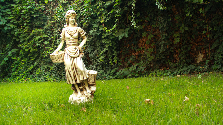
Surely, you've thought of how majestic your property might look with marble statues bedecking your front lawn or garden to create a visual anchor, sprinkle in some Mediterranean whimsiness, and evoke the chance passerby and neighborly envy. But in Connelly's opinion, these life-sized sculptures are an overkill in American yards. "Unless you own a villa in Athens, skip the yard statues," he recommends. They rarely work with the surroundings and don't offer much style. Plus, they can be expensive.
Instead, he suggests investing in exterior yard lighting. "Well-placed lights can make your home look larger, more inviting, and far more elegant at night." However, when you're trying to make your outdoor space visually pop at night, be conscientious and take the local wildlife into account. Since migratory birds and night pollinators abound during moonlight, you don't want to project too many bright lights and interfere with their activities. Instead, stick to warm tones and highlight specific features with direct light for a wow effect.
Curtains that are only just wide enough for windows
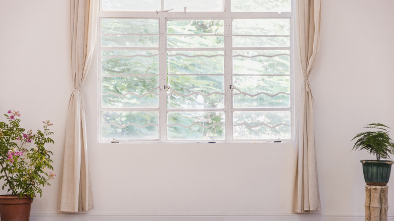
When choosing the perfect curtains for your space, you may fixate on getting the length, color, and material right. While these factors are important, it's essential to take stock of the lateral spread of your curtains. If they end within an inch of the windows, they can make the wall look tacky. "One of the most common mistakes I see, both in my work and in many homes, is using ill-fitting curtains. To save money, people often buy curtains that are just wide enough to cover the window but lack the proper "gather" — the luxurious folds that make curtains look full and elegant," Silverton elaborates. As a result, they appear flat and lifeless, rendering the room cheap and unfinished.
Luckily, you can easily rescue this situation by sizing up. The added spread will enable you to create more folds and immediately raise the oomph factor. "As a rule of thumb, the more folds a curtain has, the more luxurious it will look," explains Silverton. To get that luxurious look, he recommends opting for curtains that measure "twice the width of the closed space [they'll] occupy."
Cheap imitation plants that look obviously artificial won't elevate a space

Admittedly, faux plants can help busy homeowners enliven their space. However, this doesn't always hold true on both the aesthetics and maintenance fronts. Explaining why that's the case, Silverton elaborates, "While high-quality artificial plants can be a great addition, the cheap plastic versions often seen in homes quickly become tacky and old-looking in a short time. They collect dust, look faded, and ultimately make a room feel old and unkempt, completely defeating the purpose of bringing in greenery to add life to a space." Worse, they can make the space look cold and commercial (think a doctor's office or bank decor).
Understandably, when you can't maintain live plants or offer them their desired growth conditions, you have little way to incorporate greenery in your home other than artificial plants. In this case, Silverton advises focusing on quality. Look for plants that closely match their real counterparts' color, texture, and shape. And if you're using imitation florals, incorporate these game-changing tricks to make artificial flowers look real.
Low-quality mirrored decor items don't feel classy
Decorating with mirrors is a given in every home. By reflecting natural light, they can brighten the space and make the room appear larger than its true dimensions, giving it an instant lift. But if an item is made of low-grade glass or take up too much of a space, this plays out conversely. "Cheap, mirrored items are a fast track to a tacky-looking room," admits Silverton. He chalks it up to their "tell-tale flimsy feel and distorted reflections," which, rather than bringing flair and classiness to the room, just cheapen it and reflect shoddiness.
That's why, to render your home with an upmarket elegance, it's important you invest in a statement piece. "A high-end mirrored piece can be a stunning accent," agrees Silverton. Though it may be a bit more expensive, it pays for itself many times over in clear reflections, sophistication, and longevity. Look for mirrors that are at least ¼ inch thick and — preferably — real glass.
Poorly chosen paint combinations that don't reflect a cohesive color palette can cheapen your space

When designing your home, you may feel tempted to give in to your inner Matisse and slap on the brightest paint colors. But if you ignore how these colors flow, pair, and contrast across the rooms, you're in for a home that feels poorly put together. Touching upon this in his exclusive interview with House Digest, David Santiago, owner of Casa Santi Interior, mentions, "When it comes to decorating, one common misstep is overusing paint as a cover-up rather than as an intentional design choice." When you randomly combine "a bunch of colors together for the sake of being different," the final result often misses the mark and goes against the intended outcome and the overall ambiance.
Hence, Santiago advocates being more deliberate about your color schemes. "It's all about being strategic with color and techniques. Use it as an artistic element and a reflection of one's living space with a cohesive color concept." So, go ahead and pick your dominant color and echo it across the rooms — over walls, furniture, or ornamentation — in related hues or tones, building a color story. If still confused, here are a few luxe color schemes that'll make your home look more high-end without costing a fortune.
Cheap rugs that aren't designed to wear well won't look luxe for long
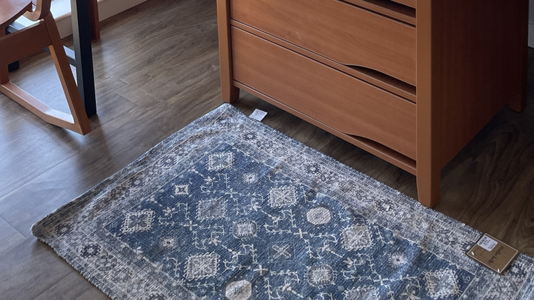
In home design, rugs play several roles, from anchoring the room and sectioning the space to protecting your floors from scuffs and scratches. Alas, they can also put a damper on the overall aesthetic if they wear out too soon. Unfortunately, this is an undeniable outcome for most mass-produced, cheap rugs. Echoing this sentiment, Santiago opines, "Today, there is a plethora of inexpensive rugs out on the market that make them almost feel disposable. I get the price makes them very attractive; however, don't invest in a cheap rug that doesn't have longevity and quality." He also states such rugs aren't eco-friendly and don't gel well with the sustainable lifestyle that we must collectively aspire to.
So, the next time you're choosing your living room rug, Santiago advises that you "invest in quality and durability!" Look for wool or silk-based weaves, as they last a long time. For that chef's kiss luxury look, opt for rugs with hand-woven edges in place of the standard machine-edging.
Low-cost lighting that's badly installed won't elevate a space
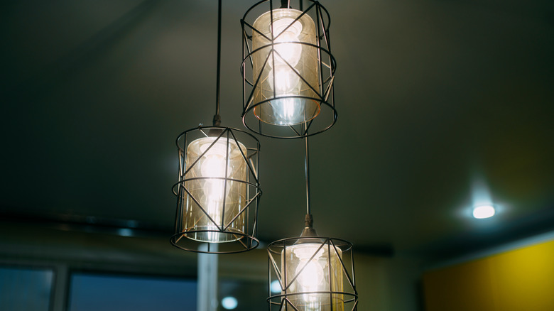
According to Santiago, another type of decor that homeowners get wrong is lighting. Low-priced lights and DIY installation might be budget-friendly, but this can go sideways, leaving you with sad-looking interiors. "Inexpensive lighting fixtures can often reveal their true nature," says Santiago. "Think tacky aesthetics that just don't cut it," plus, "let's be honest, nothing ruins a chandelier's charm like messy cords or chains awkwardly cut and wrapped."
He also warns against randomly sticking LED strips to the walls in the wild hope that they will create a cozy atmosphere. "Another element that reads poorly is LED lighting strips installed purely for effect and not refined for ambient and layered lighting." In other words, you need to be intentional about how various lights illuminate the space, making sure they highlight different levels without eating into each other's space. Invest in finely-crafted statement or sculptural pieces that wash the room in style, like this elegant tripod lamp by Lightdot. As for LED strips, use them minimally, to spotlight specific fixtures or highlight cabinetry or coves so the overall scheme looks cohesive.
Imprecisely applied self-adhesive products can give off a cheap feel
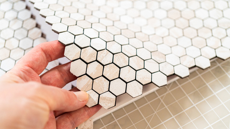
Peel-and-stick tiles have become popular as an affordable way to update interiors. They imitate the appearance of traditional tiles, without costing as much, and are touted to be DIY-friendly. In Santiago's experience, however, these self-adhesive products don't go as seamlessly on the walls or floors as it's usually projected, and leave the room looking tatty rather than elevated. "While I'm not against self-adhesive tiles, flooring, or wall coverings, it's the lack of precision in the cutting and installation that often gives away the shortcuts," elaborates Santiago. Since in a DIY project, you must self-measure the length of the floors, cut the tiles accordingly, and remove their adhesive tape to fix them in place, there are plenty of instances you may falter, creating a messy look.
That's why Santiago advises handling self-adhesive products only if you've got the eye for details and the time to follow the manufacturer's instructions. "Dedication to detail is what elevates a space and gives it the perceived value it deserves. You can achieve this if installed properly, so don't cut corners just to get the job done," he states. Be sure there are no gaps between the tiles, or you'll have to contend with grueling upkeep to remove dirt, which would further hurt your aesthetic.
Furniture that's the wrong size for the room
Another common folly homeowners make when designing their homes is trying to squeeze in ill-scaled furniture. "I've seen sofas so big you can barely walk around them, and tables so small they look like kids' furniture in a big room. Neither works," elaborates Riley Thorne, founder of Home Renovation Index, during her exclusive interview with House Digest. In short, the next time you thrift that floral-patterned chair that looks like it's in great shape and is available for a steal, also take its size into account, making sure it'll blend harmoniously into your room.
To avoid committing a misstep, follow Thorne's advice of measuring the furniture's dimensions beforehand and examining whether it allows breathability and movement. "Before you buy, tape the dimensions out on the floor. If you can't move around comfortably, it's too big," she points out. Conversely, if the furniture appears undersized, rather than squeezing multiple pieces and cluttering the space, opt for a bigger product. "If the piece looks lost in the outline, size up," Riley recommends.
Finishes that don't stand the test of time
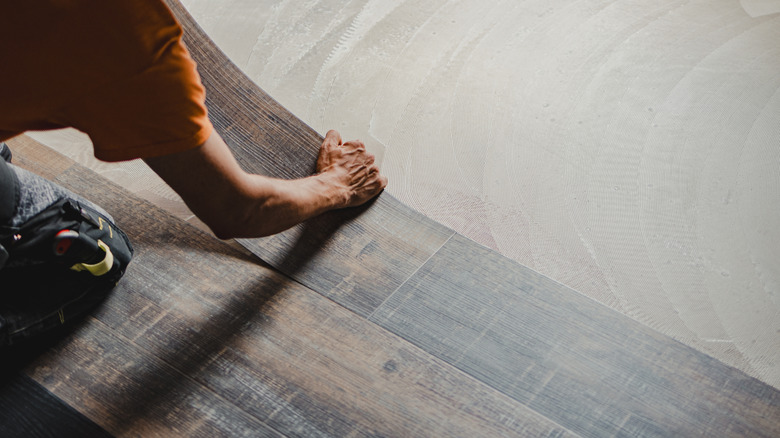
Going for budget-friendly final touches and finishes does your home no favors. The façade eventually dissipates and can rarely be salvaged, even with a coat of paint or stain. Thorne especially takes issue with laminate and vinyl materials masquerading as hardwood because they don't offer the latter's timelessness and resilience, and they start taking damage the moment they're put to use or exposed to moisture. "I've seen plenty of 'marble' counters that are just laminate and vinyl floors trying to pass as hardwood. They don't fool anyone for long — corners peel, scratches show, and suddenly the whole space feels cheap," she says.
Her advice? "Go for real materials." Luckily, save for the true-blue luxurious ones like mahogany and walnut, plenty of real materials are available at reasonable prices and won't give off a knockoff or builder-grade feel. "Plywood, cork, or engineered wood done right will outshine any fake 'high-end' finish," she clarifies.
Light that's way too harsh
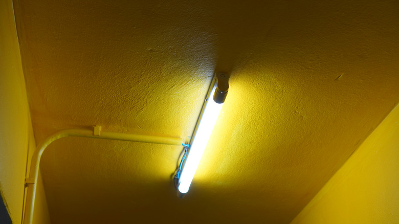
You may mount a gigantic fixture in the center of the ceiling to flood the space with a pool of light. While it does the job, it'll make your room feel tacky and uninviting. Thorne asserts, "One ceiling light blasting the whole room? Makes everything flat and cold, no matter how nice the space is."
Since the same room may support various activities, from putting on makeup to watching a movie, you need different kinds of lighting (focused versus ambient). So, incorporate softer lights. "Keep it basic, but layer in softer lighting where you actually live — lamps by the sofa, strips under cabinets, a wall sconce or two," explains Thorne. Also, consider adding dimmers so you have the option to vary the brightness according to your task or mood. Such lighting will make your home look more expensive because of the added depth and warmth.
Generic art that feels feel impersonal and uncurated
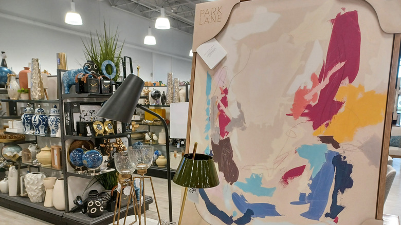
Cool it with the cheap Van Gogh prints. While the original is surely spectacular, it's blatantly obvious that's not what's donning your living room wall. Similarly, give rest to any mass-produced "paintings" or generic AI art that neither screams class nor creativity. Such images are making your home look tacky, rather than tastefully put together. Thorne expands, "I see the same store-bought prints in house after house, and they just suck the life out of the space." Retire them!
Rather than opting for cookie-cutter or mass-produced art pieces, cover your walls with art that speaks to your soul, is personally commissioned by you, or at least reflects your tastes in the overall curation. In Thorne's words, "Use art that actually matters to you. A snapshot from a trip, a quick sketch, even fabric you liked enough to frame — anything personal beats store-bought art."
Floors that don't go together can create a patched-together look
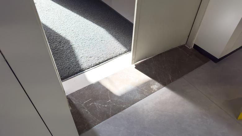
Accommodating every family member's personal likes or the urge to delineate spaces in an open layout may convince you to create mixed floorings. Sadly, such a mish-mash can often come across as disjointed, raising questions about your stylistic choices, hints Thorne. Drawing from her experience, she mentions, "I've walked into hallways where three different floor types meet — it makes the whole house feel patched together."
Although there's no harm in flirting around with different textures across your floors, build a theme, with one dominant floor type becoming the common denominator across all rooms. To make this work, "Use the same flooring in the main areas for continuity and if you switch, make it intentional — like a bold tile strip at the entry — so it looks planned, not random," recommends Thorne.