The Best Paint Choices When Using The Color Capping Trend
Color capping adds an elegant touch to any room, often uplifting the space and drawing visual attention to the frequently neglected ceiling. Where color drenching doused a room in one tone, offering a monochromatic look, color capping takes on an ombre-like effect, using different tones or shades of one color to create a gradient masterpiece that ranges from wall to ceiling. The term "color capping" was coined by Benjamin Moore in the brand's AW2025 lookbook, and has become the latest color trend you'll be seeing everywhere. The idea is simple. A tone variant different from your walls or trim is painted on the ceiling to create a "capped" look. This can help raise the visual height of a small room or add a cozy, enclave feeling to a grand space.
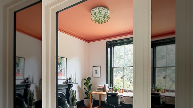
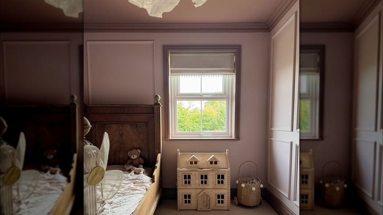
Benjamin Moore's color expert, Helen Shaw, spoke to Livingetc about the trend, saying, "Color capping involves enveloping a space in a tonal wash that gradually deepens the further up it goes." However, choosing the right color and paint type can vastly affect how color capping looks in your design. Benjamin Moore suggests starting with "a soft hue for walls moving into a mid-tone for cornicing," then topping off the ombre effect with a darker tone for the ceiling, creating a natural gradient. While this is a classic method for color capping, in the AW2025 lookbook, the brand also features a stunning bedroom design where the walls are painted a darker tone and the ceiling and cornicing are a shade lighter.
Set the mood by choosing the right color when color capping
The gradient can either darken or lighten as you move up to the ceiling, depending on your preference. But how do you create a cohesive color palette for your home using the right colors when color capping for each room? Design experts suggest thinking about what you want to achieve in a color capped room. If you want to open up and enlarge the space, lighter muted tones like blue or green could be perfect for creating an airy effect. Cream and neutral tones have also been widely featured in color capping palettes, often embracing soft eggshell colors on the walls paired with toasted cream on the trim and ceiling.
Lighter, soothing hues are often reserved for communal spaces like the living room and dining room, while moodier tones are popping up in bedrooms. However, there is a lot of room for personalization, with some designers using cream and gold tones in bedrooms and deep red and burgundy in the dining room. Overall, it seems many are favoring the trendy paint colors that will be taking over walls in 2026, like gorgeous greens, warm neutrals, and velvety mauve tones. In general, muted tones are the most common in color capped spaces. However, jewel tones are also being experimented with. Designers suggest using bolder hues to highlight unique architectural pieces in your home design, such as grandiose cornicing, which could invite more drama into your space.
Placement, lighting, and finish will impact your color capped design
When creating the cap, choosing the correct placement is everything. A higher cap, above trim, will extend the visual height of a room, while a lower cap utilizing cornicing could create a cozier look. Benjamin Moore also suggests considering the natural lighting of the room you're color capping. East and west-facing windows will impact the color of lighting and how it falls on your walls and the ceiling. For example, a west-facing room will receive cooler light in the morning and a warmer light in the afternoon. The brand shares in their AW2025 lookbook that "choosing blue-based tones ... is a clever way of balancing out the light in such a room, offering a cooler finish," which could help offset the warmth of the afternoon lighting.
Further, designers share that the key to pulling off color capping is to choose shades with the same undertones. Tonal colors create the most cohesive palette for color capping, with just enough shade variation to create the unique look. Finishes often remain the same across the two to three different tones of color, making the tonal change the only difference in these paint colors for the best effect. Matte and flat finishes are the most common choice, following 2026 paint trends and carrying over from trends of the previous year. These finishes offer a modern and velvety look.