The Sherwin-Williams Paint Color That Can Complete Your Vintage Home
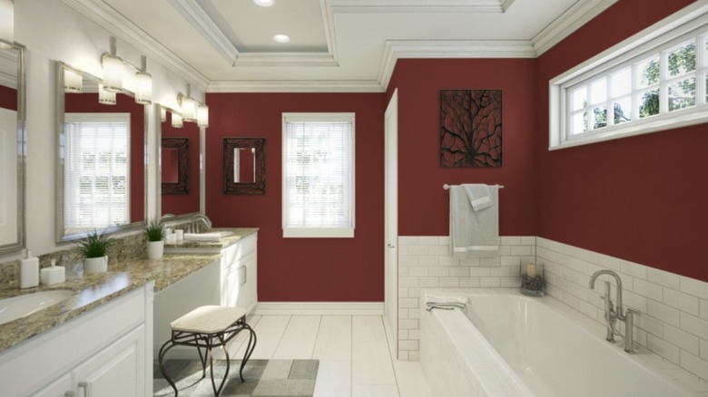
There's no question that painting a room red is a bold choice — but that's not a bad thing. In fact, it can be a great way to add or enhance the vintage charm of a home. If that's what you're going for, one color that is sure to do the trick is Crabby Apple by Sherwin-Williams. This timeless shade adds drama and character to a space, whether you're color-drenching an entire room or incorporating it in subtle accents.
Red paint is often misunderstood. Mentions of it typically evoke images of high-gloss, fire-engine reds of the '80s or cabernet-colored walls that graced many homes in the '90s. While red paint is more temperamental than other colors, Crabby Apple has the perfect amount of richness and depth to keep it feeling classic while injecting a nice dose of nostalgia.
The reason this shade works well has to do with its undertones, which are a big part of picking the right red. If the undertones are too warm, the color will veer orange, appearing terra cotta or rust. Meanwhile, undertones that are too cool can end up reading purple. Crabby Apple manages to strike the perfect balance of undertones, with hints of brown and burgundy creating a rich shade of red that feels luxurious without being overpowering. While it's a timeless choice year-round, if you're looking to double down on your vintage vibes ahead of the holiday season, a few coats of Crabby Apple may be just what you need.
The best shades to pair with Sherwin-Williams' Crabby Apple
If color drenching isn't your thing and you're looking to balance out a Crabby Apple-painted room with some lighter shades for contrast, Sherwin-Williams has various neutral colors that work well. Alabaster, Accessible Beige, Creamy, and Aged White are all good options. Shades of taupe, such as Loggia or Nearly Brown, also pair well, keeping things warm and neutral. If you want to add more drama to your space, consider complementing Crabby Apple with another moody Sherwin-Williams hue, such as a dark navy like Naval, a deep brown like Urbane Bronze (perfect for your home office), or a soft, earthy green such as Softened Green.
While Crabby Apple is a versatile color that can work in a variety of spaces, the cozy atmosphere it creates makes it a particularly great choice in areas where you're looking to create an inviting, intimate atmosphere, such as dining rooms, entryways, and studies. It can also be used as an accent in kitchens — on cabinetry, or on an island.
In terms of fixtures, the shade coordinates well with warm-tone metals, such as gold, bronze, brushed brass, or copper. Dark wood furniture also looks great against a Crabby Apple backdrop. Consider adding wooden antique pieces to enhance the vintage feel of your space. Keep in mind: As with all paints, lighting has a huge impact on how it looks in a room. So before painting your walls red, make sure to test out the color in a small area first to get a better sense of how it will look.