The Finish Mistake That's Making Your Moody Paint Colors Look All Wrong
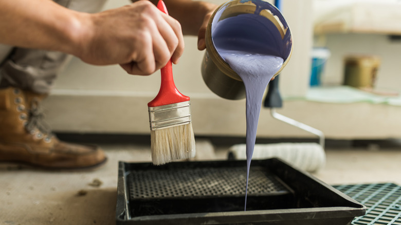
We can spend hours comparing swatches and agonizing over undertones, but sometimes it's not the color choice that throws off your design. There are plenty of mistakes everyone makes when choosing a paint color for their home, but often it's getting the little details wrong that can be the most frustrating. Many of us start our painting with a clear vision in mind, whether that's bright and minimalist or bold and busy. Each aesthetic goal will require some thoughtfulness, especially if the look you're going for is a moody, dramatic color palette. These schemes often require taking a bit of risk, considering that these tones are typically prepared to make a big statement. If you want your paint colors to nail that timeless, moody vibe, some designers recommend avoiding a gloss finish in favor of something more classic.
You might expect your paint to land as deep and enchanting, but overlooking a detail as simple as the finish could sabotage everything, leading to a tacky result. While a glossy finish is appropriate in many cases, its reflective qualities can conflict with an intense aesthetic. Before you settle on your swatches, it's worth reconsidering if a glossy finish is the right fit. If it's not, don't be discouraged, as there are plenty of alternative finishes that can elevate your design for a much more satisfying look.
Why you might reconsider glossy finishes for moody paint colors
Figuring out how to choose the right finish of paint for your house can be difficult, but it's a factor that is always worth considering. While a gloss finish is a common pick for homes, in certain cases, it might lead to regret. When it comes to moody interiors, palettes tend to sway dark, deep, and powerful — qualities that might lose some appeal with a gloss. One reason many people gravitate towards glossy finishes is their shiny effect, which can make interiors look sleek and polished. While this luxe look is well-suited to light, contemporary aesthetics, it may not land the same if your goal is to emphasize the deep, rich character of your paint colors. The gloss effect can make your paint choice land brighter, especially in rooms with plenty of natural light, which will reflect throughout the finish.
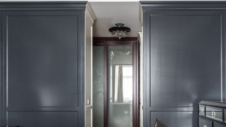
Using a dark paint color is a great way to set the tone of a room, but a gloss may diminish its impact, highlighting imperfections in the surface texture instead. In particular, this might lead to problems in larger applications, like on walls, where these issues are magnified, distracting from the overall intention of the color palette. If you really want to incorporate this kind of finish, it may work better in smaller doses, like trim or accents.
Aim for timeless finishes that enhance a moody palette
While a gloss may be better left for lighter, sleeker interiors, there are plenty of alternative finishes that can bring out the best in your color choices. Overlooking the impact of your lighting is one of the mistakes to avoid when designing a moody room, and this includes a lack of consideration for how your lighting will interact with your paint finish. Choosing your finish isn't just a last-minute detail; it's a decision that you can use to your design's advantage. A matte finish can deepen a moody scheme by diffusing light rather than bouncing it around the room. If a matte style feels too understated for your space and a shiny effect seems too over-the-top, finishes like eggshell or satin can provide the perfect balance, with a soft appearance on the surface and a quiet sheen in certain types of lighting.
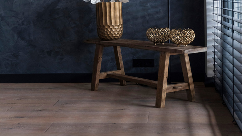
Other professionals believe that a more natural approach benefits dark paint colors. Finishes like limewash or plaster can create a more classic appeal to elevate your surface and shade. Paint finishes come in a wide range of options, which all vary in sheen, so the key is to choose the level that feels most aligned with your design. It's also not necessary to commit to one finish — in fact, choosing different finishes for certain elements can help incorporate contrast while still maintaining the moody colors you plan to use.